Welcome to a tutorial on how to create a simple responsive pure CSS Hamburger Menu. Yep, there are plenty of other hamburger menus on the Internet, but some of them still require the use of Javascript. So here it is, a menu that is purely CSS-driven, not a single line of Javascript. Read on to find out how to build one!
ⓘ I have included a zip file with all the source code at the start of this tutorial, so you don’t have to copy-paste everything… Or if you just want to dive straight in.
TABLE OF CONTENTS
 Download & Demo Download & Demo |
 How to Build How to Build |
 Useful Bits Useful Bits |
 Tutorial Video Tutorial Video |
 The End The End |
DOWNLOAD & DEMO
Firstly, here is the download link to the example code as promised.
QUICK NOTES
If you spot a bug, feel free to comment below. I try to answer short questions too, but it is one person versus the entire world… If you need answers urgently, please check out my list of websites to get help with programming.
EXAMPLE CODE DOWNLOAD
Click here to download the source code, I have released it under the MIT license, so feel free to build on top of it or use it in your own project.
HAMBURGER MENU DEMO
Go ahead. Resize the window and see the hamburger menu in action.
HOW TO BUILD A HAMBURGER MENU
Building a hamburger menu is actually not that difficult these days with the help of modern CSS…
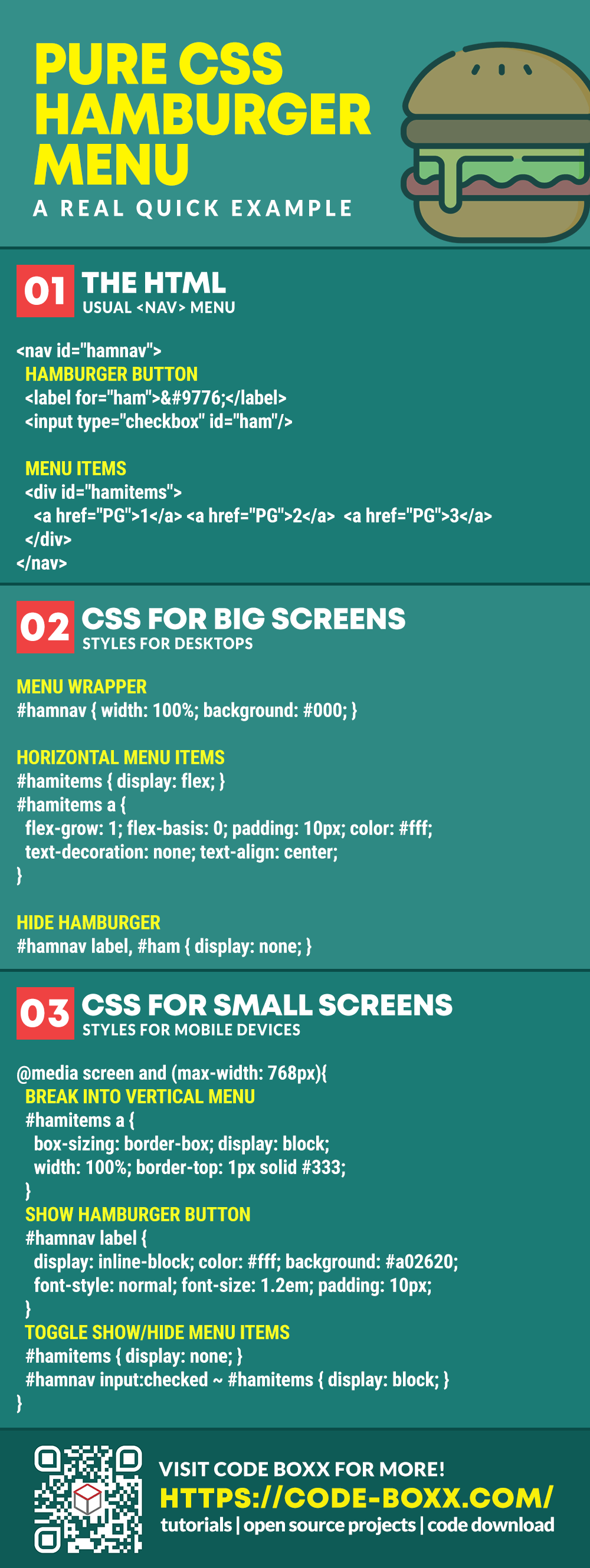
STEP 1) THE HTML
<!-- (A) MENU WRAPPER -->
<nav id="hamnav">
<!-- (B) THE HAMBURGER -->
<label for="hamburger">☰</label>
<input type="checkbox" id="hamburger"/>
<!-- (C) MENU ITEMS -->
<div id="hamitems">
<a href="a.html">First</a>
<a href="b.html">Second</a>
<a href="c.html">Third</a>
<a href="d.html">Forth</a>
</div>
</nav>
The HTML part should be pretty straightforward:
- First, we create the wrapper for the navigation menu
<nav id="hamnav">. - Followed by using a
<label for="hamburger">and<input type="checkbox" id="hamburger"/>as the hamburger button. For people who are new, that☰is the HTML symbol for the “3 lines hamburger icon”. - Finally, we sandwich the menu items
<a>inside the<div id="hamitems">wrapper.
That’s all, zero Javascript involved.
STEP 2) CSS FOR BIG SCREENS
/* [ON BIG SCREEN] */
/* (A) WRAPPER */
#hamnav {
  width: 100%;
  background: #000;
}

/* (B) HORIZONTAL MENU ITEMS */
#hamitems { display: flex; }
#hamitems a {
  flex-grow: 1;
  flex-basis: 0;
  padding: 10px;
  color: white;
  text-decoration: none;
  text-align: center;
}
#hamitems a:hover { background: #af0d0d; }

/* (C) HIDE HAMBURGER */
#hamnav label, #hamburger { display: none; }
The CSS is where all the magic happens. This may seem to be a little complicated, but let’s take it step-by-step. Starting with how to display a “normal menu bar” on the big screens:
- Self-explanatory, a full-width navigation menu.
- Next, we set
#hamitemstodisplay: flex. Addingflex-grow: 1andflex-basis: 0to the menu items will automatically space them out equally. - Since we do not need the hamburger icon on the big screen, we hide it by attaching
display: noneto#hamnav labeland#hamburger.
This is actually all the important mechanics on the big screen, and we now have a working horizontal navigation bar.
STEP 3) RESPONSIVE CSS FOR SMALL SCREENS
/* [ON SMALL SCREENS] */
@media screen and (max-width: 768px){
  /* (A) BREAK INTO VERTICAL MENU */
  #hamitems a {
    box-sizing: border-box;
    display: block;
    width: 100%;
    border-top: 1px solid #333;
  }

  /* (B) SHOW HAMBURGER ICON */
  #hamnav label {
    display: inline-block;
    color: white;
    background: #a02620;
    font-style: normal;
    font-size: 1.2em;
    padding: 10px;
  }

  /* (C) TOGGLE SHOW/HIDE MENU */
  #hamitems { display: none; }
  #hamnav input:checked ~ #hamitems { display: block; }
}
Lastly, we add some style changes on the small screen to do the responsive magic:
- Transform the horizontal menu into a vertical one by adding
#hamitems a { width: 100% } - Show the hamburger icon with
#hamnav label { display: inline-block }.- Take extra note – We are showing the hamburger
labelonly, thecheckboxremains hidden. - The checkbox will still work when the user clicks on the
label.
- Take extra note – We are showing the hamburger
- A little confusing, but this is where the magic happens.
- By default,
#hamitems { display: none; }will hide the menu items. #hamnav input:checked ~ #hamitems { display: block; }in simple English – Show the menu items when the hiddencheckboxis checked.
- By default,
USEFUL BITS & LINKS
That’s it for the code, and here is a small extra that you may find useful.
STICKY MENU BAR
Want the menu bar to be permanently fixed on top of the screen as the user scrolls down on your website? Simply add a position: sticky to the navigation bar, and that should do the magic.
#hamnav {
  position: sticky;
  top: 0;
}
But this will probably cause more problems on a small screen, so use it wisely.
BIGGER HAMBURGER?
The hamburger icon is an HTML symbol. Yes, changing the size is as easy as setting label[for="hamburger"] { font-size: XX em }.
I WANT DROPDOWN ITEMS!
That won’t be “simple” anymore, but feel free to challenge yourself…
- Dropdown Menu With Pure CSS – Code Boxx
- Multi-Level Dropdown? That’s more like a Tree Menu – Code Boxx
COMPATIBILITY CHECKS
- CSS Flexbox – CanIUse
- CSS Sibling Selector – CanIUse
This hamburger menu works nice across all modern browsers.
TUTORIAL VIDEO
INFOGRAPHIC CHEAT SHEET
THE END
Thank you for reading, and we have come to the end of this tutorial. I hope that it has helped you to create a better menu system for your project, and if you have anything to add to this guide, please feel free to comment below. Good luck and happy coding!
Very Easy to follow! Thank you.
So I need to put the html code on the top of ‘every’ webpage?
What happens if I need to add a link on the menu?
In the past I used an iframe and needed only to make the change to the header where my links were.
How do I do this to avoid having to change every webpage to add a link to the menu.
Study basic HTML, CSS, and server-side programming on your own. Or just hire a freelancer. Good luck with your project.
https://code-boxx.com/faq/#help “Explain Everything” “Answers all over the Internet”
Thank you for the reply, and the link. It sure paints a clearer picture of you and your people skills.
Good people skills – Sorry, I am kind of a newbie. Can you point me to some tutorials where I can get more direction? Much appreciated!
S-WHOLE people skills – Taking freely from others, then attacking them when they don’t give you more.
https://code-boxx.com/faq/#badatti – I don’t owe you anything. It is also not convincing to preach about people skills when you wear wet diapers. 😉
Can’t find my comment, do you at least have the text, I could use parts of it on another site.
Nothing but praise and kudos concerning your site/post, no
idea why it did not post. Oh wellzzzz AGAIN how do I see or
get a copy of my comment?!?! Thanks in advance. —RM
Glad it helped – All comments are just held for moderation… Too much spam to deal with.
I have just come here and gona must try this. Thank you so much
I have everything working, but when going to the hamburger nav, the checkbox is still visible, and I cannot figure out how to make it disappear.
By the way, thanks so much for taking the time to make this tutorial. I was able to do this much easier than trying to do the one posted in my class 🙂
Great! Is it possible to make the first option in the menu default active on any size device?
Not quite sure what you mean by “make the first option in the menu default active on any size device”.
https://code-boxx.com/faq/#help “unclear question”