Welcome to a tutorial on how to create a responsive dropdown menu in HTML CSS. Yep, there are a ton of “dropdown menu plugins” on the Internet. But we can literally build one within minutes, using only HTML CSS. No third-party libraries and senseless bloat. Read on for the example!
TABLE OF CONTENTS
 Download & Demo
 Dropdown Menu
 Extras
 The End
DOWNLOAD & DEMO
Here is the download link to the example code, so you don’t have to copy-paste everything.
EXAMPLE CODE DOWNLOAD
Click here to download | Example on CodePen
The example code is released under the MIT license, so feel free to build on top of it or use it in your own project.
SORRY FOR THE ADS...
But someone has to pay the bills, and sponsors are paying for it. I insist on not turning Code Boxx into a "paid scripts" business, and I don't "block people with Adblock". Every little bit of support helps.
Buy Me A Coffee Code Boxx eBooks
DROPDOWN MENU DEMO
Go ahead – Resize the window and see how the menu changes its layout.
TUTORIAL VIDEO
PART 1) THE HTML
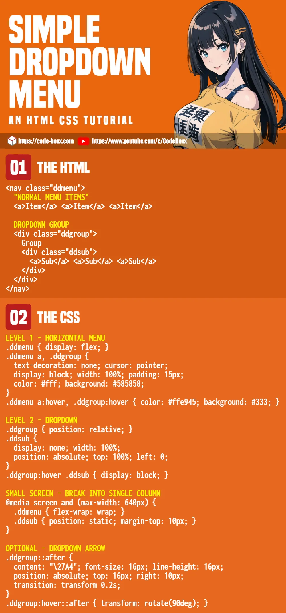
<nav class="ddmenu">
  <!-- (A) "NORMAL ITEMS" -->
  <a>Item</a>
  <a>Item</a>
  <a>Item</a>

  <!-- (B) DROPDOWN GROUP -->
  <div class="ddgroup">
    Group
    <div class="ddsub">
      <a>Sub</a>
      <a>Sub</a>
    </div>
  </div>
</nav>
This should be pretty self-explanatory.
- Create a “normal”
<nav>menu as usual, sandwich<a>inside. - A little more is required for dropdown groups.
- Wrap the entire dropdown tab in a
<div class="ddgroup">wrapper. - Wrap the
<a>links inside yet another<div class="ddsub">wrapper.
- Wrap the entire dropdown tab in a
PART 2) FLAT NAVIGATION BAR
/* (A) FIRST LEVEL */
.ddmenu { display: flex; }
.ddmenu a, .ddgroup {
  text-decoration: none;
  cursor: pointer;
  display: block; width: 100%; padding: 15px;
  color: #fff; background: #585858;
}
.ddmenu a:hover, .ddgroup:hover {
  color: #ffe945; background: #3a3a3a;
}
Now that the HTML is ready, the first step is to create a navigation bar.
.ddmenu { display: flex; }Setting flex layout pretty much does the magic of creating a horizontal menu bar..ddmenu a, .ddgroup { ... }Of course, some cosmetics to make the menu items and groups look better..ddmenu a:hover, .ddgroup:hover { ... }Change the colors on mouse hover.
PART 3) DROPDOWN MECHANISM
/* (B) SECOND LEVEL */
.ddgroup { position: relative; }
.ddsub {
  display: none; width: 100%;
  position: absolute; top: 100%; left: 0;
}
.ddgroup:hover .ddsub { display: block; }
To deal with the dropdown groups.
- Position the dropdown items under the respective tabs.
.ddgroup { position: relative; }.ddsub { position absolute; top: 100%; left: 0; }
.ddsub { display: none; }Hide the dropdown items by default..ddgroup:hover .ddsub { display: block; }Show the dropdown items only on mouse hover.
PART 4) RESPONSIVE MOBILE SUPPORT
/* (C) ON SMALL SCREENS */
@media screen and (max-width: 640px) {
  .ddmenu { flex-wrap: wrap; }
  .ddsub { position: static; margin-top: 10px; }
}
Finally, some small changes to make the menu look good on small mobile screens.
.ddmenu { flex-wrap: wrap }Break the menu items into a single column..ddsub { position: static }Do not “float” the dropdown items, display it in a single column as well.
OPTIONAL) DROPDOWN ARROW INDICATOR
/* (D) DROPDOWN ARROW */
.ddgroup::after {
  content: "\27A4"; font-size: 16px; line-height: 16px;
  position: absolute; top: 16px; right: 10px;
  transition: transform 0.2s;
}
.ddgroup:hover::after { transform: rotate(90deg); }
To add an arrow to indicate the dropdown.
content: "\27A4"Use the after pseudo-class to attach the dropdown arrow.position: absolute; top: 16px; right: 10px;Place the arrow at the right side..ddgroup:hover::after { transform: rotate(90deg); }Rotate the arrow on mouse hover.
EXTRAS
That’s all for this guide, and here is a small section on some extras and links that may be useful to you.
DESIGN RESTRICTIONS
- Captain Obvious to the rescue, the dropdown is restricted to 2 levels only.
- It is possible to add more levels, but that becomes a “tree menu” instead – See the links below.
- I will not recommend more than 2 levels – It gets complicated, and the nested menu is awkward on small mobile screens.
COMPATIBILITY CHECKS
- CSS Flexbox – CanIUse
- CSS Animation – CanIUse
The HTML CSS dropdown menu works on all modern browsers.
LINKS & REFERENCES
- HTML CSS Hamburger Menu – Code Boxx
- HTML CSS Responsive Tree Menu – Code Boxx
INFOGRAPHIC CHEAT SHEET
THE END
Thank you for reading, and we have come to the end of this guide. I hope that this has helped you to build a better website, and if you have anything to add to this guide, please feel free to comment below. Good luck and happy coding!
Thanks 🙏
This works awesome for desktop, but when I go to use it on mobile, there isn’t really a hover feature. I can click the menu drop down and it expands fine, but when I try to click it again it doesn’t retract.
Your own website has this feature on mobile, is this something that needs javascript or is there a strictly CSS way to retract the submenu when done on mobile?
Check out https://code-boxx.com/css-collapsible-tree-menu/
Your guides are great! I am wondering if you have already done a combination of this (drop down) and the hamburger menu. I am trying to combine, but keep running into problems. What I am trying to achieve is a menu that has two levels of sub menus and, which viewed on mobile (small screens) just shows the hamburger which can be clicked to expand the menu.
Multiple levels are never easy to deal with, that is more like multiple tree menus than a single dropdown. Shall consider this as a request, but can’t help much otherwise. Good luck with your project.
https://code-boxx.com/css-collapsible-tree-menu/
https://code-boxx.com/faq/#help