Welcome to a step-by-step tutorial on how to create simple responsive CSS speech bubbles. Once upon a time in the Stone Age of the Internet, we created speech bubbles by putting several pieces of background images together… Like it’s some sort of a jigsaw puzzle. But today, it is totally possible to create a speech bubble using pure CSS only – Read on for the example!
TABLE OF CONTENTS
 Download & Notes
 Responsive Speech Bubble
 Extras
 The End
DOWNLOAD & NOTES
Here is the download link to the example code, so you don’t have to copy-paste everything.
EXAMPLE CODE DOWNLOAD
Click here to download. The example code is released under the MIT license, so feel free to build on top of it or use it in your own project.
SORRY FOR THE ADS...
But someone has to pay the bills, and sponsors are paying for it. I insist on not turning Code Boxx into a "paid scripts" business, and I don't "block people with Adblock". Every little bit of support helps.
Buy Me A Coffee Code Boxx eBooks
RESPONSIVE SPEECH BUBBLE
All right, let us get into the steps of creating a speech bubble using pure HTML and CSS.
TUTORIAL VIDEO
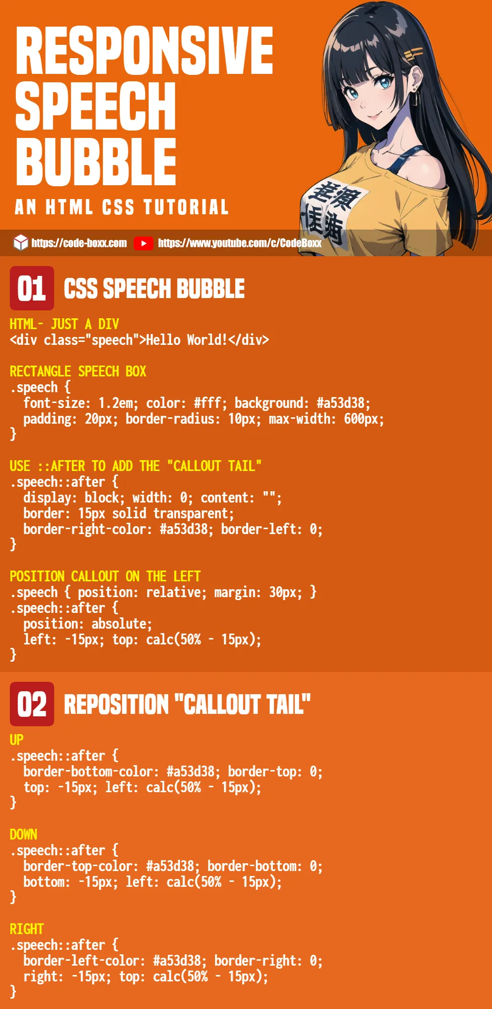
STEP 1) SIMPLE SPEECH BOX
<div class="speech">Hello World!</div>/* (A) SPEECH BOX */
.speech {
/* (A1) FONT & COLORS */
font-size: 1.2em;
color: #fff;
background: #a53d38;
/* (A2) DIMENSIONS */
padding: 20px;
border-radius: 10px;
max-width: 600px;
}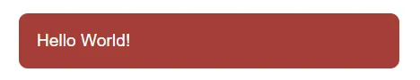
Aye, all we need to create a speech bubble is just a normal <div>. The CSS shouldn’t be any trouble either. We are just creating a “normal rectangle box” by setting the background color, padding, font size, font color, etc…
STEP 2) ADD SPEECH BUBBLE “CALLOUT”
<div class="speech up">Hello World!</div>
<div class="speech down">Hello World!</div>
<div class="speech left">Hello World!</div>
<div class="speech right">Hello World!</div>/* (B) USE ::AFTER TO CREATE THE "CALLOUT" */
.speech::after {
display: block; width: 0; content: "";
border: 15px solid transparent;
}
/* (C) "CALLOUT" DIRECTIONS */
.speech.up::after {
border-bottom-color: #a53d38;
border-top: 0;
}
.speech.down::after {
border-top-color: #a53d38;
border-bottom: 0;
}
.speech.left::after {
border-right-color: #a53d38;
border-left: 0;
}
.speech.right::after {
border-left-color: #a53d38;
border-right: 0;
}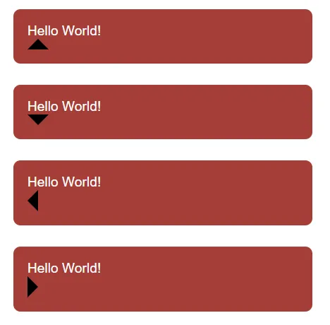 We now have a rectangle speech box, but it is missing the “speech callout triangle thing”. In ancient days, creating this “callout” involves positioning a triangle image. But in modern CSS, we can use the “border triangle” trick to create the “callout” on
 ::after – See the extras section if you want to learn more.
STEP 3) POSITION THE “CALLOUT”
/* (D) POSITION THE CALLOUT */
.speech {
position: relative;
margin: 30px;
}
.speech::after { position: absolute; }
.speech.up::after {
top: -15px; left: calc(50% - 15px);
}
.speech.down::after {
bottom: -15px; left: calc(50% - 15px);
}
.speech.left::after {
left: -15px; top: calc(50% - 15px);
}
.speech.right::after {
right: -15px; top: calc(50% - 15px);
}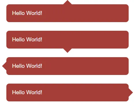 All that’s left is to position the “callout triangle” properly.
EXTRAS
That’s all for the CSS speech bubble, here are some extras that may be useful.
THE “MAGIC TRIANGLE”
<style>
/* (A) DIFFERENT COLOR BORDERS */
.all {
width: 0;
border: 20px solid;
border-top-color: black;
border-bottom-color: red;
border-left-color: green;
border-right-color: blue;
}
/* (B) ARROW USING BORDERS */
.up, .down, .left, .right {
width: 0;
border: 20px solid transparent;
}
.up { border-bottom-color: red; }
.down { border-top-color: black; }
.left { border-right-color: blue; }
.right { border-left-color: green; }
</style>
<div class="all"></div>
<div class="up"></div>
<div class="down"></div>
<div class="left"></div>
<div class="right"></div>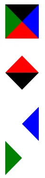 For you guys who are wondering how we “transform” the border into a triangle.
- As you can see, the borders around HTML elements are “cut” at 45 degrees.
- So very simply – We set a solid color on the required side, and the rest will be transparent.
INFOGRAPHIC CHEATSHEET
LINKS & REFERENCES
- Responsive Timeline – Code Boxx
- Simple Show/Hide Animations – Code Boxx
THE END
Thank you for reading, and we have come to the end of this short tutorial. I hope that it has helped you to build a better project, and if you have anything to add to this project, please feel free to comment below. Good luck and happy coding!
Great tutorial! Easy to follow and works great!