Welcome to a tutorial on how to show/hide HTML elements with animations. So you want to toggle the visibility of an HTML element with bells and whistles? There’s no need to load an entire library, we can do it easily with modern CSS – Here are some examples that you can copy-paste. Read on!
TABLE OF CONTENTS
 Download & Notes
 Show & Hide Animations
 Extras
 The End
DOWNLOAD & NOTES
Here is the download link to the example code, so you don’t have to copy-paste everything.
EXAMPLE CODE DOWNLOAD
Click here to download | Example on CodePen
The example code is released under the MIT license, so feel free to build on top of it or use it in your own project.
SORRY FOR THE ADS...
But someone has to pay the bills, and sponsors are paying for it. I insist on not turning Code Boxx into a "paid scripts" business, and I don't "block people with Adblock". Every little bit of support helps.
Buy Me A Coffee Code Boxx eBooks
SHOW & HIDE ANIMATIONS
All right, let us now get into the examples of toggling the visibility of an HTML element, with animations.
YOUTUBE TUTORIAL
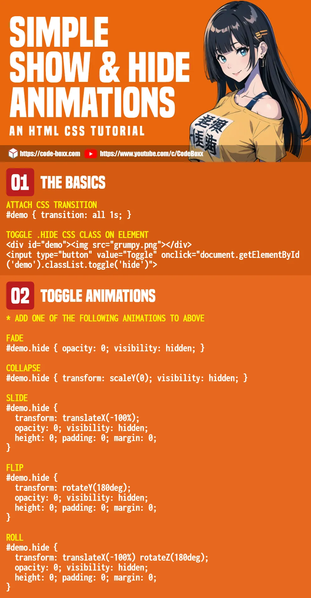
EXAMPLE 1) FADE IN & OUT
<style>
/* (A) SET CSS TRANSITION */
#fade { transition: all 1s; }

/* (B) HIDE */
#fade.hide {
  opacity: 0;
  visibility: hidden;
  height: 0; padding: 0; margin: 0; /* optional */
}
</style>

<div id="fade"><img src="grumpy.png"></div>
<input type="button" value="Toggle" onclick="document.getElementById('fade').classList.toggle('hide')">

There are only 2 HTML elements here.
<div id="fade">The dummy section that we will show/hide.<input type="button">Toggles a.hideCSS class on<div id="fade">to trigger the show/hide.
As for how the CSS animation magic works:
#fade { transition: all 1s; }Tells the browser to attach CSS animations to<div id="fade">.#fade.hide { opacity: 0; }When the.hideCSS class is added to<div id="fade">, CSS will automatically animate and fade out the element.- Vice-versa, CSS will animate and fade in the element when we remove
.hide(set the opacity to 1). - That’s all, the rest are pretty much optional.
visibility: hiddento make sure the element is hidden.height: 0; padding: 0; margin: 0;to collapse the element on hide.
EXAMPLE 2) EXPAND & COLLAPSE
<style>
/* (A) SET CSS TRANSITION */
#collapse { transition: all 1s; }

/* (B) HIDE */
#collapse.hide {
  transform: scaleY(0);
  visibility: hidden;
  height: 0; padding: 0; margin: 0; /* optional */
}
</style>

<div id="collapse"><img src="grumpy.png"></div>
<input type="button" value="Toggle" onclick="document.getElementById('collapse').classList.toggle('hide')">
It’s the same “demo section and toggle button”. The only difference here is the animation, transform: scaleY(0) will shrink/expand the height of the section.
P.S. scaleX(0) will shrink/expand the width of the section, and scale(0) along both axes.
EXAMPLE 3) SLIDE
<style>
/* (A) SET CSS TRANSITION */
#slide { transition: all 1s; }

/* (B) HIDE */
#slide.hide {
  transform: translateX(-100%);
  opacity: 0;
  visibility: hidden;
  height: 0; padding: 0; margin: 0;
}
</style>

<div id="slide"><img src="grumpy.png"></div>
<input type="button" value="Toggle" onclick="document.getElementById('slide').classList.toggle('hide')">
Once again, the only difference here is transform: translateX(-100%), which will shift the element to the left. Also, take note that it is “combined” with opacity: 0 for a smoother animation.
P.S. Use translateY() if you want to shift up/down instead.
EXAMPLE 4) FLIP
<style>
/* (A) SET CSS TRANSITION */
#flip { transition: all 1s; }

/* (B) HIDE */
#flip.hide {
  transform: rotateY(180deg);
  opacity: 0;
  visibility: hidden;
  height: 0; padding: 0; margin: 0;
}
</style>

<div id="flip"><img src="grumpy.png"></div>
<input type="button" value="Toggle" onclick="document.getElementById('flip').classList.toggle('hide')">
You should be an expert by now… The only difference here is transform: rotateY(180deg), which will rotate the section along the horizontal axis.
P.S. Use rotateX() if you want to rotate along the vertical instead.
EXAMPLE 5) ROLL
<style>
/* (A) SET CSS TRANSITION */
#roll { transition: all 1s; }

/* (B) HIDE */
#roll.hide {
  transform: translateX(-100%) rotateZ(180deg);
  opacity: 0;
  visibility: hidden;
  height: 0; padding: 0; margin: 0;
}
</style>

<div id="roll"><img src="grumpy.png"></div>
<input type="button" value="Toggle" onclick="document.getElementById('roll').classList.toggle('hide')">
Finally, we are using 3 different properties for this animation –
translateXto shift the section to the left.rotateZfor the roll effect.opacityto fade the section.
EXTRAS
That’s all for this guide, and here is a small section on some extras and links that may be useful to you.
INFOGRAPHIC CHEATSHEET
LINKS & REFERENCES
- CSS Transition – MDN
- CSS Transform – MDN
THE END
Thank you for reading, and we have come to the end of this guide. I hope that it has helped you with your project, and if you want to share anything with this guide, please feel free to comment below. Good luck and happy coding!
Very nice and beautiful, thank you 🙂