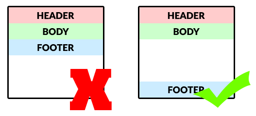
Welcome to a quick tutorial on how to keep HTML footers at the bottom. Once upon a time in the Dark Ages of the Internet, we have to use all sorts of crazy negative margin, position, and CSS hacks to stick a footer at the bottom. But thankfully, we are long past that painful age. Here are 3 easy examples to keep the footer at the bottom, read on!
ⓘ I have included a zip file with all the example source code at the start of this tutorial, so you don’t have to copy-paste everything… Or if you just want to dive straight in.
TLDR – QUICK SLIDES
[web_stories_embed url=”https://code-boxx.com/web-stories/keep-html-footers-at-bottom/” title=”How To Keep HTML Footers At Bottom” poster=”https://code-boxx.com/wp-content/uploads/2022/03/STORY-HTML-20230505.webp” width=”360″ height=”600″ align=”center”]
Fullscreen Mode – Click Here
TABLE OF CONTENTS
DOWNLOAD & NOTES

Firstly, here is the download link to the example code as promised.
QUICK NOTES
If you spot a bug, feel free to comment below. I try to answer short questions too, but it is one person versus the entire world… If you need answers urgently, please check out my list of websites to get help with programming.
EXAMPLE CODE DOWNLOAD
Click here to download the source code, I have released it under the MIT license, so feel free to build on top of it or use it in your own project.
WAYS TO KEEP FOOTER AT BOTTOM

All right, let us now get into the various ways and examples to keep the footer at the bottom.
1) FIXED BOTTOM FOOTER
/* (A) WHOLE PAGE */
* { box-sizing: border-box; }
body { padding: 0; margin: 0; }

/* (B) MAIN */
/* same or more bottom padding than footer height */
#pageMain { padding-bottom: 50px; }

/* (C) FOOTER */
#pageFoot {
  /* (C1) FIXED AT BOTTOM */
  position: fixed;
  bottom: 0; left: 0; z-index: 9;

  /* (C2) DIMENSIONS */
  width: 100%; height: 40px;

  /* (C3) CENTER TEXT */
  display: flex;
  align-items: center;
  justify-content: center;
}

<header id="pageHead">Head</header>
<main id="pageMain">Content</main>
<footer id="pageFoot">Foot</footer>- (C1) Basically,
position: fixedandbottom: 0keeps the footer at the bottom. - But the fixed footer will cover over contents at the bottom. To solve this problem:
- (C2) We set a fixed height on the footer.
- (B) Add
#pageMain { padding-bottom: N }to push the contents up so that they are not covered by the fixed footer.
P.S. We can also set position: sticky on the footer, so that it “docks” as the user scrolls toward the bottom.
2) FLEX BOTTOM FOOTER
<style>
/* (A) WHOLE PAGE */
* { box-sizing: border-box; }

/* (B) FULL HEIGHT FLEX BODY */
body {
  padding: 0; margin: 0;
  min-height: 100vh;
  display: flex;
  flex-direction: column;
}

/* (C) ALLOW MAIN TO FILL HEIGHT */
#pageMain { flex-grow: 1; }
</style>

<header id="pageHead">Head</header>
<main id="pageMain">Content</main>
<footer id="pageFoot">Foot</footer>
- (B) First, we set the entire document to cover the full height –
body { height: 100vh; }. - (B) The magic actually comes from the flexible box layout –
body { display: flex; flex-direction: column; }. This will set the header, contents, and footer in a vertical, single-column layout. - (C) Setting
#pageMain { flex-grow: 1; }will allow the main contents to “stretch to fill height” – Effectively pushing the footer to the bottom.
3) GRID BOTTOM FOOTER
<style>
/* (A) WHOLE PAGE */
* { box-sizing: border-box; }

/* (B) FULL HEIGHT BODY */
body {
  padding: 0; margin: 0;
  min-height: 100vh;
  display: grid;
  grid-template-rows: auto 1fr auto;
}
</style>

<header id="pageHead">Head</header>
<main id="pageMain">Content</main>
<footer id="pageFoot">Foot</footer>- Again, we set the entire page to fill the full height –
body { height: 100vh }. - Set the body to grid layout –
body { display: grid }. - The magic comes from
grid-template-rows: auto 1fr auto. In human terms:- Layout the page in 3 rows (header, contents, footer).
- The header and footer will have
autoheight. - The main contents will have
1frflexible height – This allows the contents to “stretch to fill height”, effectively pushing the footer to the bottom.
EXTRA) ADD A SIDEBAR
<style>
#pageMain { display: flex; }
#pageContent { flex-grow: 1; }
#pageSide { width: 30%; }
@media screen and (max-width:768px) {
  #pageMain { flex-wrap: wrap; }
  #pageContent, #pageSide { width: 100%; }
}
</style>

<div id="pageMain">
  <main id="pageContent">Content</main>
  <div id="pageSide">Side</div>
</div>
If you need a sidebar, just split the “main content” section into 2 columns.
EXTRA BITS & LINKS

That’s all for this guide, and here is a small section on some extras and links that may be useful to you.
WHICH IS THE BEST METHOD?
Personally, I will go with the flex or grid layout. The reason why I avoid using a fixed bottom menu is that mobile screens are already small enough. A fixed bottom footer will occupy space, leaving less room for content – Especially on the portrait orientation.
LINKS & REFERENCES
- How to keep your footer where it belongs? – Free Code Camp
- How to keep footers at the bottom of the page – Matthew James Taylor
- Sticky Footer, Five Ways – CSS Tricks
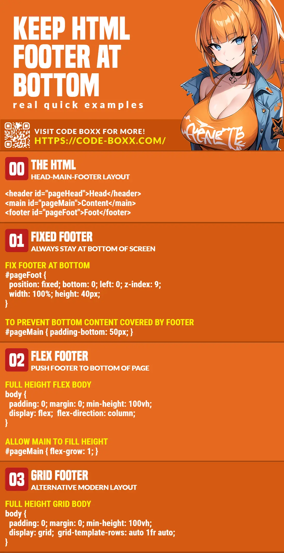
INFOGRAPHIC CHEAT SHEET
THE END

Thank you for reading, and we have come to the end of this guide. I hope that it has helped you with your project, and if you want to share anything with this guide, please feel free to comment below. Good luck and happy coding!