Welcome to a tutorial on how to create a simple responsive accordion with HTML and CSS. Yes, you read that right, no Javascript is involved.
To create an accordion using HTML and CSS only:
- Create a “stack” of checkbox, label, and container.
<input id="check" type="checkbox"><label for="check">Title</label><div id="content">Content</div>
- Hide the checkbox and content by default. Only show the content when the checkbox is checked.
#check, #content { display: none; }#check:checked ~ #content { display : block; }
Yep, that’s all for the basic mechanics. Read on for a “nice example”!
TABLE OF CONTENTS
 Download & Demo
 HTML CSS Accordion
 Extras
 The End
DOWNLOAD & DEMO
Here is the download link to the example code, so you don’t have to copy-paste everything.
EXAMPLE CODE DOWNLOAD
Click here to download | Example on CodePen
The example code is released under the MIT license, so feel free to build on top of it or use it in your own project.
SORRY FOR THE ADS...
But someone has to pay the bills, and sponsors are paying for it. I insist on not turning Code Boxx into a "paid scripts" business, and I don't "block people with Adblock". Every little bit of support helps.
Buy Me A Coffee Code Boxx eBooks
ACCORDION DEMO
HTML CSS ACCORDION
All right, let us now get into a slightly more detailed example of the HTML CSS accordion.
TUTORIAL VIDEO
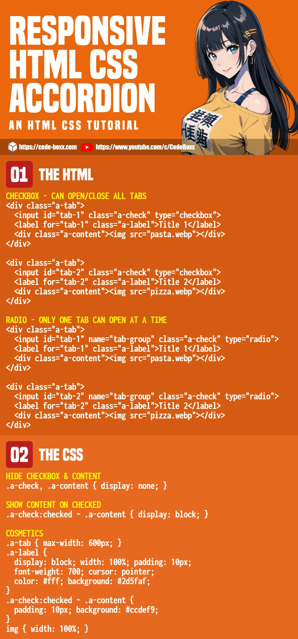
PART 1) THE HTML
<!-- TAB 1 -->
<div class="a-tab">
  <input id="tab-1" class="a-check" type="checkbox">
  <label for="tab-1" class="a-label">Title 1</label>
  <div class="a-content"><img src="pasta.webp"></div>
</div>

<!-- TAB 2 -->
<div class="a-tab">
  <input id="tab-2" class="a-check" type="checkbox">
  <label for="tab-2" class="a-label">Title 2</label>
  <div class="a-content"><img src="pizza.webp"></div>
</div>- As in the introduction, we only need to create a “stack” of checkbox, label, and container.
- The only difference here is that we wrap them in a
<div class="a-tab">.
PART 2) BASIC MECHANICS
/* (A) HIDE CHECKBOX & CONTENT */
.a-check { display: none; }
.a-content { max-height: 0; overflow: hidden; }

/* (B) SHOW CONTENT ON CHECKED */
.a-check:checked ~ .a-content { max-height: 500px; overflow: auto; }
.a-content { transition: all 0.5s; }
This is a slightly different approach from the introduction snippet.
- We hide the checkbox with
display: noneas usual. - But hide the content with
max-height: 0andoverflow: hidden. - The reason is simple, we combine
max-heightwithtransitionto give a nice “grow and shrink” animation.
PART 3) RESPONSIVE & COSMETICS
/* (C) COSMETICS */
/* (C1) WRAPPER */
.a-tab { max-width: 600px; }

/* (C2) LABEL */
.a-label {
  display: block; width: 100%; padding: 10px;
  font-weight: 700; cursor: pointer;
  color: #fff; background: #2d5faf;
}

/* (C3) LABEL ARROW */
.a-label { position: relative; }
.a-label::after {
  display: block; content: "\25b6";
  position: absolute; right: 10px; top: 10px;
  transition: all 0.4s;
}
.a-check:checked ~ label::after { transform: rotate(90deg); }

/* (C4) CONTENT */
  .a-check:checked ~ .a-content {
  padding: 10px;
  background: #ccdef9;
}

/* (C5) ENTIRE PAGE */
img { width: 100%; }
* {
  font-family: Arial, Helvetica, sans-serif;
  box-sizing: border-box;
}
The rest are pretty much cosmetics. Feel free to change the font, colors, and dimensions.
EXTRAS
That’s all for this guide, and here is a small section on some extras that may be useful to you.
ONLY ONE TAB CAN OPEN AT A TIME
<!-- TAB 1 -->
<div class="a-tab">
  <input id="tab-1" name="tab-group" class="a-check" type="radio" checked>
  <label for="tab-1" class="a-label">Title 1</label>
  <div class="a-content"><img src="pasta.webp"></div>
</div>

<!-- TAB 2 -->
<div class="a-tab">
  <input id="tab-2" name="tab-group" class="a-check" type="radio">
  <label for="tab-2" class="a-label">Title 2</label>
  <div class="a-content"><img src="pizza.webp"></div>
</div>
Use radio buttons instead of checkboxes, and set them to the same name.
OPENING TABS “BY DEFAULT”
How do we set a tab to be opened by default? Simply set the checked attribute – <input type="checkbox" checked>.
RADIO ACCORDION RESTRICTION
Well, as some may have already noticed. The default behavior in HTML is that one radio button will be selected at all times, and there is no way we can unselect without using Javascript. So yes, the “restriction” in the radio button accordion is that one tab will be opened at all times.
LINKS & REFERENCES
- Javascript Accordion – Code Boxx
INFOGRAPHIC CHEAT SHEET
THE END
Thank you for reading, we have come to the end of this guide. I hope that it has helped you to create a better website, and if you have anything to share with this guide, please feel free to comment below. Good luck and happy coding!
Thanks so much for this.
One thing, though. I found that the absolute positioning of the label icon produced undesirable results. The icon – I chose plus and minus for this – was positioned to the edge of the window.
I fixed this by making the label element a flexbox.
Thanks again.
Thank you for this tutorial! You saved me a lot of time and headache!! So many accordions require JS, and I’m excited to have found one that doesn’t.
This is fantastic. I was using a javscript version, but this is working better. One quick question, for the radio button options, if I click Tab 1 to expand, is there any way I can click Tab 1 again to collapse it?
Sadly, no. There is no way we can uncheck an HTML radio button without using Javascript.
Nice! I’ve been looking for an accordion solution that doesn’t include Javascript which clean and simple. Is there an way to set, by default, one of the tabs to be open? Thanks in advance!
Jake
Very easy. Just check the checkbox –
<input type="checkbox" checked/>Thanks so much for this! You saved my life (work-wise). So cool!
You are a genius!
Franc