Welcome to a tutorial and examples on how to create a simple sticky menu with HTML and CSS. So you need to “fix” a navigation menu on the web page, and make it follow along as the user scrolls? Read on for the examples!
TABLE OF CONTENTS
 Download & Notes
 Sticky Menu
 Extras
 The End
DOWNLOAD & NOTES
Here is the download link to the example code, so you don’t have to copy-paste everything.
EXAMPLE CODE DOWNLOAD
The example code is released under the MIT license, so feel free to build on top of it or use it in your own project.
SORRY FOR THE ADS...
But someone has to pay the bills, and sponsors are paying for it. I insist on not turning Code Boxx into a "paid scripts" business, and I don't "block people with Adblock". Every little bit of support helps.
Buy Me A Coffee Code Boxx eBooks
HTML CSS STICKY MENU
All right, let us now get into the detailed examples of creating a sticky menu using HTML CSS only.
TUTORIAL VIDEO
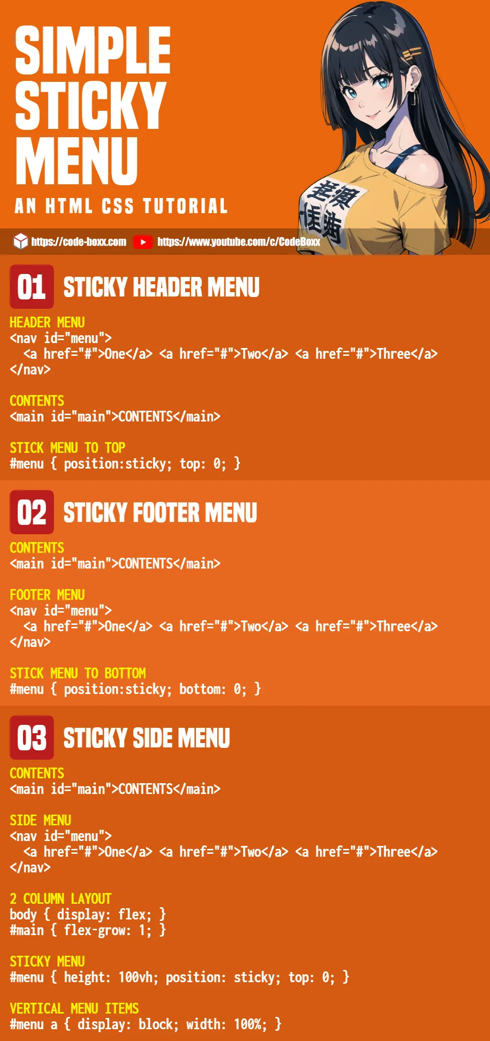
1) STICKY HEADER MENU
1A) THE HTML
<!-- (A) HEADER MENU -->
<nav id="menu">
  <a href="#">One</a>
  <a href="#">Two</a>
  <a href="#">Three</a>
</nav>

<!-- (B) CONTENTS -->
<main id="main">
  START <div id="spacer"></div> END
</main>
This should be self-explanatory.
- Create a
<nav id="menu">at the top of the page. - Sandwich the
<a>links inside.
1B) THE CSS
/* (A) STICKY MENU */
#menu {
  position: sticky; top: 0;
}
Yep, position: sticky; top: 0; is all it takes to create a sticky header menu. It will “dock” at the top of the page, but follows along as the user scrolls down.
2) STICKY FOOTER MENU
2A) THE HTML
<!-- (A) CONTENTS -->
<main id="main">
  START <div id="spacer"></div> END
</main>

<!-- (B) FOOTER MENU -->
<nav id="menu">
  <a href="#">One</a>
  <a href="#">Two</a>
  <a href="#">Three</a>
</nav>
The order is reversed now – Content at the top, footer menu at the bottom.
2B) THE CSS
/* (A) STICKY MENU */
#menu {
  position: sticky; bottom: 0;
}
Well, just sticky the menu to the bottom.
3) STICKY SIDE MENU
3A) THE HTML
<!-- (A) CONTENTS -->
<main id="main">
  START <div id="spacer"></div> END
</main>

<!-- (B) SIDE MENU -->
<nav id="menu">
  <a href="#">One</a>
  <a href="#">Two</a>
  <a href="#">Three</a>
</nav>- Content on the left, menu on the right.
- Just reverse the layout if you want the menu on the left and the content on the right.
3B) THE CSS
/* (A) TWO-COLUMN LAYOUT */
body { display: flex; }
#main { flex-grow: 1; }

/* (B) STICKY MENU */
#menu {
  height: 100vh;
  position: sticky; top: 0;
}

/* (C) MENU ITEMS */
#menu a {
  display: block; width: 100%;
  margin: 10px 0;
}- Setting
display: flexon the<body>will lay the menu on the left, and content on the right. - Set the menu to cover the height of the window, then it’s the same old “stick the menu” trick.
- Lay the menu items out in a single column.
EXTRAS
That’s all for the examples, and here are a few more extras that may be useful to you.
POTENTIAL PROBLEM WITH STICKY SIDE MENUS
- The menu is fixed to
height: 100vh. It works great, but how about mobile screens in landscape orientation? - For those who are lost – If you have too many menu items, the bottom items will be “cut off” and cannot be accessed.
- This is why I don’t recommend sticky side menus, a couple of possible alternatives:
- Just set
#menu { min-height: 100vh }, no sticky. - Add a “scroll to top” button somewhere at the bottom.
- Use a hamburger menu instead – All links are below.
- Just set
LINKS & REFERENCES
- CSS Position – MDN
- Responsive Hamburger Menu – Code Boxx
- Responsive Dropdown Menu – Code Boxx
- Collapsible Tree Menu – Code Boxx
INFOGRAPHIC CHEAT SHEET
THE END
Thank you for reading, and we have come to the end of this guide. I hope that it has helped you to create a better website, and if you have anything to share with this guide, please feel free to comment below. Good luck and happy coding!