Welcome to a tutorial and example of how to create a custom checkbox and radio button using pure CSS. The Stone Age of the Internet is long over, but it is still impossible to create a custom checkbox or radio button using “direct CSS only”. So here it is, let us walk through a simple example in this guide – Read on!
ⓘ I have included a zip file with all the source code at the start of this tutorial, so you don’t have to copy-paste everything… Or if you just want to dive straight in.
TABLE OF CONTENTS
 Tutorial Video
DOWNLOAD & NOTES

Firstly, here is the download link to the example code as promised.
QUICK NOTES
If you spot a bug, feel free to comment below. I try to answer short questions too, but it is one person versus the entire world… If you need answers urgently, please check out my list of websites to get help with programming.
EXAMPLE CODE DOWNLOAD
Click here to download the source code, I have released it under the MIT license, so feel free to build on top of it or use it in your own project.
CUSTOM CHECKBOX & RADIO BUTTON

All right, let us now dive into the custom checkbox and radio button with pure CSS.
THE DEMO
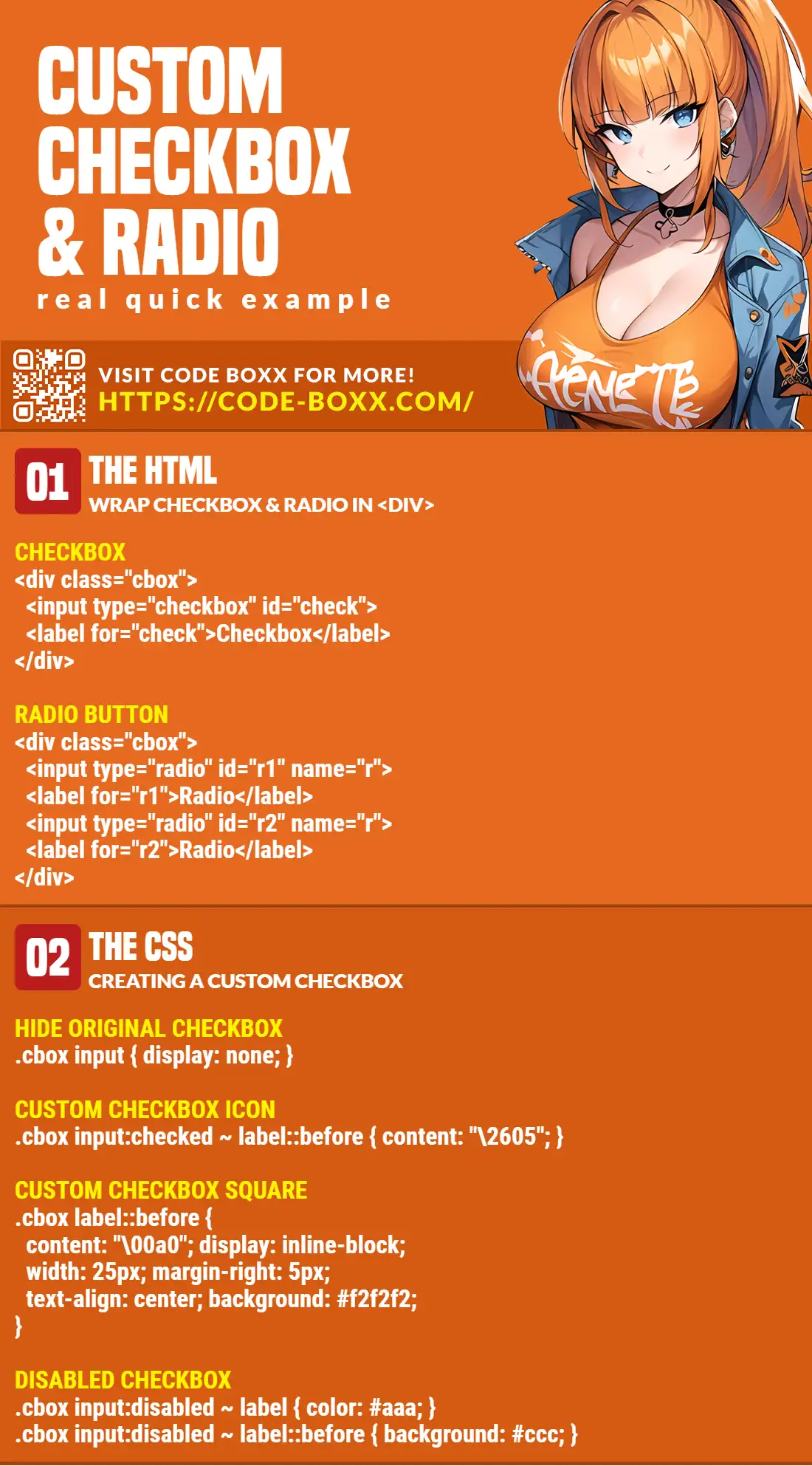
THE HTML
<!-- (A) CHECKBOX -->
<div class="cbox">
  <input type="checkbox" name="checkA" id="checkA">
  <label for="checkA">Checkbox</label>
</div>

<!-- (B) RADIO BUTTONS -->
<div class="cbox">
  <input type="radio" name="radioB" id="radioB1">
  <label for="radioB1">Radio</label>
</div>
<div class="cbox">
  <input type="radio" name="radioB" id="radioB2">
  <label for="radioB2">Radio</label>
</div>

<!-- (C) DISABLED CHECKBOX & RADIO BUTTON -->
<div class="cbox">
  <input type="checkbox" name="checkC" id="checkC" disabled>
  <label for="checkC">Disabled Checkbox</label>
</div>
<div class="cbox">
  <input type="radio" name="radioD" id="radioD2" disabled>
  <label for="radioD2">Disabled Radio</label>
</div>
This should be straightforward:
- Create the
<input type="checkbox">or<input type="radio">as usual. - Attach a
<label>to the checkbox or radio button. - Finally, wrap both the label and checkbox/radio in a
<div class="cbox">.
THE CSS
/* (A) HIDE ORIGINAL CHECKBOX/RADIO */
.cbox input { display: none; }

/* (B) ICON TO SHOW WHEN CHECKED */
.cbox input:checked ~ label::before { content: "\2605"; }

/* (C) CUSTOM CHECKBOX SQUARE */
.cbox label::before {
  display: inline-block;
  content: "\00a0"; /* Blank space */
  width: 25px;
  margin-right: 5px;
  text-align: center;
  background: #f2f2f2;
}

/* (D) MORE COSMETICS */
.cbox {
  font-size: 18px;
  line-height: 20px;
  margin: 10px;
}
.cbox label { cursor: pointer; }
.cbox label:hover::before { background: #ddd; }

/* (E) DISABLED CHECKBOXS & RADIO BUTTONS */
.cbox input:disabled ~ label { color: #aaa; }
.cbox input:disabled ~ label::before { background: #ccc; }
This may seem pretty confusing at first, but let us walk through section-by-section:
- Since checkboxes and radio buttons cannot be directly styled, we start by hiding them… Clicking on the label will still work anyway.
- The whole idea is to then use
label::beforeto draw our custom checkbox. In English, this line means “show a star symbol when the checkbox/radio is checked”. Will leave a link below to an entire list of available HTML symbols. - Draw our custom square checkbox.
- Just a couple more cosmetics. The font size, shows a pointer on mouse hover, and changes the background color.
- Color changes on a disabled checkbox/radio.
EXTRA BITS & LINKS

That’s all for this guide, and here is a small section on some extras and links that may be useful to you.
LINKS & REFERENCES
- Character Entities – Github
- HTML Symbols, Entities and Codes — Toptal Designers
- Pure CSS: Accessible Checkboxes and Radios Buttons -Aditya Bhandari
- Example on CodePen – Pure HTML CSS Custom Radio Checkbox
TUTORIAL VIDEO
INFOGRAPHIC CHEAT SHEET
THE END

Thank you for reading, and we have come to the end of this short guide. I hope that it has helped you to create a better project, and if you have anything to share with this guide, please feel free to comment below. Good luck and happy coding!