Welcome to a quick tutorial on how to create a simple hidden side menu in HTML and CSS. I am sure there are a ton of “sidebar plugins” on the Internet, but they are bloated and hard to customize. So let us do something different in this guide – Only the raw basics, so you can customize however you want. Read on!
TABLE OF CONTENTS
 Download & Notes
 Hidden Sidebar Menu
 Extras
 The End
DOWNLOAD & NOTES
Here is the download link to the example code, so you don’t have to copy-paste everything.
EXAMPLE CODE DOWNLOAD
Click here to download | Example on CodePen
The example code is released under the MIT license, so feel free to build on top of it or use it in your own project.
SORRY FOR THE ADS...
But someone has to pay the bills, and sponsors are paying for it. I insist on not turning Code Boxx into a "paid scripts" business, and I don't "block people with Adblock". Every little bit of support helps.
Buy Me A Coffee Code Boxx eBooks
HIDDEN SIDEBAR MENU
All right, let us now get into the details of how to create a hidden side menu.
TUTORIAL VIDEO
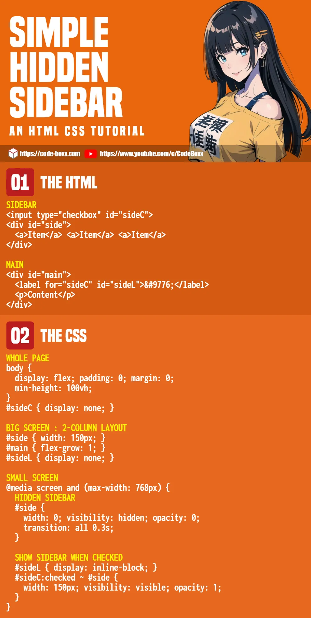
PART 1) THE HTML
<!-- (A) SIDEBAR -->
<input type="checkbox" id="sideC">
<div id="side">
<a>Item</a>
<a>Item</a>
<a>Item</a>
</div>
<!-- (B) MAIN -->
<div id="main">
<label for="sideC" id="sideL">☰</label>
<p>Content</p>
</div>The HTML is as straightforward as can be:
<div id="side">It’s the sidebar, Captain Obvious at your service. Just sandwich the<a>menu items inside.<div id="main">The main contents area.- Take note of how the menu toggle button works:
<input type="checkbox" id="sideC">is placed before the sidebar.<label for="sideC" id="sideL">is used as the menu button, placed in the main content area.- We will use CSS to toggle the sidebar, more on that below.
PART 2) ESSENTIAL CSS
/* (A) WHOLE PAGE */
body {
  display: flex;
  padding: 0; margin: 0;
  min-height: 100vh;
}
#sideC { display: none; }

/* (B) BIG SCREEN : 2-COLUMN LAYOUT */
#side { width: 150px; }
#main { flex-grow: 1; }
#sideL { display: none; }

/* (C) SMALL SCREEN */
@media screen and (max-width: 768px) {
  /* (C1) HIDDEN SIDEBAR */
  #side {
    width: 0; visibility: hidden; opacity: 0;
    transition: all 0.3s;
  }

  /* (C2) SHOW SIDEBAR WHEN CHECKED */
  #sideL { display: inline-block; }
  #sideC:checked ~ #side {
    width: 150px; visibility: visible; opacity: 1;
  }
}
Beginners, no need to panic. Here’s how it works:
- (A)
#sideC { display: none; }Hide the “sidebar checkbox” by default. It will still work when we click on the label/menu button. - (A & B) On big screens – Two columns layout and hide the menu button.
body { display: flex; }#side { width: 150px; }#main { flex-grow: 1; }#sideL { display: none; }
- (C) On small screens – Hide the sidebar and show the menu button.
#side { width: 0; visibility: hidden; opacity: 0; }#sideL { display: inline-block; }
- (C2) When the checkbox is checked, show the sidebar –
#sideC:checked ~ #side { width: 150px; visibility: visible; opacity: 1; }
PART 3) COSMETIC CSS
/* (X) COSMETICS */
/* (X1) WHOLE PAGE */
* {
  font-family: Arial, Helvetica, sans-serif;
  box-sizing: border-box;
}

/* (X2) SIDEBAR */
#side {
  color: #fff;
  background: #333;
}
#side a {
  display: block;
  width: 100%;
  padding: 15px 10px;
}

/* (X3) MAIN */
#sideL {
  padding: 10px;
  font-size: 24px;
  color: #fff; background: #b12a2a;
  cursor: pointer;
}
#main { padding: 10px; }
Finally, a whole bunch of cosmetics to make things look better.
EXTRAS
That’s all for the tutorial, and here is a small section on some extras and links that may be useful to you.
LINKS & REFERENCES
- 3 Simple Responsive Sidebar Designs In HTML CSS – Code Boxx
INFOGRAPHIC CHEAT SHEET
THE END
Thank you for reading, and we have come to the end. I hope that it has helped you to better understand, and if you want to share anything with this guide, please feel free to comment below. Good luck and happy coding!