Welcome to a quick tutorial on how to create an HTML timetable. Yep, there are already a ton of “HTML timetable” examples on the Internet. I mean, it’s so easy to create one using a <table>, any newbie can do it with an eye closed. So let us walk through a different example in this guide, a CSS grid timetable – Read on!
ⓘ I have included a zip file with all the source code at the start of this tutorial, so you don’t have to copy-paste everything… Or if you just want to dive straight in.
TABLE OF CONTENTS
DOWNLOAD & DEMO

Firstly, here is the download link to the example code as promised.
QUICK NOTES
- It is highly recommended that you learn some of the basics of CSS grid before touching on this tutorial, links in the “useful bits” section below.
EXAMPLE CODE DOWNLOAD
Click here to download all the example source code, I have released it under the MIT license, so feel free to build on top of it or use it in your own project.
TIMETABLE DEMO
CSS TIMETABLE

All right, let us now get into more details on how the CSS grid timetable works.
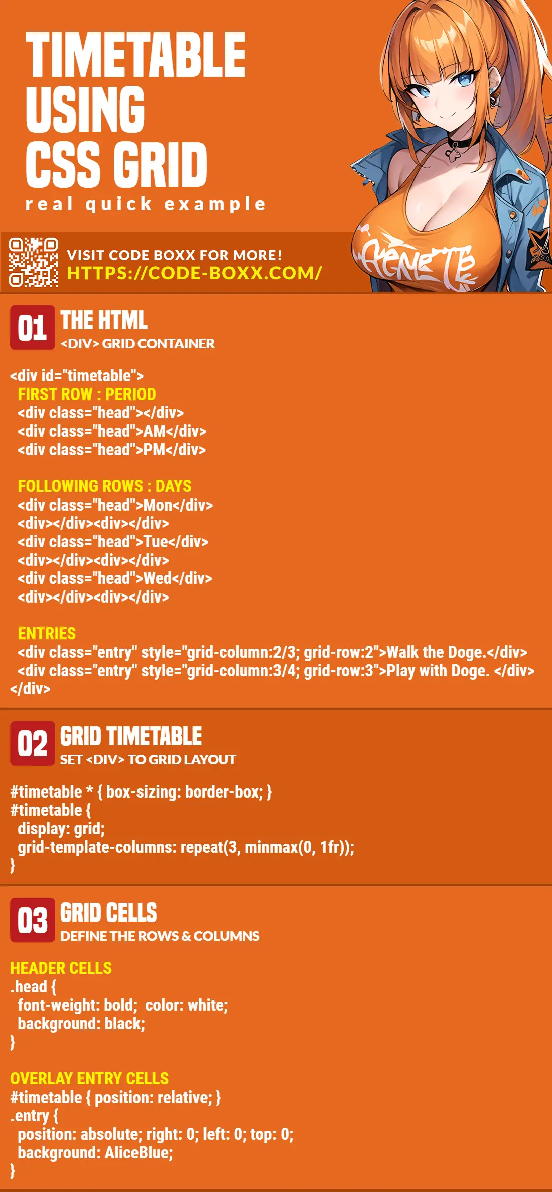
PART 1) THE HTML
<div id="timetable">
<!-- (A) FIRST ROW : TIME -->
<div class="cell head"> </div>
<div class="cell head">Morning</div>
<div class="cell head">Afternoon</div>
<div class="cell head">Night</div>
<!-- (B) FOLLOWING ROWS : MON TO SUN -->
<div class="cell head">Mon</div>
<div class="cell"> </div><div class="cell"> </div><div class="cell"> </div>
<div class="cell head">Tue</div>
<div class="cell"> </div><div class="cell"> </div><div class="cell"> </div>
<div class="cell head">Wed</div>
<div class="cell"> </div><div class="cell"> </div><div class="cell"> </div>
<div class="cell head">Thur</div>
<div class="cell"> </div><div class="cell"> </div><div class="cell"> </div>
<div class="cell head">Fri</div>
<div class="cell"> </div><div class="cell"> </div><div class="cell"> </div>
<div class="cell head">Sat</div>
<div class="cell"> </div><div class="cell"> </div><div class="cell"> </div>
<div class="cell head">Sun</div>
<div class="cell"> </div><div class="cell"> </div><div class="cell"> </div>
<!-- (C) TIME TABLE ENTRIES -->
<div class="cell entry" style="grid-column: 2 / 3; grid-row: 2; color: #fff; background: #2498ab;">
Walk the Doge.
</div>
<div class="cell entry" style="grid-column: 2 / 4; grid-row: 3; color: #fff; background: #ab2424;">
Feed the Doge.
</div>
<div class="cell entry" style="grid-column: 3 / 5; grid-row: 4; color: #fff; background: #243bab;">
Play with Doge.
</div>
<div class="cell entry" style="grid-column: 3 / 4; grid-row: 6; color: #fff; background: #91127b;">
Eat with Doge.
</div>
<div class="cell entry" style="grid-column: 2 / 5; grid-row: 8; color: #fff; background: #13a124;">
Do nothing.
</div>
</div>This may look like a whole load of complicated HTML at first, but keep calm and look carefully.
- We insert cells into
<div id="timetable">just like a “normal table”.<div class="cell">A “normal” blank cell.<div class="cell head">A “header” cell.<div class="cell entry">A “timetable entry” cell.
- Take note of the order of the cells.
- (A) The first row is for the morning/afternoon/night headers.
- (B) The following rows are for Monday to Sunday. The first cell is a header, followed by 3 empty ones.
- (C) The “dynamic” timetable entries are kept at the bottom. Will go through more of this below.
That’s about it. The “number of rows and columns” are defined in CSS, not HTML.
PART 2) THE CSS
2A) BASIC TIMETABLE
/* (A) WHOLE PAGE */
* {
  font-family: Arial, Helvetica, sans-serif;
  box-sizing: border-box;
}

/* (B) BASIC TIMETABLE */
:root { --row-height: 50px; }
#timetable {
  display: grid;
  position: relative;
  /* grid-template-columns: repeat(COLUMNS, WIDTH); */
  grid-template-columns: 80px repeat(3, minmax(0, 1fr));
  grid-auto-rows: var(--row-height);
}
The first part of the CSS should be pretty straightforward, we define the “rows and columns” of the grid.
#timetable { display: grid }Set to grid layout. Captain Obvious at your service.grid-template-columns: 80px repeat(3, minmax(0, 1fr))There are 4 columns in this simple example. The first column is fixed to80pxand the rest will auto-resize equally.--row-height: 50pxandgrid-auto-rows: var(--row-height)Each row will have a height of50px.
2B) BLANK & EMPTY CELLS
/* (C) BLANK & HEADER CELLS */
.cell {
  display: flex;
  align-items: center;
  padding: 10px;
  height: var(--row-height);
  border: 1px solid #efefef;
}
.head {
  font-weight: 700;
  justify-content: center;
  color: #333;
  background: #f9f9f9;
}
Next, we deal with the cells themselves. The only essential part here is .cell { height: var(--row-height) }, to ensure that all cells have the same row height as the grid. The rest are cosmetics.
2C) TIMETABLE ENTRY CELLS
/* (D) ENTRY CELLS */
.entry {
  position: absolute;
  right: 0; left: 0; top: 0;
  white-space: nowrap;
  overflow: hidden;
  text-overflow: ellipsis;
}
Lastly, we overlay the timetable entries over existing empty cells. How this is done:
#timetable { position: relative }and.entry { position: absolute }is the basic mechanic to overlap the timetable entries over the existing cells.right: 0; left: 0;makes sure that the entry cells retain the “rightful width” that it should have.- Finally, use
<div style="grid-column: X/Y; grid-row:Z">to place the entry cell where it needs to be.-
- Monday is
grid-row: 2, Tuesday isgrid-row: 3, and so on. - To span the entry over morning
grid-column: 2/3, over morning and afternoongrid-column: 2/4, and so on.
- Monday is
-
Yep, that’s all to the “complicated code”.
EXTRA BITS & LINKS

That’s all for the tutorial, and here is a small section on some extras and links that may be useful to you.
HOW ABOUT A RESPONSIVE TIMETABLE?
For the lost souls – This is already a responsive timetable, it resizes itself to fit. But it is a different story when it comes to a massive table.
- Add your own cells
<div class="cell">into<div id="timetable>". - Adjust the number of columns, and the column width with
grid-template-columns. - Adjust the height of the rows with
--row-height.
A massive table will probably require a scrollbar to display properly. One simple trick I use is to wrap the timetable into another container – <div style="width:100%; overflow:auto;"><div id="timetable"></div></div>.
COMPATIBILITY CHECKS
- CSS Grid – CanIUse
- CSS Variables – CanIUse
The required CSS features are already well-supported in all modern browsers.
LINKS & REFERENCES
- How to Create a Grid in HTML & CSS – Code Boxx
- Freeze Table Rows & Columns – Code Boxx
INFOGRAPHIC CHEATSHEET
THE END

Thank you for reading, and we have come to the end. I hope that it has helped you to better understand, and if you want to share anything with this guide, please feel free to comment below. Good luck and happy coding!