Welcome to a quick tutorial on how to create a grid in HTML and CSS. Still using tables, CSS hacks, and complicated Javascript code to create grids? It’s time to stop.
To create a simple grid in HTML and CSS:
- Define the HTML container –
<div class="grid"> <div>Cell</div> <div>Cell</div> </div> - Create a grid container and specify the number of columns in CSS –
.grid { display: grid; grid-template-columns: auto auto; }
Yes, that’s all it takes in modern HTML CSS to create a simple grid. But let us walk through more examples in this guide – Read on!
ⓘ I have included a zip file with all the example source code at the start of this tutorial, so you don’t have to copy-paste everything… Or if you just want to dive straight in.
TABLE OF CONTENTS
DOWNLOAD & NOTES

Firstly, here is the download link to the example code as promised.
QUICK NOTES
If you spot a bug, feel free to comment below. I try to answer short questions too, but it is one person versus the entire world… If you need answers urgently, please check out my list of websites to get help with programming.
EXAMPLE CODE DOWNLOAD
Click here to download the source code, I have released it under the MIT license, so feel free to build on top of it or use it in your own project.
CREATING GRIDS

Alright, let us now dive into more examples of creating grids in HTML and CSS.
PART 1) GRID COLUMNS

1A) THE HTML
<div id="grid-col">
  <div class="cell">Cell</div> <div class="cell">Cell</div>
  <div class="cell">Cell</div> <div class="cell">Cell</div>
  <div class="cell">Cell</div> <div class="cell">Cell</div>
</div>
Yep, the HTML of a basic grid is as simple as that – Just create a <div id="grid-col"> container, and put the cells <div class="cell"> inside.
1B) THE CSS
/* (A) CONTAINER */
#grid-col {
  /* (A1) GRID LAYOUT */
  display: grid;

  /* (A2) SPECIFY COLUMNS */
  grid-template-columns: auto auto auto;

  /* we can also specify exact pixels, percentage, repeat
  grid-template-columns: 50px 100px 150px;
  grid-template-columns: 25% 50% 25%;
  grid-template-columns: 100px 20% auto;
  grid-template-columns: repeat(3, auto);
  grid-template-columns: repeat(3, minmax(0, 1fr)); /* equal columns */
}

/* (B) GRID CELLS */
div.cell {
  background: LightBlue;
  border: 1px solid Blue;
  padding: 10px;
}

/* (C) RESPONSIVE - 1 COLUMN ON SMALL SCREENS */
@media screen and (max-width: 640px) {
  #grid-col { grid-template-columns: 100%; }
}
This may seem complicated at first, but the raw essentials are:
- Set a grid container
#grid-col { display: grid } - Define the number of columns with
grid-template-columns. Take note thatautowill leave it to the browser to determine the width of the columns. We can also specify exactpxor%. - Finally and optionally, we use
@mediamedia query to add responsive support for mobile devices. Changegrid-template-columnsso that there are fewer columns on a small screen.
PART 2) GRID ROWS
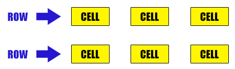
2A) THE HTML
<div id="grid-row">
  <div class="cell">Cell</div> <div class="cell">Cell</div>
  <div class="cell">Cell</div> <div class="cell">Cell</div>
  <div class="cell">Cell</div> <div class="cell">Cell</div>
</div>
2B) THE CSS
/* (A) CONTAINER */
#grid-row {
   /* (A1) GRID LAYOUT */
  display: grid;

  /* (A2) SPECIFY COLUMNS */
  grid-template-columns: auto auto auto;

  /* (A3) SPECIFY ROWS */
  grid-template-rows: 50px 100px;

  /* note: row 3 onwards will be auto height */
  /* same as columns, we can use exact pixels, percentage, repeat. */
}

/* (B) GRID CELLS */
div.cell {
  background: #fff600;
  border: 1px solid #000;
  padding: 10px;
}
We can also use grid-template-rows to control the height of each row. By default, the height of rows is set to auto. So don’t bother to define grid-template-rows unless you want to set a specific height for a certain row.
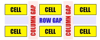
PART 3) CELL GAPS
3A) THE HTML
<div id="grid-gap">
  <div class="cell">Cell</div> <div class="cell">Cell</div>
  <div class="cell">Cell</div> <div class="cell">Cell</div>
  <div class="cell">Cell</div> <div class="cell">Cell</div>
</div>
3B) THE CSS
/* (A) CONTAINER */
#grid-gap {
  /* (A1) GRID LAYOUT */
  display: grid;

  /* (A2) SPECIFY COLUMNS */
  grid-template-columns: auto auto auto;

  /* (A3) SET SPACING BETWEEN CELLS */
  grid-gap: 20px;

  /* (A4) TO SET SPECIFIC ROW-COL SPACING
  grid-column-gap: 10px;
  grid-row-gap: 30px; */
}

/* (B) GRID CELLS */
div.cell {
  background: #fff600;
  border: 1px solid #000;
  padding: 10px;
}
Want to space out the cells?
- Use
grid-column-gapto control the spacing in-between cells horizontally. - Use
grid-row-gapto control the spacing in-between cells horizontally. - Or simply apply a uniform spacing using
grid-gap.
PART 4) GRID LINES
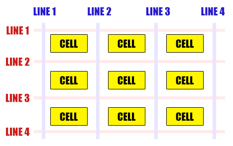
We have only created an “equal grid” so far, but what if we want a cell to span across more than one row or column? Introducing grid lines:
- Imagine “invisible” lines running across the grid.
- The lines that run from left to right are called the column lines – Starting from line number 1 on the far left.
- The lines that run from top to bottom are called the row lines – Starting from line number 1 on the topmost.
- To span a cell across many columns, we specify
grid-column-startandgrid-column-end. - To span a cell across many rows, we specify
grid-row-startandgrid-row-end.
4A) SPANNING ACROSS COLUMNS

<div id="grid-line">
  <div class="cell">Cell</div>
  <div class="cell">Cell</div>
  <div class="cell">Cell</div>
  <div class="cell spancol">
    This one will span from column line 1 to 4.
  </div>
  <div class="cell">Cell</div>
  <div class="cell">Cell</div>
  <div class="cell">Cell</div>
</div>/* (A) GRID CONTAINER */
#grid-line {
display: grid;
grid-template-columns: auto auto auto;
grid-gap: 10px;
}
/* (B) GRID CELL */
div.cell {
background: #fff600;
border: 1px solid #000;
padding: 10px;
}
/* (C) SPAN MULTIPLE COLUMNS */
.spancol {
grid-column-start: 1;
grid-column-end: 4;
}
4B) SPANNING ACROSS ROWS
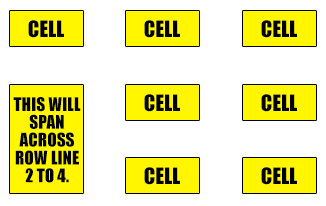
<div id="grid-line">
  <div class="cell">Cell</div>
  <div class="cell">Cell</div>
  <div class="cell">Cell</div>
  <div class="cell spanrow">
    This will span across row line 2 to 4.
  </div>
  <div class="cell">Cell</div>
  <div class="cell">Cell</div>
  <div class="cell">Cell</div>
  <div class="cell">Cell</div>
</div>/* (A) GRID CONTAINER */
#grid-line {
display: grid;
grid-template-columns: auto auto auto; /* 3 COL LAYOUT */
grid-gap: 10px;
}
/* (B) GRID CELL */
div.cell {
background: #fff600;
border: 1px solid #000;
padding: 10px;
}
/* (C) SPAN MULTIPLE ROWS */
.spanrow {
grid-row-start: 2;
grid-row-end: 4;
}
PART 5) GRID TEMPLATE AREAS
So far so good? You should be able to do plenty of “good enough” CSS grid yoga by now. But here is one last piece to the basics of CSS grid – An alternate way to create a grid by defining a template and specifying areas. For example:
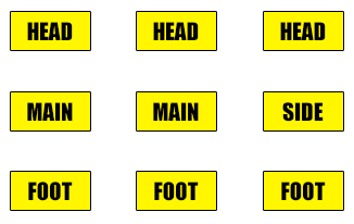
Yep, that is essentially a 3 columns 3 rows grid… But we have specified which cell is in which area.
5A) THE CSS
/* (A) CONTAINER */
#grid-layout {
  /* (A1) GRID LAYOUT */
  display: grid;
  grid-gap: 10px;

  /* (A2) DESIGN YOUR GRID TEMPLATE */
  grid-template-areas:
  "head head head"
  "main main side"
  "foot foot foot";
}

/* (B) GRID CELLS */
.cell { padding: 10px; }

/* (C) ASSIGN THE AREAS */
.head {
  grid-area: head;
  background: #ffe5db;
}
.main {
  grid-area: main;
  background: #e3ffdb;
}
.side {
  grid-area: side;
  background: #dbf8ff;
}
.foot {
  grid-area: foot;
  background: #ebebeb;
}
Yep, we can “design” a grid template using grid-template-areas – You can name the area whatever you wish. Then simply “assign” the areas to which cell using grid-area.
5B) THE HTML
<div id="grid-layout">
  <div class="cell head">Header</div>
  <div class="cell main">Main</div>
  <div class="cell side">Side</div>
  <div class="cell foot">Footer</div>
</div>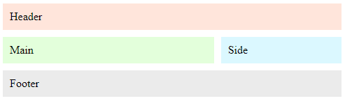
This last part is self-explanatory.
EXTRA BITS & LINKS

That’s all for the tutorial, and here is a small section on some extras and links that may be useful to you.
SUMMARY – ALL THE BASIC CSS GRID PROPERTIES
| Property | Description |
display: grid |
The container will display as a grid. |
grid-template-columns: auto | px | % |
Set the width of the grid columns. |
grid-template-rows: auto | px | % |
Set the width of the grid rows. |
grid-column-gap: px | % |
Spacing in-between the cells horizontally. |
grid-row-gap: px | % |
Spacing in-between the cells vertically. |
grid-gap: px | % |
Sets spacing in-between the cells horizontally and vertically. |
grid-column-start: N and grid-column-end: N |
How many columns to span across. |
grid-row-start: N and grid-row-end: N |
How many rows to span across. |
grid-template-areas: 'AREA AREA AREA' |
Create a grid template with area names. |
grid-area: AREA |
Assign this cell to this area in the template. |
LINKS & REFERENCES
- CSS Grid – MDN
- Grid Gap – MDN
- Grid Area – MDN
- A Complete Guide to Grid – CSS Tricks
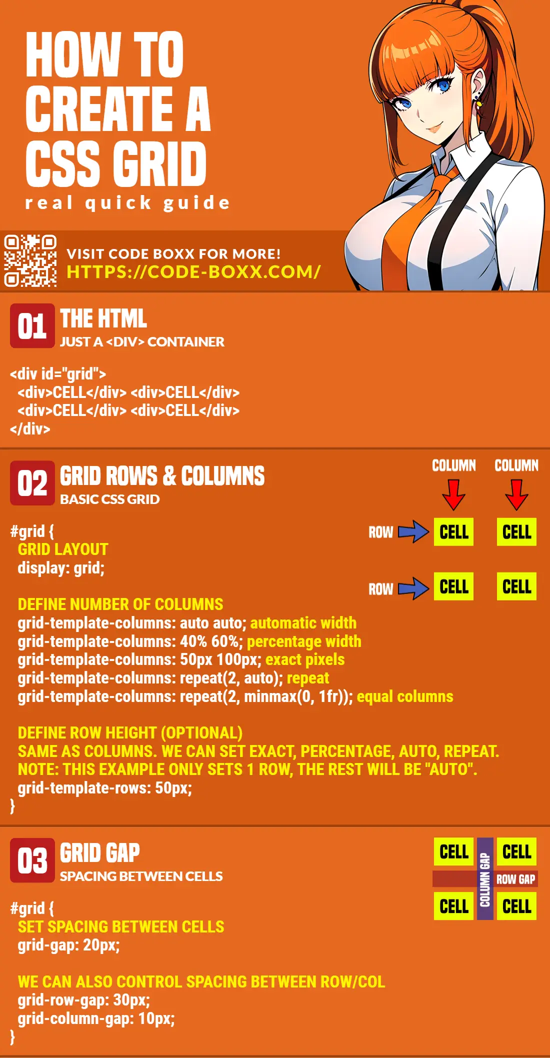
INFOGRAPHIC CHEATSHEET
THE END

Thank you for reading, and we have come to the end. I hope that it has helped you to better understand, and if you want to share anything with this guide, please feel free to comment below. Good luck and happy coding!
This is a very good lesson on grids thank for your effort
thank you
edmond january
thanks so much. Your stuff really helped me