Welcome to a tutorial on how to display two DIVs side by side. So you are having trouble trying to put two div containers beside each other?
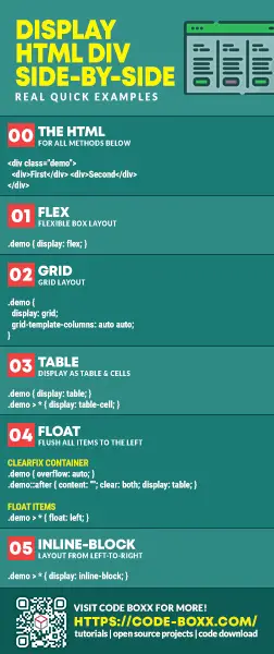
One of the easiest ways to display two (or more) DIVs side-by-side is to use a flexible box – <div style="display:flex"> <div>FIRST</div> <div>SECOND</div> </div>
That covers the quick basics, but there are more methods to do it – Let us walk through a few more examples in this guide, read on!
ⓘ I have included a zip file with all the source code at the start of this tutorial, so you don’t have to copy-paste everything… Or if you just want to dive straight in.
QUICK SLIDES
[web_stories_embed url=”https://code-boxx.com/web-stories/display-div-containers-side-by-side/” title=”Display DIV Containers Side-by-Side” poster=”https://code-boxx.com/wp-content/uploads/2022/03/STORY-HTML-20230505.webp” width=”360″ height=”600″ align=”center”]
TABLE OF CONTENTS
DOWNLOAD & NOTES
Firstly, here is the download link to the example code as promised.
QUICK NOTES
If you spot a bug, feel free to comment below. I try to answer short questions too, but it is one person versus the entire world… If you need answers urgently, please check out my list of websites to get help with programming.
EXAMPLE CODE DOWNLOAD
Click here to download the source code, I have released it under the MIT license, so feel free to build on top of it or use it in your own project.
SIDE-BY-SIDE DIV CONTAINERS
All right, let us now get into the ways to create side-by-side div containers.
METHOD 1) FLEXIBLE BOX
<style>
/* (A) FLEX CONTAINER */
.flex-wrap { display: flex; }

/* (B) OPTIONAL COSMETICS */
.flex-wrap > * {
  box-sizing: border-box;
  width: 50%; padding: 10px;
  background: #ffe2e0;
}
</style>

<div class="flex-wrap">
  <div>First</div>
  <div>Second</div>
</div>As in the above introduction snippet, this is probably the easiest way to place <div> side-by-side. Just add display: flex, and the browser will lay all the items in a left-to-right manner automatically. But there’s actually a lot more to the flex layout, I will leave links in the extras section below if you are interested.
METHOD 2) GRID LAYOUT
<style>
/* (A) GRID CONTAINER */
.grid-wrap {
  display: grid;
  grid-template-columns: auto auto;
}

/* (B) OPTIONAL COSMETICS */
.grid-wrap > * {
  box-sizing: border-box;
  padding: 10px;
  background: #f3ffe0;
}
</style>

<div class="grid-wrap">
  <div>First</div>
  <div>Second</div>
</div>The grid layout is yet another modern CSS convenience. Simply set the container to display: grid and define the columns with grid-template-columns. Done, CSS does the rest of the magic again.
METHOD 3) DISPLAY AS TABLE
<style>
/* (A) DISPLAY AS TABLE & TABLE CELLS */
.table-wrap { display: table; }
.table-wrap > * { display: table-cell; }

/* (B) OPTIONAL COSMETICS */
.table-wrap { width: 100%; }
.table-wrap > * {
  box-sizing: border-box;
  width: 50%; padding: 10px;
  background: #e0f8ff;
}
</style>

<div class="table-wrap">
  <div>First</div>
  <div>Second</div>
</div>This should be pretty self-explanatory – We set the container <div> to display as a <table>, and the <div> inside as <td>. Some “expert code ninjas” may not like this method as it seems like a “hack”, but it works. Period.
METHOD 4) FLOATING DIVS
<style>
/* (A) CLEARFIX CONTAINER */
.float-wrap { overflow: auto; }
.float-wrap::after {
  content: "";
  clear: both;
  display: table;
}

/* (B) FLOAT ITEMS */
.float-wrap > * { float: left; }

/* (C) OPTIONAL COSMETICS */
.float-wrap > * {
  box-sizing: border-box;
  width: 50%; padding: 10px;
  background: #f3e0ff;
}
</style>

<div class="float-wrap">
  <div>First</div>
  <div>Second</div>
</div>
This is an old-school method that we use, long before flex and grid are available.
- (B) The basic idea is actually simple. We just set
float: lefton all the inner<div>, so that they will flush to the left side (effectively placing them side-by-side). - (A) But the main
<div class="float-wrap">will “collapse” when all the inner items are floating, the layout below this container will all be destroyed. This is why we have to use another age-old CSS trick called “clear fix” to help the container retain its dimensions.
METHOD 5) INLINE BLOCK
<style>
/* (A) INLINE-BLOCK ITEMS */
.block-wrap > * { display: inline-block; }

/* (B) OPTIONAL COSMETICS */
.block-wrap > * {
  box-sizing: border-box;
  width: 50%; padding: 10px;
  background: #fffce0;
}
</style>

<div class="block-wrap">
  <div>First</div><!--
  --><div>Second</div>
</div>Lastly, this is yet another old-school method. It is as simple as setting display: inline-block on all the inner <div> items, and this will automatically lay them out in a left-to-right manner.
But as you can see, this simple method also has an underlying problem. Any empty spaces and line breaks between inline-block containers will show as a “gap”. This is why we insert the “stupid HTML comments” <!-- and --> to prevent “gaps” in between the <div> items.
USEFUL BITS & LINKS
That’s all for the tutorial, and here is a small section on some extras and links that may be useful to you.
WHICH IS THE BEST METHOD?
Personally, I will stick with using modern CSS flex and grid. They are already well-supported on all major browsers as at the time of writing. But if you have to support “the ancient ones”, float and inline-block are your only options.
LINKS & REFERENCES
- A Complete Guide to Flexbox – CSS Tricks
- A Complete Guide to Grid – CSS Tricks
YOUTUBE TUTORIAL
INFOGRAPHIC CHEAT SHEET

THE END
Thank you for reading, and we have come to the end of this short guide. I hope that it has helped to solve your positioning woes, and if you have anything to add to this guide, please feel free to comment below. Good luck and happy coding!

Great work, helped me a lot.
This was really useful, thanks for writing.