Welcome to a quick tutorial on how to create a simple custom tooltip using pure CSS. Sick of those default boring yellow tooltip boxes? Yes, we can actually create our own custom tooltips in just a few simple steps.
To create a custom tooltip using only pure HTML and CSS:
- Set
data-tooltipon the HTML element –<i data-tooltip="TIP">TERM</i> - Build the tooltip using the CSS before pseudo-class –
[data-tooltip]::before { content: attr(data-tooltip); } - Set the position of the tooltip.
[data-tooltip] { position: relative; display: inline-block; }[data-tooltip]::before { position: absolute; bottom: 100%; }
- Show the tooltip only on mouse hover.
[data-tooltip]::before { visibility: hidden; }[data-tooltip]:hover::before { visibility: visible; }
- Lastly, set some styles on the tooltip box itself –
[data-tooltip]::before { background: red; min-width: 100px; }
That covers the quick basics, but read on for the demo and example!
ⓘ I have included a zip file with all the example source code at the start of this tutorial, so you don’t have to copy-paste everything… Or if you just want to dive straight in.
QUICK SLIDES
[web_stories_embed url=”https://code-boxx.com/web-stories/custom-tooltip-with-html-css/” title=”Custom Tooltip With HTML CSS” poster=”https://code-boxx.com/wp-content/uploads/2022/03/STORY-HTML-20230505.webp” width=”360″ height=”600″ align=”center”]
TABLE OF CONTENTS
 Download & Demo Download & Demo |
 Custom Tooltip Custom Tooltip |
 Useful Bits & Links Useful Bits & Links |
 Tutorial Video Tutorial Video |
 The End The End |
DOWNLOAD & DEMO
First, here is the download link to the example source code as promised.
QUICK NOTES
If you spot a bug, feel free to comment below. I try to answer short questions too, but it is one person versus the entire world… If you need answers urgently, please check out my list of websites to get help with programming.
EXAMPLE CODE DOWNLOAD
Click here to download the source code, I have released it under the MIT license, so feel free to build on top of it or use it in your own project.
THE DEMO
CUSTOM TOOLTIP WITH PURE HTML CSS
All right, let us now into the detailed example of a custom tooltip using only pure HTML and CSS.
THE HTML
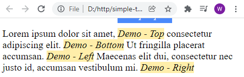
<p id="demo">
  Lorem ipsum dolor sit amet,
  <i data-tooltip="Top Tip" class="top">Demo - Top</i>
  consectetur adipiscing elit.
  <i data-tooltip="Bottom Tip" class="bottom">Demo - Bottom</i>
  Ut fringilla placerat accumsan.
  <i data-tooltip="Left Tip" class="left">Demo - Left</i>
  Maecenas elit dui, consectetur nec justo id, accumsan vestibulum mi.
  <i data-tooltip="Right Tip" class="right">Demo - Right</i>
</p>
Yep, that is actually all we need for the HTML. Just define a custom data-tooltip on the element that you want a tooltip on.
THE CSS
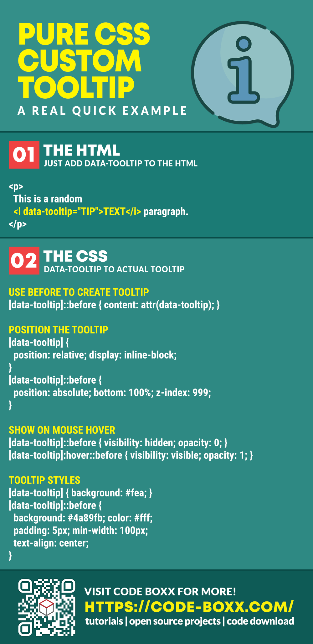
/* (A) BUILD TOOLTIP USING BEFORE PSEUDO-CLASS */
[data-tooltip]::before {
  content: attr(data-tooltip);
}

/* (B) POSITION TOOLTIP */
[data-tooltip] {
  position: relative;
  display: inline-block;
}
[data-tooltip]::before {
  position: absolute;
  z-index: 999;
}
[data-tooltip].top::before {
  bottom: 100%;
  margin-bottom: 10px;
}
[data-tooltip].bottom::before {
  top: 100%;
  margin-top: 10px;
}
[data-tooltip].left::before {
  right: 100%;
  margin-right: 10px;
}
[data-tooltip].right::before {
  left: 100%;
  margin-left: 10px;
}

/* (C) SHOW TOOLTIP ONLY ON HOVER */
[data-tooltip]::before {
  visibility: hidden;
  opacity: 0;
  transition: opacity 1s;
}
[data-tooltip]:hover::before {
  visibility: visible;
  opacity: 1;
}

/* (D) STYLE THE TOOLTIP */
[data-tooltip] { background: #fea; }
[data-tooltip]::before {
  background: #4a89fb;
  color: #fff;
  padding: 5px;
  min-width: 100px;
  text-align: center;
}
This may look confusing at first, but keep calm and look carefully. This is essentially the same steps in the above introduction, but with more goodies.
- Same old story, use
[data-tooltip]::beforeto build the custom tooltip. - Position the tooltip using absolute position and
top right bottom left. - Captain Obvious to the rescue, show the tooltip only on mouse hover.
- Lastly, some cosmetics on the tooltip box itself.
USEFUL BITS & LINKS
That’s all for this guide, and here is a small section on some extras and links that may be useful to you.
CSS-ONLY RESTRICTION
Without the use of Javascript to detect spaces, the CSS tooltip may not be 100% accurate with the positioning. As you can see, there will be a hiccup when the tooltip is too close to the edge of the screen – It gets clipped off. So ensure that there is always sufficient padding space around the content to display the tooltip.
LINKS & REFERENCES
- Responsive CSS Speech Bubbles – Code Boxx
- Example on CodePen – Pure CSS Custom Tooltip
TUTORIAL VIDEO
INFOGRAPHIC CHEAT SHEET
THE END
Thank you for reading, and we have come to the end of this guide. I hope that it has helped you with your project, and if you want to share anything with this guide, please feel free to comment below. Good luck and happy coding!