Welcome to a tutorial on how to do background color animation with pure CSS. Once upon a time in the Stone Age of the Internet, doing color animations involves crazy scripts and fighting with digital monsters. But thankfully, it is a breeze with modern CSS.
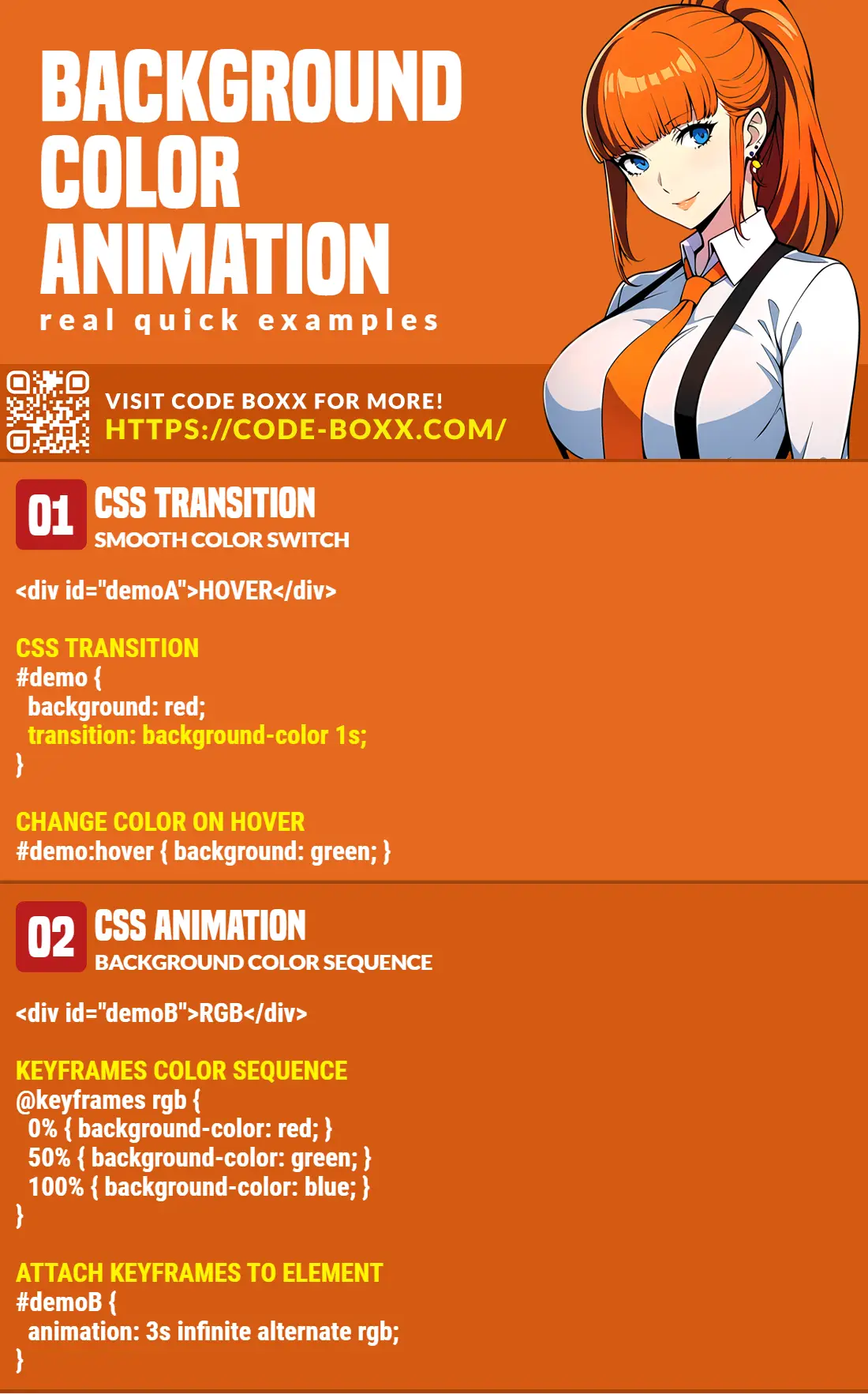
There are 2 easy ways to animate the background color with modern CSS:
- Use CSS transition to progressively change the background color.
<div id="demo">Demo</div>#demo { transition: background-color 1s }document.getElementById("demo").style.backgroundColor = "red";
- Use CSS keyframes to specify a sequence of background colors.
@keyframes col { 0% {background-color:red} 50% {background-color:green} 100% {background-color:blue} }#demo { animation: col 5s infinite }
That covers the basics, but let us walk through more examples in this guide – Read on!
ⓘ I have included a zip file with all the example code at the start of this tutorial, so you don’t have to copy-paste everything… Or if you just want to dive straight in.
TABLE OF CONTENTS
DOWNLOAD & NOTES

Firstly, here is the download link to the example code as promised.
QUICK NOTES
If you spot a bug, feel free to comment below. I try to answer short questions too, but it is one person versus the entire world… If you need answers urgently, please check out my list of websites to get help with programming.
EXAMPLE CODE DOWNLOAD
Click here to download the source code, I have released it under the MIT license, so feel free to build on top of it or use it in your own project.
CSS BACKGROUND COLOR ANIMATION

All right, let us now get started with the examples of background color animation with CSS.
1) BACKGROUND COLOR TRANSITION
<!-- (A) THE CSS -->
<style>
#demo {
  /* (A1) ALL WE NEED : CSS TRANSITION */
  transition: background-color 1s;

  /* (A2) COSMETICS */
  width: 100%;
  height: 100px;
  background-color: #eee;
}

/* (A3) BACKGROUND COLOR CHANGE */
#demo.swap { background-color: #e00; }
</style>

<!-- (B) THE HTML -->
<!-- (B1) DEMO DIV -->
<div id="demo"></div>

<!-- (B2) TOGGLE .SWAP CSS CLASS ON #DEMO -->
<input type="button" value="Swap background color"
       onclick="document.getElementById('demo').classList.toggle('swap')">
Oh no, CSS animation is so difficult… Not! For the beginners who are lost to what this demo does:
- (B1) We have a
<div id="demo">that defaults tobackground-color: #eee. - (B2) Clicking on the button will toggle the
.swapCSS class on#demo, effectively changing it tobackground-color: #e00. - (A1) Normally, the background color change will be instantaneous. But that single line of
transition: background-color 1sis all it takes to do animation magic.
2) BACKGROUND COLOR KEYFRAME SEQUENCE
<!-- (A) THE CSS -->
<style>
/* (A1) ANIMATION KEYFRAMES - BACKGROUND COLOR SEQUENCE */
@keyframes morph {
  0% { background-color: red; }
  50% { background-color: green; }
  100% { background-color: blue; }
}

/* (A2) COSMETICS */
#demo {
  width: 100%;
  height: 100px;
  background-color: #eee;
}

/* (A3) BACKGROUND COLOR ANIMATION WITH KEYFRAMES */
#demo.swap { animation: morph 3s linear; }
</style>

<!-- (B) THE HTML -->
<!-- (B1) DEMO DIV -->
<div id="demo"></div>

<!-- (B2) TOGGLE .SWAP CSS CLASS ON #DEMO -->
<input type="button" value="Animate background color"
       onclick="document.getElementById('demo').classList.toggle('swap')">
So what if we want to change between multiple background colors? This is an “upgraded version” of the first example with @keyframes. This may be seemingly difficult at first, but it is actually a simple step-by-step process:
- (A1) Start by creating a set of
@keyframesto define the sequence of background colors. - (A3) Then, attach the keyframe sequence to a CSS class.
- (B) This is the same mechanism as the previous example. We only need to attach
.swapto#demo, and this will effectively trigger the animation sequence.
3) BACKGROUND COLOR ANIMATION LOOP
<!-- (A) THE CSS -->
<style>
/* (A1) BACKGROUND COLOR SEQUENCE */
@keyframes morph {
  0% { background-color: red; }
  33% { background-color: green; }
  66% { background-color: blue; }
  100% { background-color: red; }
}

/* (A2) ATTACH SEQUENCE */
#demo {
  width: 100%;
  height: 100px;
  animation: morph 3s infinite;
}
</style>

<!-- (B) THE HTML -->
<div id="demo"></div>
By now, this should be pretty self-explanatory. As above, all we need is to create a set of @keyframes and attach it to an element/class. But in this example, we set the animation to loop infinitely, no Javascript is required to run.
4) BACKGROUND COLOR ANIMATION WITH OPACITY
<!-- (A) THE CSS -->
<style>
/* (A1) BACKGROUND COLOR SEQUENCE */
@keyframes morph {
  0% { background-color: rgba(0, 0, 0, 0); }
  50% { background-color: rgba(255, 0, 0, 0.5); }
  100% { background-color: rgba(0, 255, 0, 1); }
}

/* (A2) ATTACH SEQUENCE */
#demo {
  width: 100%;
  height: 100px;
  animation: morph 3s infinite alternate;
}
</style>

<!-- (B) THE HTML -->
<div id="demo"></div>
Finally, this is for you guys who are wondering how to add opacity to the equation – Simply use rgba() instead of the “usual” hex or color name.
EXTRA BITS & LINKS

That’s all for the main tutorial, and here is a small section on some extras and links that may be useful to you.
COMPATIBILITY CHECKS
- CSS Animations – CanIUse
- CSS Transitions – CanIUse
CSS animation and transitions are generally well-supported on all modern browsers.
LINKS & REFERENCES
- CSS Animations – MDN
- CSS Transitions – MDN
YOUTUBE TUTORIAL
INFOGRAPHIC CHEAT SHEET
THE END

Thank you for reading, and we have come to the end of this short tutorial. I hope that it has helped you to better understand CSS animations on the background color. If you have anything to add to this guide, please feel free to comment below. Good luck and happy coding!
The initial example #2 has incorrect syntax. The colon characters in “@keyframes col { 0%:{background-color:red} 50%:{background-color:green} 100%:{background-color:blue} } ” need to be removed.
Got it. Thanks for reporting.