Welcome to a tutorial on how to create glowing text in HTML and CSS. Need to catch the attention of users, or want to add some funky effects to your website?
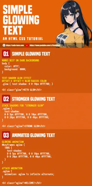
A block of glowing text can be easily created by using the CSS text-shadow property. For example, p.glow { text-shadow: 0 0 10px #fff700 }
It’s that simple, but let us walk through more examples in this guide – Read on!
TABLE OF CONTENTS
DOWNLOAD & NOTES
Here is the download link to the example code, so you don’t have to copy-paste everything.
EXAMPLE CODE DOWNLOAD
Click here to download | Example on CodePen
The example code is released under the MIT license, so feel free to build on top of it or use it in your own project.
SORRY FOR THE ADS...
But someone has to pay the bills, and sponsors are paying for it. I insist on not turning Code Boxx into a "paid scripts" business, and I don't "block people with Adblock". Every little bit of support helps.
Buy Me A Coffee Code Boxx eBooks
HTML CSS GLOWING TEXT
When it comes to the glowing text, the immediate “recoil effect” of some people will be “it’s so difficult”. But well, it is in actual fact, a very simple and dumb CSS trick…
TUTORIAL VIDEO
EXAMPLE 1) BASIC TEXT GLOW
<style>
/* (A) WORKS BEST ON DARK BACKGROUND */
body {
  color: #fff;
  background: #000;
}

/* (B) TEXT-SHADOW */
/* offset-x offset-y blur-radius color */
.glow { text-shadow: 0 0 10px #fff700; }
</style>

<h1>NO GLOW</h1>

<h1 class="glow">WITH GLOW</h1>- The glowing text effect works best on a dark background, which is why we set the HTML
<body>to a black background with white text. - The trick to glowing is done by using
text-shadow. But instead of a dark-colored shadow, we give it a light-colored shadow instead – This will create the glow illusion.
EXAMPLE 2) STRONGER GLOW
<style>
/* (A) WORKS BEST ON DARK BACKGROUND */
body {
  color: #fff;
  background: #000;
}

/* (B) STACK SHADOWS FOR "STRONGER GLOW" */
.sglow {
  text-shadow:
  0 0 5px #fff700, 0 0 10px #fff700,
  0 0 20px #fff700, 0 0 40px #fff700;
}
</style>

<h1 class="sglow">STRONK GLOW</h1>You may have noticed that the above glow is not quite… strong enough. So yes, we can actually “stack” multiple text-shadow and make the glow more prominent.
EXAMPLE 3) ANIMATED GLOW
<style>
/* (A) WORKS BEST ON DARK BACKGROUND */
body {
  color: #fff;
  background: #000;
}

/* (B) GLOWING ANIMATION */
@keyframes aglow {
  100% {
    text-shadow:
    0 0 5px #fff700, 0 0 10px #fff700,
    0 0 20px #fff700, 0 0 40px #fff700;
  }
}

/* (C) ATTACH ANIMATION */
.aglow {
  animation: aglow 1s infinite alternate;
}
</style>

<h1 class="aglow">WELCOME!</h1>Finally, we can combine the “glow trick” with CSS animation.
- Light text against a dark background as usual.
- Set the
text-shadowas a keyframe. - Attach the keyframe to a CSS class, and set it to loop infinitely in alternate directions – This will create the animated glowing text effect.
EXTRAS
That’s all for this tutorial, and here is a small section on some extras and links that may be useful to you.
LINKS & REFERENCES
- Text Shadow – MDN
- Box Shadow – MDN
- CSS Keyframes – MDN
- Animation – MDN
INFOGRAPHIC CHEAT SHEET

THE END
Thank you for reading, and we have come to the end of this guide. I hope that it has helped you with your project, and if you want to share anything with this guide, please feel free to comment below. Good luck and happy coding!

Goood ……………. Thank You