Welcome to a quick tutorial on how to create a collapsible list with HTML, CSS, and Javascript. Yes, there are plenty of such “free downloadable collapsible lists” all over the Internet. So here is one that is slightly different – A barebones no-bloat version, so you can customize it quickly. Read on!
ⓘ I have included a zip file with all the source code at the start of this tutorial, so you don’t have to copy-paste everything… Or if you just want to dive straight in.
TABLE OF CONTENTS
DOWNLOAD & DEMO

Firstly, here is the download link to the example code as promised.
QUICK NOTES
If you spot a bug, feel free to comment below. I try to answer short questions too, but it is one person versus the entire world… If you need answers urgently, please check out my list of websites to get help with programming.
EXAMPLE CODE DOWNLOAD
Click here to download all the example source code, I have released it under the MIT license, so feel free to build on top of it or use it in your own project.
DEMO & HOW TO USE
<!-- (A) LOAD CSS & JS -->
<link rel="stylesheet" href="collapse-list.css">
<script src="collapse-list.js"></script>

<!-- (B) NESTED LIST -->
<ul class="collapse">
  <li>
    TITLE
    <ul>
      <li>A</li> <li>B</li>
      <li>
        SUB-TITLE
        <ul>
          <li>C</li> <li>D</li>
        </ul>
      </li>
    </ul>
  </li>
</ul>- TITLE
- A
- B
- SUB-TITLE
- C
- D
For you guys who just want to use this as a “widget”:
- Load the CSS and JS, or embed them directly on the page. Captain Obvious at your service.
- Define your nested list as usual. Just attach a
class="collapse"to the<ul>container.
HTML CSS COLLAPSIBLE LIST

All right, let us now get into more details on how the collapsible list works. This is for you guys who want to “deep customize” it.
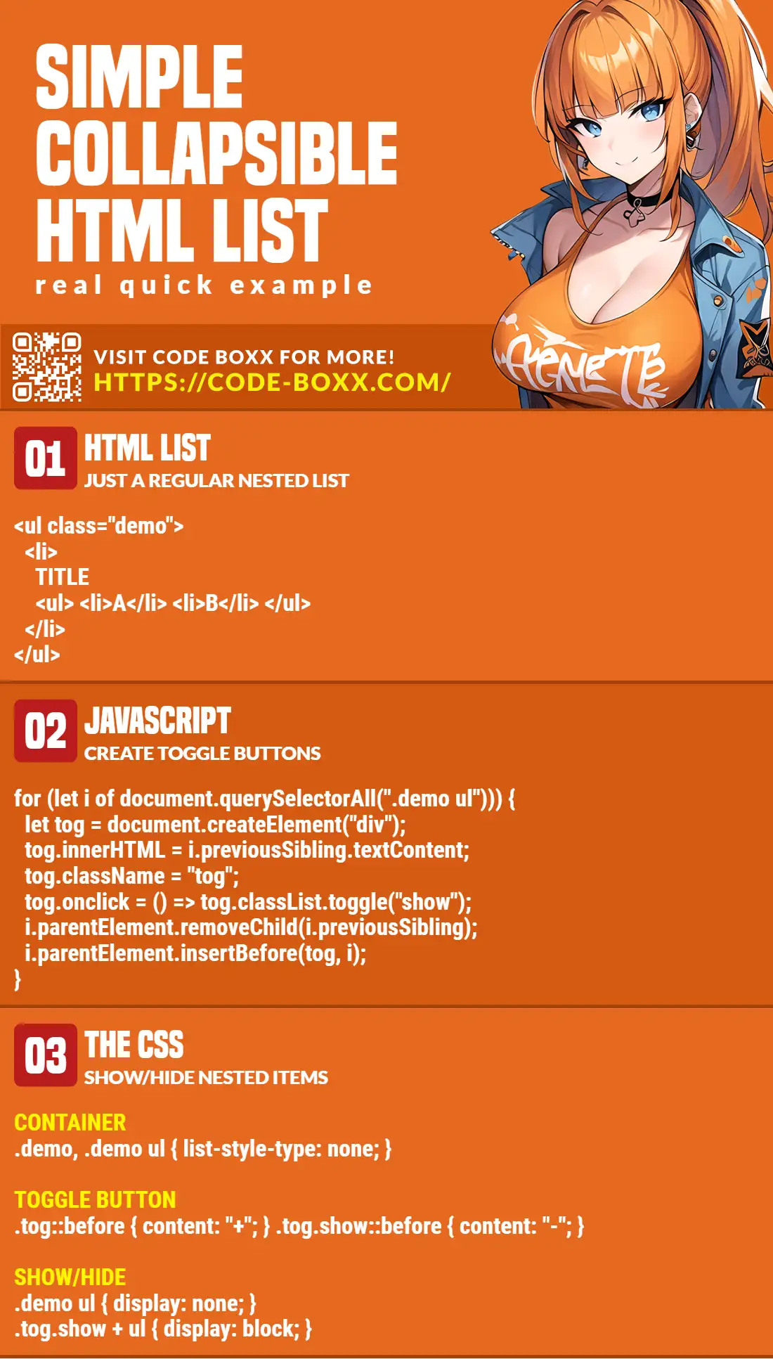
PART 1) THE JAVASCRIPT
window.addEventListener("load", () => {
  for (let i of document.querySelectorAll(".collapse ul")) {
    let tog = document.createElement("div");
    tog.innerHTML = i.previousSibling.textContent;
    tog.className = "toggle";
    tog.onclick = () => tog.classList.toggle("show");
    i.parentElement.removeChild(i.previousSibling);
    i.parentElement.insertBefore(tog, i);
  }
});
for (let i of document.querySelectorAll(".collapse ul")) { ... }Get all the<ul>“sub-lists” inside of<ul class="collapse">.- Loop through all the “sub-list” and create the respective toggle buttons –
<div class="toggle" onclick="TOGGLE SUB SECTION">TITLE</div>.
Yep, this is only 10 lines of code.
PART 2) THE CSS
/* (A) CONTAINER */
.collapse, .collapse ul {
  list-style-type: none;
  padding-left: 10px;
}

/* (B) LIST ITEMS */
.collapse li { padding: 10px; }

/* (C) TOGGLE */
.toggle {
  padding: 10px;
  cursor: pointer;
}
.toggle::before {
  display: inline-block;
  width: 15px;
  content: "+";
}
.toggle.show::before { content: "-"; }

/* (D) SHOW/HIDE */
.collapse ul { display: none; }
.toggle.show + ul { display: block; }- (A & B) Just some cosmetics,
list-style-type: nonewill remove the default points/numbers/alphabets. Feel free to retain them if required. - (C) More cosmetics. Remember that we created
<div class="toggle">buttons in the above Javascript?.toggle::before { content: "+" }will show a+symbol on the left side.- When the user clicks on the “toggle button”, a
.showCSS class will be added. That is,<div class="toggle show">. .toggle.show::before { content: "-"; }Should be self-explanatory now. We just change+to-.
- (D) The only functional part.
.collapse ul { display: none; }By default, all the sub-sections are hidden..toggle.show + ul { display: block; }When the toggle button isshow, we display the corresponding sub-section.
EXTRA BITS & LINKS

That’s all for the tutorial, and here is a small section on some extras and links that may be useful to you.
EVEN SIMPLER LIST?
<details>
  <summary>TITLE</summary>
  Text.
</details>
TITLE
Text.
Yes, there is an “even simpler” way to create a collapsible list with HTML <details><summary>. But it will depend on your definition of “list” –
- Semantically speaking,
<details><summary>is not a list. Cosmetically, it is also more of an “accordion”. - If your definition of a “list” is
<ul><ol>, then yes, you are at the right tutorial.
Which is correct? Both works. But if you want to be “semantically correct” and enjoy the benefits of SEO – <ul><ol> will help search engines better understand that it is a list and not a summary.
COMPATIBILITY CHECKS
- Arrow Functions – CanIUse
- Query Selector All – CanIUse
This example works on all modern “Grade A” browsers.
LINKS & REFERENCES
- Expand Collapse HTML DIV Using Pure CSS Only – Code Boxx
- Pure HTML CSS Accordion – Code Boxx
INFOGRAPHIC CHEAT SHEET
THE END

Thank you for reading, and we have come to the end. I hope that it has helped you to better understand, and if you want to share anything with this guide, please feel free to comment below. Good luck and happy coding!
why is this simple???
Because you only need to load the CSS/JS and add
.collapseCSS class to the list.P.S. Tutorial updated – See “EVEN SIMPLER LIST?” above.