Want to show some text or an image caption on mouse hover? Yes, we can do that without a single line of Javascript – Let us walk through a few simple examples in this guide. Read on!
TABLE OF CONTENTS
 Download & Notes
 Text Over Image
 Extras
 The End
DOWNLOAD & NOTES
Here is the download link to the example code, so you don’t have to copy-paste everything.
EXAMPLE CODE DOWNLOAD
Click here to download | Example on CodePen
The example code is released under the MIT license, so feel free to build on top of it or use it in your own project.
SORRY FOR THE ADS...
But someone has to pay the bills, and sponsors are paying for it. I insist on not turning Code Boxx into a "paid scripts" business, and I don't "block people with Adblock". Every little bit of support helps.
Buy Me A Coffee Code Boxx eBooks
TEXT OVER IMAGE
All right, let us now get into the examples of showing a text caption on image hover.
TUTORIAL VIDEO
EXAMPLE 1) TEXT ON HOVER
1A) THE DEMO

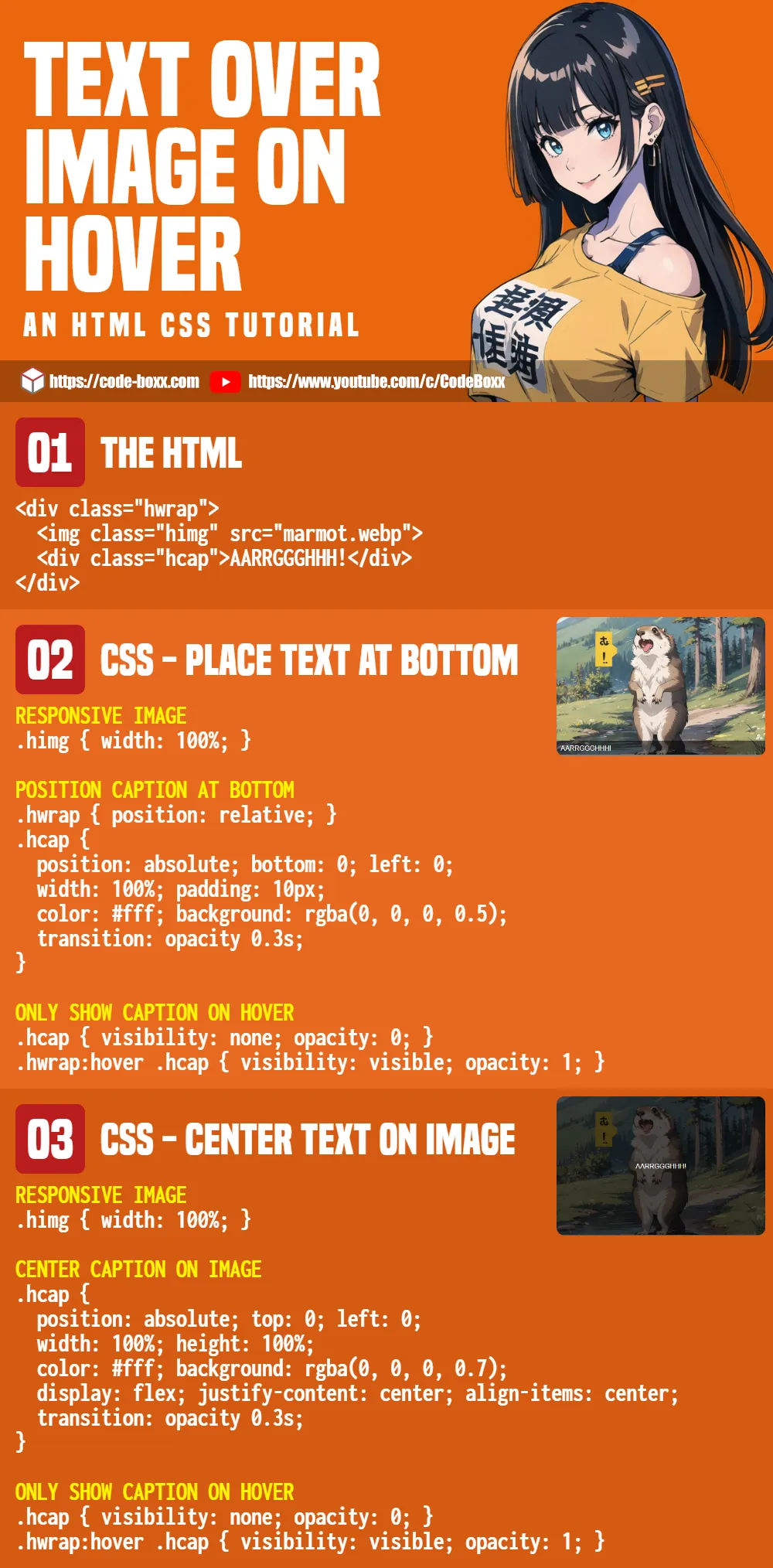
1B) THE HTML
<div class="hwrap">
  <img class="himg" src="marmot.webp">
  <div class="hcap">AARRGGGHHH!</div>
</div>
The HTML is as simple as it gets.
- Create a
<div class="hwrap">wrapper. - Sandwich the image
<img class="himg" src="pie.webp">and caption<div class="hcap">inside.
1C) THE CSS
/* (A) RESPONSIVE IMAGE */
.himg { width: 100%; }
.hwrap { max-width: 500px; } /* optional */

/* (B) POSITION CAPTION */
.hwrap { position: relative; }
.hcap {
  /* (B1) PLACE AT BOTTOM */
  position: absolute; bottom: 0; left: 0;

  /* (B2) DIMENSIONS + COLORS */
  width: 100%; padding: 10px;
  color: #fff; background: rgba(0, 0, 0, 0.5);
}

/* (C) ONLY SHOW CAPTION ON HOVER */
.hcap {
  visibility: none; opacity: 0;
  transition: opacity 0.3s;
}
.hwrap:hover .hcap{
  visibility: visible; opacity: 1;
}
Keep calm and look carefully, this is actually very straightforward.
- First, we deal with the image.
img { width: 100% }will automatically scale the image to fit, usemax-widthto prevent the image from stretching too much..hoverwrap { position: relative }is required to properly position the caption.
- To position the caption.
- Remember
position: relativeabove? Settingposition: absolute; bottom: 0; left: 0;here will place the caption at the bottom-left of the wrapper. - Set the caption to
width: 100%, and give it some cosmetics.
- Remember
- Lastly, we hide the caption and only show it on mouse hover.
P.S. For you guys who are thinking “Isn’t it easier with display:none and display:block” – CSS cannot animate display, thus the roundabout way of using visibility and opacity.
EXAMPLE 2) CENTERED OVERLAY ON HOVER
2A) THE DEMO
2B) THE HTML
<div class="fwrap">
  <img class="fimg" src="marmot.webp">
  <div class="fcap">
    <button>This will cover the entire image!</button>
  </div>
</div>
Need to show more than just a simple text caption? Of course, we can also add links, buttons, forms, and even other images in the caption overlay.
2C) THE CSS
/* (A) RESPONSIVE IMAGE */
.fimg { width: 100%; }
.fwrap { max-width: 500px; } /* optional */

/* (B) POSITION CAPTION */
.fwrap { position: relative; }
.fcap {
  /* (B1) COVER OVER ENTIRE IMAGE */
  position: absolute; top: 0; left: 0;
  width: 100%; height: 100%;
  background: rgba(0, 0, 0, 0.7);

  /* (B2) CENTER CONTENT */
  display: flex; justify-content: center; align-items: center;
}

/* (C) ONLY SHOW CAPTION ON HOVER */
.fcap {
  visibility: none; opacity: 0;
  transition: opacity 0.3s;
}
.fwrap:hover .fcap {
  visibility: visible; opacity: 1;
}
Look no further, there are only a few minor changes.
- (B1) Instead of positioning the caption at the bottom-left, it is now positioned on the top-left. It is also set to
width: 100%; height: 100%to cover the entire image. - (B2) To center the content, just set
display: flexwith “center horizontally and vertically”.
EXTRAS
That’s all for the tutorial, and here is a small section on some extras and links that may be useful to you.
LINKS & REFERENCES
- Figure Caption – MDN
- Simple Tooltip – Code Boxx
INFOGRAPHIC CHEAT SHEET
THE END
Thank you for reading, and we have come to the end. I hope that it has helped you to better understand, and if you want to share anything with this guide, please feel free to comment below. Good luck and happy coding!