Welcome to a beginner’s tutorial on how to create a box around the text in HTML. New to HTML and want to quickly create your own notification or information box?
<p style="padding: 10px; border: 2px solid red;">TEXT</p>That’s it. But rather than leaving you guys clueless as to what just happened, we will walk through more examples in this guide – Read on!
ⓘ I have included a zip file with all the example source code at the start of this tutorial, so you don’t have to copy-paste everything… Or if you just want to dive straight in.
TLDR – QUICK SLIDES
[web_stories_embed url=”https://code-boxx.com/web-stories/how-to-add-box-around-text/” title=”How To Add Box Around Text” poster=”https://code-boxx.com/wp-content/uploads/2022/03/STORY-HTML-20230505.webp” width=”360″ height=”600″ align=”center”]
Fullscreen Mode – Click Here
TABLE OF CONTENTS
DOWNLOAD & NOTES

Firstly, here is the download link to the example code as promised.
QUICK NOTES
If you spot a bug, feel free to comment below. I try to answer short questions too, but it is one person versus the entire world… If you need answers urgently, please check out my list of websites to get help with programming.
EXAMPLE CODE DOWNLOAD
Click here to download the source code, I have released it under the MIT license, so feel free to build on top of it or use it in your own project.
CREATING BOXES

All right, let us now get into the details of creating boxes with HTML and CSS.
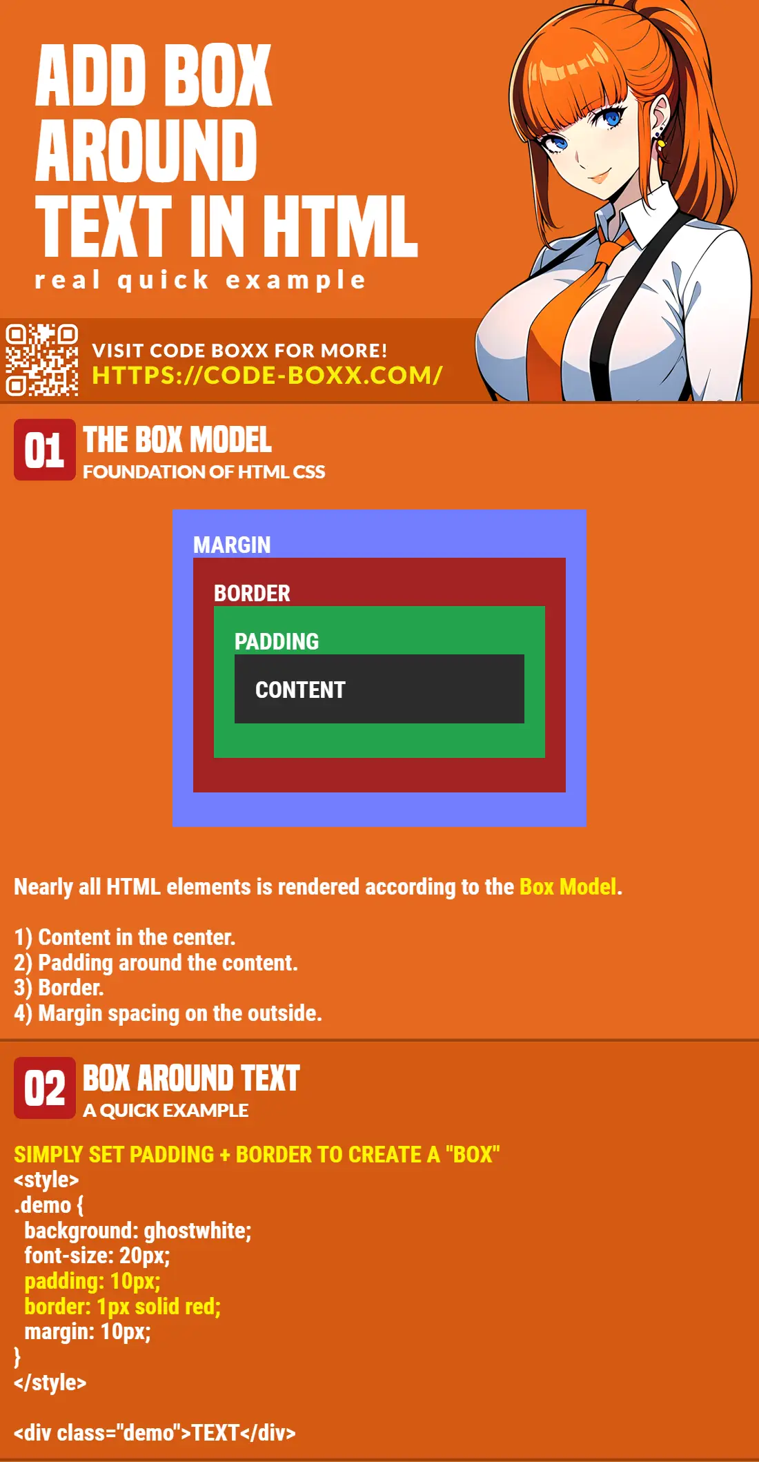
EXAMPLE 1) BOX BASICS – THE BOX MODEL
HMTL & CSS
<div style="background: ghostwhite;
            font-size: 20px;
            padding: 10px;
            border: 1px solid lightgray;
            margin: 10px;">
  This is some dummy text.
</div>
THE EXPLANATION
Just what are all those background, font-size, padding, border, margin? Simply put, HTML renders each element based on something called “the box model” – Which is something like layers of an onion.
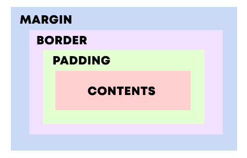
- At the center of the box, we have the content (text, image, or video).
- The text can be controlled with various properties –
font-size, font-weight, font-familiy, text-decoration, color… Which should be pretty self-explanatory. - We can also set the
backgroundcolor or use abackground-image.
- The text can be controlled with various properties –
- Followed by a layer of
padding. - Next, we can set a
border. - Finally,
marginon the outside. This is simply an “empty transparent space” around the box.
Well, the best is to test it hands-on. Go ahead, download the example above, edit each property and see for yourself.
EXAMPLE 2) CSS CLASSES – SOMETHING LIKE TEMPLATES
HMTL & CSS
<style>
/* (A) SHARED CLASS */
.box {
margin: 10px;
padding: 10px;
font-size: 18px;
}
/* (B) BOX VARIATIONS */
/* (B1) INFORMATION BOX */
.info {
color: brown;
background: cornsilk;
border: 1px solid burlywood;
}
/* (B2) WARNING BOX */
.warn {
color: darkmagenta;
background: lightpink;
border: 1px solid darkred;
}
/* (B3) SUCCESS */
.ok {
color: darkgreen;
background: greenyellow;
border: 1px solid darkgreen;
}
</style>
<!-- (B1) INFORMATION -->
<div class="box info">
ⓘ Information box.
</div>
<!-- (B2) WARNING -->
<div class="box warn">
⚠ Warning icon.
</div>
<!-- (B3) SUCCESS -->
<div class="box ok">
ⓘ Successful!
</div>
THE EXPLANATION
The first example works great, but it is dumb to copy the same style all over the entire website. So now for a crash course on how to create reusable CSS classes.
- First, we create a
<style>tag in the<head>section. - Then define the CSS classes
.CLASS-NAME { STYLES-TO-APPLY }in the<style>tag. - Finally, simply attach the CSS classes to the HTML elements –
<ELEMENT class="CLASS-NAME">.
Yep, it’s that simple, and it should save you a lot of time from copy-pasting the same style property all over the place. This will also make it easier for future updates – Just change the class styles in the <head> section once, and all the rest will follow.
EXTRA) ADDING ICONS
HMTL & CSS
<div style="background: ghostwhite; font-size: 20px; padding: 10px; border: 1px solid lightgray; margin: 10px;">
ⓘ Information icon.
<br>
⚠ Warning icon.
<br>
❤ Heart icon.
<br>
💡 Bulb icon.
</div>
⚠ Warning icon.
❤ Heart icon.
💡 Bulb icon.
THE EXPLANATION
Just what are those &#ABCD? Those are called “HTML symbols”, and they are native to HTML. We don’t need to download any images nor use any extra third-party libraries to spice up the boxes. HTML actually has a ton of symbols, and I will leave a link in the extras section below for the complete list of symbols.
EXTRA) ROUNDED CORNERS
HMTL & CSS
<div style="border-radius: 10px; background: beige; padding: 10px;">
  Rounded
</div>
THE EXPLANATION
Yep, just add border-radius to round the corners. If we define border-radius: 50%, which will literally turn the box into a circle or oval.
EXTRA BITS & LINKS

That’s all for this tutorial, and here is a small section on some extras and links that may be useful to you.
LINKS & REFERENCES
- HTML Color Names – HTMLcolorcodes.com
- HTML Symbols – graphmica.com
- CSS Box Model – w3.org
- CSS Class Selectors – MDN
INFOGRAPHIC CHEAT SHEET
THE END

Thank you for reading, and we have come to the end of this guide. I hope that it has helped you with your project, and if you want to share anything with this guide, please feel free to comment below. Good luck and happy coding!
total nube! but i got it to work! Thank you so much!
This guide helped me a lot! Particularly the rounded box. Why do many other guides say you have to alter and/or add css to make a simple box like this?