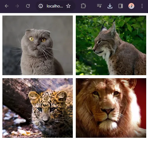
Welcome to a tutorial on how to create a simple video gallery in HTML CSS. So you want to showcase some of your videos, and don’t want to go through crazy video services/platforms? Here’s a simple video gallery you can copy-paste – Read on!
TABLE OF CONTENTS
DOWNLOAD & NOTES
Here is the download link to the example code, so you don’t have to copy-paste everything.
EXAMPLE CODE DOWNLOAD
Just click on “download zip” or do a git clone. I have released it under the MIT license, so feel free to build on top of it or use it in your own project.
SORRY FOR THE ADS...
But someone has to pay the bills, and sponsors are paying for it. I insist on not turning Code Boxx into a "paid scripts" business, and I don't "block people with Adblock". Every little bit of support helps.
Buy Me A Coffee Code Boxx eBooks
HTML CSS VIDEO GALLERY
All right, let us now get into the details of building a simple responsive video gallery with HTML, CSS, and a bit of Javascript.
TUTORIAL VIDEO
PART 1) HTML GALLERY PAGE
<!-- (A) CLOSE FULLSCREEN VIDEO -->
<div id="vClose" onclick="vtog(false)">X</div>

<!-- (B) VIDEO GALLERY -->
<div class="gallery">
  <video src="gallery/1.mp4"></video>
  <video src="gallery/2.mp4"></video>
  <video src="gallery/3.mp4"></video>
</div>
Yep, that’s all for the HTML page. Just create a <div class="gallery"> folder, and sandwich all the <video> inside. As for <div id="vClose>, this “close” button will only show when a video is playing on full screen.
PART 2) GALLERY CSS
/* (A) GALLERY WRAPPER */
/* (A1) BIG SCREENS - 3 VIDEOS PER ROW */
.gallery {
  display: grid;
  grid-template-columns: repeat(3, minmax(0, 1fr));
  grid-gap: 10px;
  max-width: 1200px; /* optional */
  margin: 0 auto; /* optional */
}

/* (A2) SMALL SCREENS - 2 VIDEOS PER ROW */
@media screen and (max-width: 768px) {
  .gallery { grid-template-columns: repeat(2, minmax(0, 1fr)); }
}

/* (B) GALLERY VIDEOS */
/* (B1) THUMBNAIL VIDEO */
.gallery video {
  width: 100%;
  height: 200px;
  object-fit: cover; /* fill | contain | cover | scale-down */
  cursor: pointer;
}

/* (B2) FULLSCREEN VIDEO */
.gallery video.full {
  position: fixed;
  top: 0; left: 0; z-index: 999;
  width: 100vw; height: 100vh;
  background: #000;
  object-fit: scale-down;
}

/* (C) EXIT FULLSCREEN */
#vClose {
  position: fixed; display: none;
  top: 0; right: 0; z-index: 9999;
  font-size: 20px; font-weight: 700;
  padding: 10px 15px;
  color: #fff;
  background: #741414;
  cursor: pointer;
}
#vClose.show { display: block; }
This may look confusing at first, but here’s a quick walkthrough:
- (B) Set the
<div class="gallery">wrapper to a grid layout. 3 videos per row on big screens, and 2 videos on small screens. - (B1) Scale to fit the thumbnail videos.
- (B2) When the user clicks on a video, we add a
.fullCSS class on it. This section simply sets the selected video to fill up the entire window. - (C) Place the “close video” button at the top right side. Hidden by default, will only show when a video is playing in fullscreen.
PART 3) GALLERY JAVASCRIPT
function vtog (v) {
  // (A) CLOSE FULLSCREEN
  if (v === false) {
    let vid = document.querySelector(".gallery .full");
    vid.classList.remove("full");
    vid.controls = false;
    vid.pause();
    document.getElementById("vClose").classList.remove("show");
  }

  // (B) ENGAGE FULLSCREEN
  else if (!v.classList.contains("full")) {
    v.classList.add("full");
    v.controls = true;
    v.play();
    vdocument.getElementById("vClose").classList.add("show");
  }
};

// (C) INIT - CLICK TO FULLSCREEN
window.addEventListener("load", () => {
  for (let v of document.querySelectorAll(".gallery video")) {
    v.onclick = () => vtog(v);
  }
});
Finally, a little bit of Javascript to drive “fullscreen videos”:
- (C) On window load, attach “click to play video in full screen”.
- (B) If the user clicks on a video, go fullscreen and show the close button.
- (A) If the user clicks on the close button, exit fullscreen and hide the close button.
The end.
EXTRAS
That’s all for the tutorial, and here is a small section on some extras and links that may be useful to you.
THE VIDEO IS NOT LOADING
- Take note that different browsers support different video formats. The safest format at the time of writing is H.264 MP4 – See the Wikipedia link below for the full list.
- Depending on the browser and Internet connection, some browsers may not preload and display the thumbnail/preview.
- You can “encourage” the browser to preload the video metadata –
<video preload="metadata" src="...">. No guarantee though, it’s still up to the browser. - Alternatively, you can set a poster manually –
<video poster="image.jpg">
- You can “encourage” the browser to preload the video metadata –
LINKS & REFERENCES
- HTML5 Video – Wikipedia
THE END
Thank you for reading, and we have come to the end. I hope that it has helped you to better understand, and if you want to share anything with this guide, please feel free to comment below. Good luck and happy coding!

