Welcome to a tutorial on how to rotate and spin images in HTML CSS. So you want to rotate or spin an image, but it is too much trouble to do image editing or create an animated GIF? Good news, it is easy to rotate images in modern CSS.
To can rotate an image in HTML CSS, simply use the transform rotate property. For example:
<img class="rright" src="IMG.JPG">img.rright { transform: rotate(90deg) }
That covers the basics, but we can do more and animate a spinning image using rotate. Let us walk through more examples in this guide – Read on!
TABLE OF CONTENTS
 Download & Notes
 Rotate & Spin Images
 Extras
 The End
DOWNLOAD & NOTES
Here is the download link to the example code, so you don’t have to copy-paste everything.
EXAMPLE CODE DOWNLOAD
Click here to download | Example on CodePen
The example code is released under the MIT license, so feel free to build on top of it or use it in your own project.
SORRY FOR THE ADS...
But someone has to pay the bills, and sponsors are paying for it. I insist on not turning Code Boxx into a "paid scripts" business, and I don't "block people with Adblock". Every little bit of support helps.
Buy Me A Coffee Code Boxx eBooks
ROTATE & SPIN IMAGES IN HTML CSS
All right, let us now get into the examples of how to rotate and spin images in HTML CSS.
TUTORIAL VIDEO
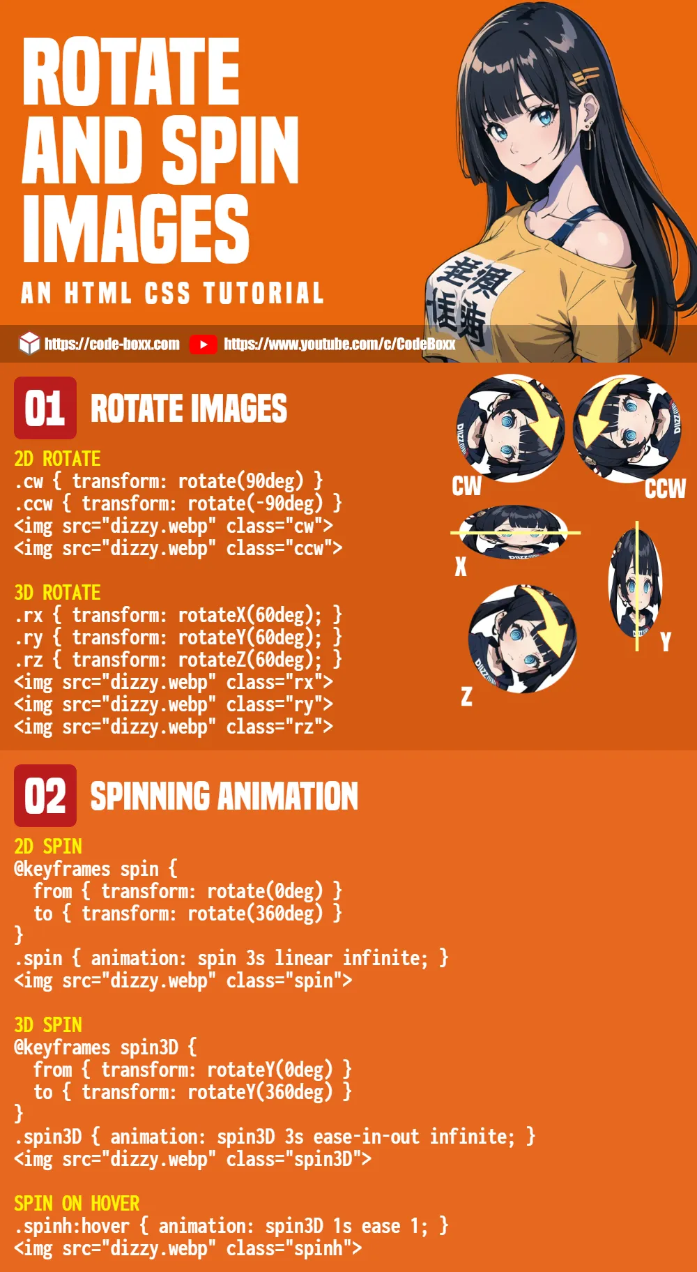
2D ROTATE IMAGE
<style>
.cw { transform: rotate(90deg) }
.ccw { transform: rotate(-90deg) }
</style>

<div>Rotate 90 degrees clockwise</div>
<img src="dizzy.webp" class="cw">

<div>Rotate 90 degrees counter-clockwise</div>
<img src="dizzy.webp" class="ccw">
- As in the above snippet, just add
transform: rotate(N deg)to rotate an image. - A positive degree will rotate the image in a clockwise direction, and a negative degree to rotate it in a counter-clockwise direction.
3D ROTATE IMAGE
<style>
.rx { transform: rotateX(60deg); }
.ry { transform: rotateY(60deg); }
.rz { transform: rotateZ(60deg); }
</style>

<div>Rotate 60 degrees x-axis</div>
<img src="dizzy.webp" class="rx">
<div>Rotate 60 degrees y-axis</div>
<img src="dizzy.webp" class="ry">
<div>Rotate 60 degrees z-axis</div>
<img src="dizzy.webp" class="rz">
Apart from the “basic 2D rotate”, we can also do a 3D rotation using rotateX, rotateY, and rotateZ.
SPINNING IMAGES
<style>
/* 2D SPINNING ANIMATION */
@keyframes spin {
  from { transform: rotate(0deg) }
  to { transform: rotate(360deg) }
}
.spin { animation: spin 3s linear infinite; }

/* 3D SPINNING ANIMATION */
@keyframes spin3D {
  from { transform: rotateY(0deg) }
  to { transform: rotateY(360deg) }
}
.spin3D { animation: spin3D 3s ease-in-out infinite; }
</style>

<div>Spinning Animation</div>
<img src="dizzy.webp" class="spin">

<div>3D Spinning Animation</div>
<img src="dizzy.webp" class="spin3D">
For you guys who are looking to catch attention by using a spinning image, we can create spinning images using CSS animation:
- First, define the keyframes
@keyframes spin.- The keyframes should start with
from { transform: rotate(0deg) }, end withto { transform: rotate(360deg) }. - If you want 3D effects, use
rotateX rotateY rotateZ.
- The keyframes should start with
- Next, we attach the animation sequence to the CSS class
animation: NAME TIME FUNCTION REPEAT.NAMEName of the keyframes. In this example, it is eitherspinorspin3D.TIMEHow fast or slow you want the animation to be.FUNCTIONControls how the animation will look like. Possible values arelinear, ease, ease-in, ease-out, ease-in-out, step-start, step-end.REPEATThe number of times to repeat the animation.
SPIN ON HOVER
<style>
.spinh:hover { animation: spin3D 1s ease 1; }
</style>

<div>Spin on hover</div>
<img src="dizzy.webp" class="spinh">
One final bit – Yes, just attach the animation to the hover pseudo-class if you want “spin on mouse hover”.
EXTRAS
That’s all for this guide, and here is a small section on some extras and links that may be useful to you.
EXTRA) ROTATE CAN BE APPLIED TO ALMOST ANYTHING
<style>
.robox {
  width: 200px; height: 50px; padding: 10px;
  border: 2px solid #aaa;
  background: #feffd6;
  transform: rotate(-10deg);
}
</style>

<div class="robox">Hello World!</div>Rotate is not limited to images, it will also work with pretty much every other HTML elements.
LINKS & REFERENCES
- Transform – MDN
- Rotate – MDN
- Using CSS animations – CSS: Cascading Style Sheets – MDN
INFOGRAPHIC CHEATSHEET
THE END
Thank you for reading, and we have come to the end of this guide. I hope that it has helped you with your project, and if you want to share anything with this guide, please feel free to comment below. Good luck and happy coding!
Thanks a bunch. I have modified my website with a bit of animation, thanks to your guidance. Much appreciated!
This is awesome! thanks for making this guide!!