Welcome to a tutorial on how to create a simple responsive text slider in HTML CSS. So you want to add a text slider to your page? There’s no need to use third-party frameworks, here’s how to create one using pure HTML CSS – Read on!
TABLE OF CONTENTS
 Download & Notes
 Text Sliders
 Extras
 The End
DOWNLOAD & NOTES
Here is the download link to the example code, so you don’t have to copy-paste everything.
EXAMPLE CODE DOWNLOAD
Click here to download | Example on CodePen
Just click on “download zip” or do a git clone. I have released it under the MIT license, so feel free to build on top of it or use it in your own project.
SORRY FOR THE ADS...
But someone has to pay the bills, and sponsors are paying for it. I insist on not turning Code Boxx into a "paid scripts" business, and I don't "block people with Adblock". Every little bit of support helps.
Buy Me A Coffee Code Boxx eBooks
HTML CSS TEXT SLIDERS
All right, let us start with a horizontal text slider (that scrolls right to left).
TUTORIAL VIDEO
1) HORIZONTAL TEXT SLIDER
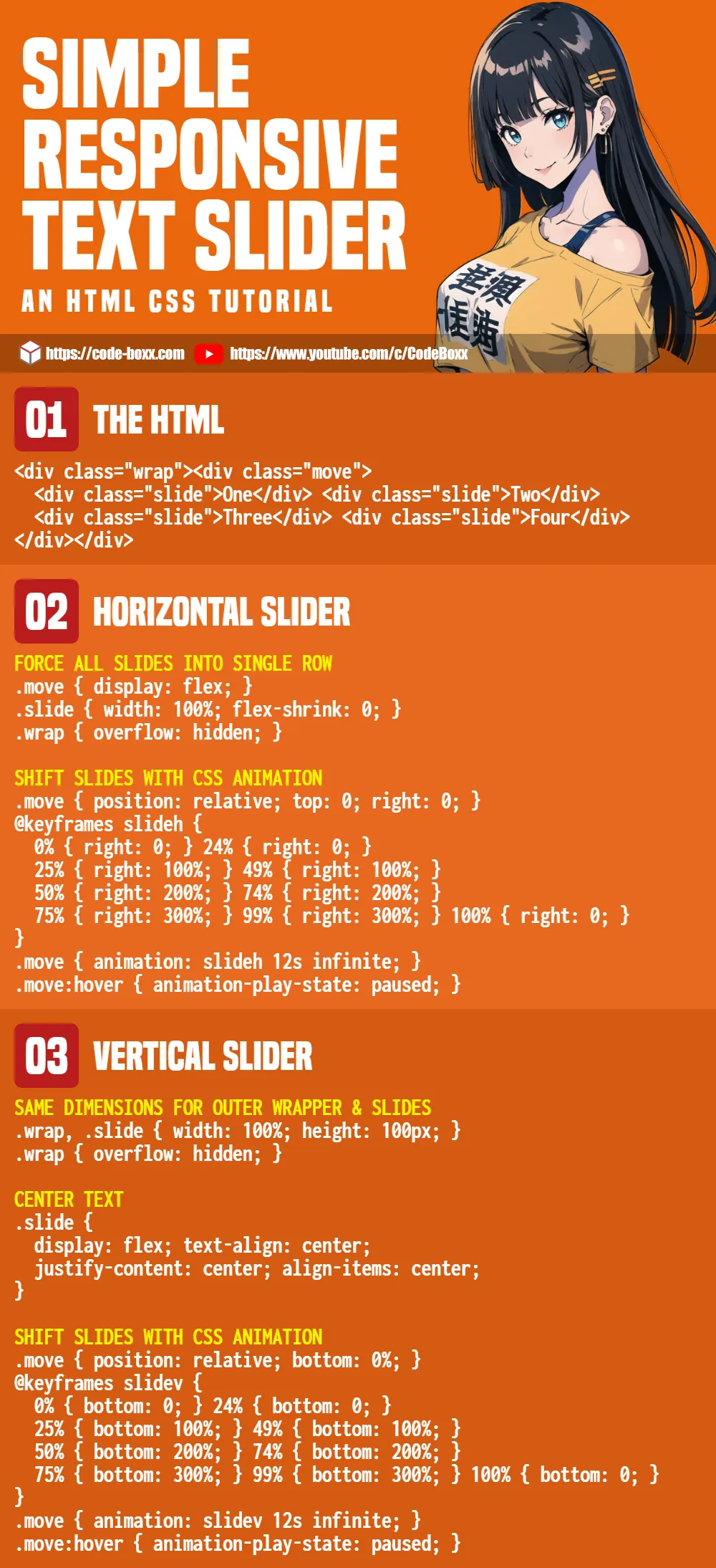
1A) HORIZONTAL SLIDER HTML
<div class="hwrap"><div class="hmove">
  <div class="hslide">The episode orbits? The panic overwhelms a fuse.</div>
  <div class="hslide">The lasting astronomer balances the counter reminder.</div>
  <div class="hslide">Her birthday calculates past a juice!</div>
  <div class="hslide">Last slide.</div>
</div></div>
The idea here is to sandwich the slides between 2 <div> wrappers.
1B) HORIZONTAL SLIDER CSS
/* (A) FORCE ALL SLIDES INTO SINGLE ROW */
.hmove { display: flex; }
.hslide { width: 100%; flex-shrink: 0; }
.hwrap { overflow: hidden; }

/* (B) SHIFT SLIDES WITH CSS ANIMATION */
/* (B1) SLIDES POSITION */
.hmove { position: relative; top: 0; right: 0; }
@keyframes slideh {
  0% { right: 0; } 24% { right: 0; }
  25% { right: 100%; } 49% { right: 100%; }
  50% { right: 200%; } 74% { right: 200%; }
  75% { right: 300%; } 99% { right: 300%; }
  100% { right: 0; }
}

/* (B2) MOVE SLIDES */
.hmove { animation: slideh 12s infinite; }
.hmove:hover { animation-play-state: paused; }
This looks like quite a handful, but keep calm and study slowly.
- The first thing we do is to lay all the slides in a long horizontal row.
- Set the inner
.hmovewrapper todisplay: flex. .hslide { width: 100%; flex-shrink: 0; }will arrange all slides into a single row.- Use
overflow: hiddento hide the ugly scrollbar on the outer.hwrapwrapper.
- Set the inner
- Next, deal with the slide rotation. Basically,
.hmove { position: relative; right: 0% }will show the first slide,right: 100%for the second,right: 200%for the third, and so on…- (B1) To “automate” the slide rotation, create a sequence of
@keyframeswith respectiveright: N%. - (B2) Attach the keyframes to
.hmove, CSS animation will do the rest of the magic. - (B2) Pause the slide rotation on mouse hover.
- (B1) To “automate” the slide rotation, create a sequence of
1C) HORIZONTAL SLIDER DEMO
1D) ADDING & REMOVING SLIDES
- The HTML is not a problem, just add or remove a
<div class="hslide">. - The inconvenient part is with the CSS, where you will have to recalculate the
@keyframes slideh. E.G. For 3 slides, there will be a stop at every100% / 3 = 33%. That is:0 - right: 033% - right: 100%66% - right: 200%100% - right: 0
- Then add the pauses in between.
65% - right: 100%99% - right: 200%
- Lastly, adjust the animation time. E.G. 3 slides at 5 seconds each will be a total of 15 seconds –
.hmove { animation: slideh linear 15s }
2) VERTICAL TEXT SLIDER
2A) VERTICAL SLIDER HTML
<div class="vwrap"><div class="vmove">
  <div class="vslide">The episode orbits? The panic overwhelms a fuse.</div>
  <div class="vslide">The lasting astronomer balances the counter reminder.</div>
  <div class="vslide">Her birthday calculates past a juice!</div>
  <div class="vslide">Last slide.</div>
</div></div>
Yep, it’s the same “sandwich slides between 2 <div> containers”. The changes are with the CSS.
2B) VERTICAL SLIDER CSS
/* (A) SAME DIMENSIONS FOR OUTER WRAPPER & SLIDES */
/* MAKE SURE ENOUGH HEIGHT SPACE FOR TEXT! */
.vwrap, .vslide { width: 100%; height: 100px; }
.vwrap { overflow: hidden; }

/* (B) CENTER TEXT */
.vslide {
  display: flex;
  text-align: center;
  justify-content: center;
  align-items: center;
}

/* (C) SHIFT SLIDES WITH CSS ANIMATION */
/* (C1) SLIDES POSITION */
.vmove { position: relative; bottom: 0%; }
@keyframes slidev {
  0% { bottom: 0; } 24% { bottom: 0; }
  25% { bottom: 100%; } 49% { bottom: 100%; }
  50% { bottom: 200%; } 74% { bottom: 200%; }
  75% { bottom: 300%; } 99% { bottom: 300%; }
  100% { bottom: 0; }
}

/* (C2) MOVE SLIDES */
.vmove { animation: slidev 12s infinite; }
.vmove:hover { animation-play-state: paused; }
The working principles behind the vertical slider are the same as the horizontal version.
- (A) First, we set the outer container
.vwrapand the slides.vslideto have the samewidthandheight. This will naturally line up all the slides in a single column. - (A) Similarly, set
overflow: hiddenon the outer.vwrapcontainer to hide the ugly scrollbars. - (B) This is kind of optional… But it just looks better when the text is centered.
- (C) Finally, we use the same
position: relative; bottom: N%CSS animation trick to rotate the slides.
2C) VERTICAL SLIDER DEMO
2D) ADDING & REMOVING SLIDES
Adding or removing slides in the vertical version is pretty much the same as the horizontal version.
- Simply add or remove a
<div class="vslide">. - Update the CSS
@keyframes slidev. - Control the animation speed with
animation: slidev Ns infinite.
EXTRAS
That’s it for the tutorial, and are some links and small extras that may be useful.
JAVASCRIPT TEXT SLIDER
Some “keyboard experts” have commented on how “dumb” keyframe calculations are, but cannot come up with constructive suggestions. Duh. So if you are not allergic to Javascript, here’s an alternative that may help.
THE HTML
<div id="demo" class="hwrap"><div class="hmove">
  <div class="hslide">...</div>
  <div class="hslide">...</div>
  <div class="hslide">...</div>
</div></div>
The HTML is the same again, just give the outer wrapper an id.
THE CSS
/* (A) FORCE SLIDES INTO SINGLE ROW */
.hmove {
  display: flex; transition: all 0.2s;
  position: relative; top: 0; right: 0;
}
.hslide { width: 100%; flex-shrink: 0; }
.hwrap { overflow: hidden; }
No more CSS keyframes. Just arrange the slides into a horizontal row.
THE JAVASCRIPT
window.addEventListener("load", () => {
  let now = 0,
      all = document.querySelectorAll("#demo .hslide").length;
  setInterval(() => {
    now++;
    if (now==all) { now = 0; }
    document.querySelector("#demo .hmove").style.right = `${now * 100}%`;
  }, 5000);
});
Instead of using CSS keyframes, we use a Javascript interval to set the appropriate right: N% on the inner wrapper.
MARQUEE TEXT SLIDER
In some other tutorials on the Internet, you will find people using <marquee> to create a text slider. Just don’t use it, marquee is deprecated and outdated at the time of writing.
INFOGRAPHIC CHEATSHEET
LINKS & REFERENCES
THE END
Thank you for reading, and we have come to the end of this short guide. I hope that it has helped you to create a better website, and if you have anything to add to this guide, please feel free to comment below. Good luck and happy coding!
Thanks for the coding but the images I see are not responsive. Any thoughts?
https://code-boxx.com/auto-resize-images-html-css/
https://code-boxx.com/simple-slideshow-css-js/