Welcome to a tutorial on how to create a news ticker in HTML and CSS. Need to add a block of scrolling news to a page? Yep, it is possible to do so using pure HTML and CSS, not a single line of Javascript. Read on for the examples!
TABLE OF CONTENTS
 Download & Notes
 HTML CSS News Ticker
 Extras
 The End
DOWNLOAD & NOTES
Here is the download link to the example code, so you don’t have to copy-paste everything.
EXAMPLE CODE DOWNLOAD
Click here to download | Example on CodePen
Just click on “download zip” or do a git clone. I have released it under the MIT license, so feel free to build on top of it or use it in your own project.
SORRY FOR THE ADS...
But someone has to pay the bills, and sponsors are paying for it. I insist on not turning Code Boxx into a "paid scripts" business, and I don't "block people with Adblock". Every little bit of support helps.
Buy Me A Coffee Code Boxx eBooks
HTML CSS NEWS TICKER
All right, let us now get into the details of building a news ticker in HTML CSS. Credits to Hipster Ipsum and Rishabh for the original news tickers.
TUTORIAL VIDEO
1) HORIZONTAL NEWS TICKER
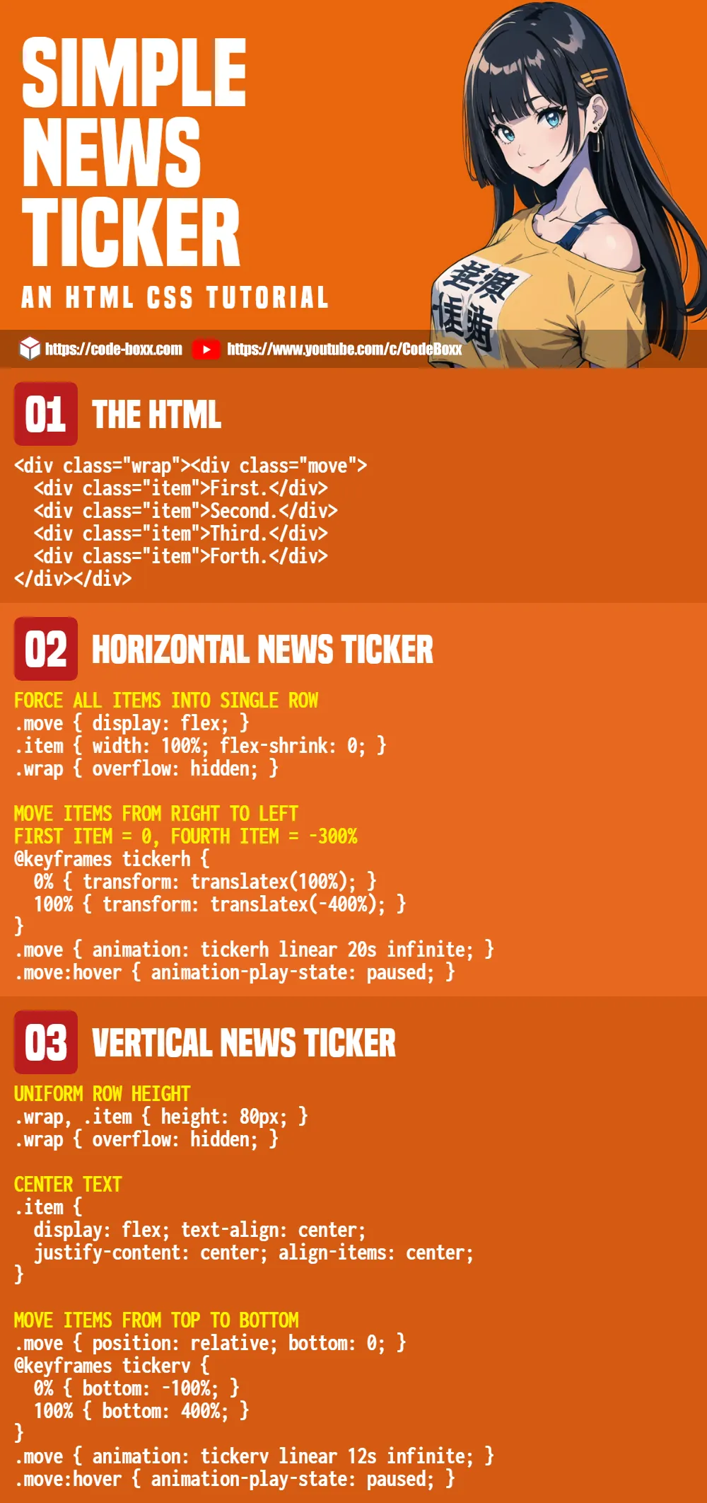
1A) THE HTML
<div class="hwrap"><div class="hmove">
  <div class="hitem">Lorem ipsum dolor sit amet, consectetur adipiscing elit.</div>
  <div class="hitem">Aliquam consequat varius consequat.</div>
  <div class="hitem">Fusce dapibus turpis vel nisi malesuada sollicitudin.</div>
  <div class="hitem">Pellentesque auctor molestie orci ut blandit.</div>
</div></div>
As simple as it gets. Create 2 <div> wrappers, and sandwich the items within.
1B) THE CSS
/* (A) FORCE ALL ITEMS INTO SINGLE ROW */
.hmove { display: flex; }
.hitem { width: 100%; flex-shrink: 0; }
.hwrap { overflow: hidden; }

/* (B) MOVE ITEMS FROM RIGHT TO LEFT */
/* first item = 0, fourth item = -300% */
@keyframes tickerh {
  0% { transform: translatex(100%); }
  100% { transform: translatex(-400%); }
}
.hmove { animation: tickerh linear 20s infinite; }
.hmove:hover { animation-play-state: paused; }
This may seem rather intimidating to beginners, but keep calm and look closely.
- (A) The basic idea is to lay the items in a long horizontal row. We do that by setting the inner wrapper to flex layout, and all slides to 100% width.
- (A) Also hide the overflow on the outer wrapper, so the user won’t see a funky long scrollbar.
- (B) The ticker magic is to set
translatex()on the inner wrapper. Long story short:translatex(0)will show the first item,translatex(-100%)for the second,translatex(-200%)for the third, and so on.- We create a set of keyframes that will shift from the first item to the last.
- Attach the keyframes to the inner wrapper, and CSS animation will do the rest of the magic.
1C) THE DEMO
1D) ADD/REMOVE ITEMS
- The HTML is self-explanatory, just set your items in the double
<div>wrappers. - Modify the
translatex()for the last item, and adjust the animation duration accordingly. - Take note, there is a potential problem here.
- The animation duration controls the “scrolling speed”.
- But depending on the window width, the scrolling speed will increase/decrease.
- A simple way to prevent the scrolling speed from going too fast/slow is to set
min-widthandmax-widthon the outer wrapper.
2) VERTICAL NEWS TICKER
2A) THE HTML
<div class="vwrap"><div class="vmove">
  <div class="vitem">Lorem ipsum dolor sit amet, consectetur adipiscing elit.</div>
  <div class="vitem">Aliquam consequat varius consequat.</div>
  <div class="vitem">Fusce dapibus turpis vel nisi malesuada sollicitudin.</div>
  <div class="vitem">Pellentesque auctor molestie orci ut blandit.</div>
</div></div>
Look no further, this is the same as the horizontal version.
2B) THE CSS
/* (A) UNIFORM ROW HEIGHT */
/* make sure enough height space */
.vwrap, .vitem { height: 80px; }
.vwrap { overflow: hidden; }

/* (B) CENTER TEXT */
.vitem {
  display: flex;
  text-align: center;
  justify-content: center;
  align-items: center;
}

/* (C) MOVE ITEMS FROM TOP TO BOTTOM */
/* bottom 0 = first item, bottom 300% = fourth item */
.vmove { position: relative; bottom: 0; }
@keyframes tickerv {
  0% { bottom: -100%; }
  100% { bottom: 400%; }
}
.vmove { animation: tickerv linear 12s infinite; }
.vmove:hover { animation-play-state: paused; }
Slightly different CSS strategy here.
- First, set the outer wrapper and items to the same height… Hide the funky scrollbar as usual.
- This is kind of optional, but it just looks better with the text centered.
- Same old CSS keyframes animation trick. But instead of
translatex(), we play with relative position andbottom.
2C) THE DEMO
EXTRAS
That’s all for this guide, and here is a small section on some extras and links that may be useful to you.
HTML MARQUEE
You may stumble on some tutorials on the Internet that use <marquee> as a solution. Just don’t use those. HTML marquee has already been deprecated and is outdated at the time of writing.
INFOGRAPHIC CHEATSHEET
COMPATIBILITY CHECKS
- CSS Flex – CanIUse
- CSS Animations – CanIUse
- CSS Transform – CanIUse
The examples in this tutorial should work on all modern browsers.
LINKS & REFERENCES
- Responsive Text Slider – Code Boxx
- Scrolling Breaking News Ticker – Bootsnipp
THE END
Thank you for reading, and we have come to the end of this short tutorial. I hope it has helped you create better websites, and if you have anything to share with this guide, please feel free to comment below. Good luck and happy coding!
Thank you so much for this, can it be done so the they will be they will be following each, not one at a time. As you can see that one will almose finish movement before another will come out
.hitem { width: auto; }good explanation of ticker construction, particularly the fixed constraints (made me decide to generate the css dynamically within my php program that generates the content!)
Thank you very much!!! Great explanation. Keep it up.
Very useful, thanks!
Is there a way to get the texts (items) closer to each other? So there is less blank space?
Not impossible, but quite a bit of trouble – Set
.hitem {andwidth: XYZ }
transform: translate3d(XYZ, 0, 0).please can you make the news ticker more graphical and nice looking, just like Kannah Theme breaking News sticker?
please you can make the news ticker more graphical and nice looking, just like Kannah Theme breaking News sticker by yourself?
https://code-boxx.com/faq/#help “I don’t work for free”