Welcome to a quick tutorial on how to auto-resize images in HTML and CSS. Just started with HTML CSS and struggling to fit images?
The easiest way to create an auto-resize-to-fit image is to set 100% width – <img src="IMAGE.JPG" style="width: 100%">
Yes, that’s all, we don’t need crazy CSS and Javascript. Read on for more examples!
TABLE OF CONTENTS
 Download & Notes
 HTML CSS Resize Images
 Extras
 The End
DOWNLOAD & NOTES
Here is the download link to the example code, so you don’t have to copy-paste everything.
EXAMPLE CODE DOWNLOAD
Click here to download | Example on CodePen
The example code is released under the MIT license, so feel free to build on top of it or use it in your own project.
SORRY FOR THE ADS...
But someone has to pay the bills, and sponsors are paying for it. I insist on not turning Code Boxx into a "paid scripts" business, and I don't "block people with Adblock". Every little bit of support helps.
Buy Me A Coffee Code Boxx eBooks
HTML CSS AUTO-RESIZING IMAGES
All right, let us now get into the examples of auto-resizing images in HTML and CSS.
TUTORIAL VIDEO
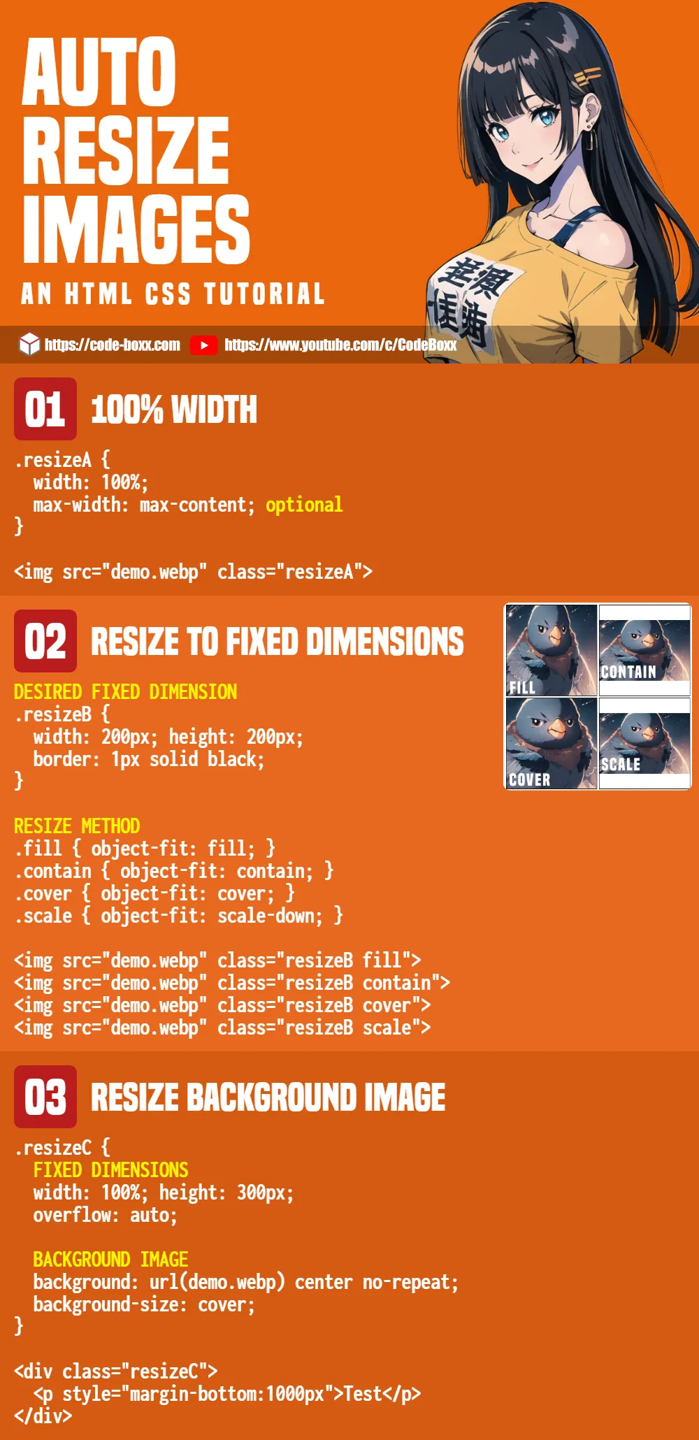
1) RESIZE IMAGE WITH 100% WIDTH
<style>
.resizeA {
  width: 100%;
  max-width: max-content; /* optional */
}
</style>

<img src="demo.webp" class="resizeA">
As in the above introduction, this is the easiest way to create an auto-resizing image.
- Setting
width: 100%on the image will make it fill the full width of its container automatically. - Images are set to
height: autoby default, so it will scale while retaining the original aspect ratio. - Lastly,
max-width: max-contentis optional – It limits the maximum resize to the image’s original width.- For example, if the image has a width of 1000 px,
width: 100%will only scale up to 1000 px. - For you guys who are new, over-stretched images will turn blurry, and this is to prevent that.
- For example, if the image has a width of 1000 px,
2) RESIZE IMAGE TO FIXED DIMENSIONS
<style>
/* (A) DESIRED FIXED DIMENSION */
.resizeB {
  width: 200px;
  height: 200px;
  border: 1px solid black;
}

/* (B) RESIZE METHOD */
.fill { object-fit: fill; }
.contain { object-fit: contain; }
.cover { object-fit: cover; }
.scale { object-fit: scale-down; }
</style>

<img src="demo.webp" class="resizeB fill">
<img src="demo.webp" class="resizeB contain">
<img src="demo.webp" class="resizeB cover">
<img src="demo.webp" class="resizeB scale">
If you want to resize the image to fit certain dimensions, object-fit is the way to go.
noneThe default if nothing is defined. No scaling or resizing.fillThis one is funky. The image is simply stretched to the specified dimensions, ignoring the original aspect ratio.containThe image will be contained within the specified dimensions, but scaled according to the original aspect ratio.coverThe image is scaled to its original aspect ratio and clipped to cover the given dimensions.scale-downThis is eithernoneorcontain. Whichever fits better.
3) RESIZE BACKGROUND IMAGE
<style>
.resizeC {
  /* (A) FIXED DIMENSIONS */
  width: 100%; height: 300px;
  overflow: auto;

  /* (B) BACKGROUND IMAGE */
  background: url(demo.webp) center no-repeat;
  background-size: cover; /* contain | cover | auto */
}
</style>

<div class="resizeC">
  <p style="margin-bottom:1000px">Test</p>
</div>
Test
To resize a background image:
url(IMAGE.JPG)Self-explanatory, image to insert into the background.centerPosition the image in the middle.no-repeatResize the image to fit the container, not repeat to fill the container.background-size: coverAs in the previous example, this will scale the image to fill the container. We can also set this tocontain.
EXTRAS
That’s all for the tutorial, and here is a small section on some extras and links that may be useful to you.
LINKS & REFERENCES
- Object Fit – MDN
- Background Image – MDN
- Responsive Full-Screen Background Image – Code Boxx
INFOGRAPHIC CHEAT SHEET
THE END
Thank you for reading, and we have come to the end. I hope that it has helped you to better understand, and if you want to share anything with this guide, please feel free to comment below. Good luck and happy coding!