Welcome to a tutorial on how to create a simple responsive image gallery with HTML and CSS. Yes, there are plenty of such “image galleries” all over the Internet. But here’s one that is fuss-free and does not use any third-party frameworks – Read on!
TABLE OF CONTENTS
 Download & Notes
 Image Gallery
 Extras
 The End
DOWNLOAD & NOTES
Here is the download link to the example code, so you don’t have to copy-paste everything.
EXAMPLE CODE DOWNLOAD
Click here to download. The example code is released under the MIT license, so feel free to build on top of it or use it in your own project.
SORRY FOR THE ADS...
But someone has to pay the bills, and sponsors are paying for it. I insist on not turning Code Boxx into a "paid scripts" business, and I don't "block people with Adblock". Every little bit of support helps.
Buy Me A Coffee Code Boxx eBooks
HTML CSS IMAGE GALLERY
All right, let us now get into the details of how the image gallery works.
TUTORIAL VIDEO
PART 1) THE HTML
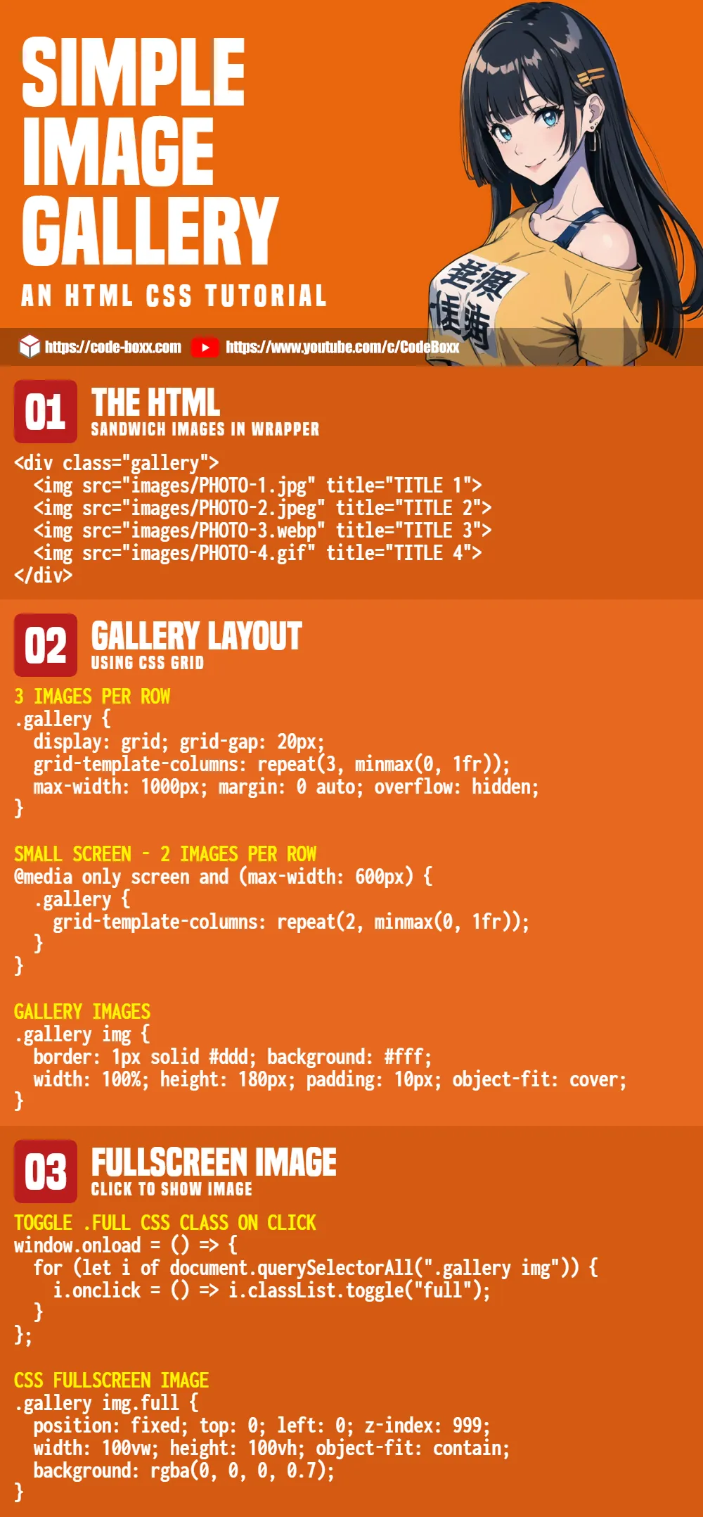
<div class="gallery">
  <img src="images/PHOTO-1.jpg" title="TITLE 1">
  <img src="images/PHOTO-2.jpeg" title="TITLE 2">
  <img src="images/PHOTO-3.webp" title="TITLE 3">
  <img src="images/PHOTO-4.gif" title="TITLE 4">
</div>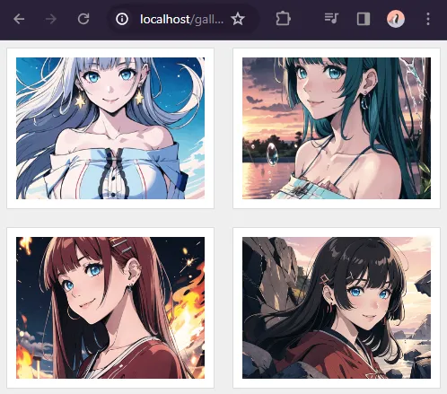
Don’t think this needs a lot of explanation. We create a <div class="gallery"> container and sandwich the images <img> inside.
P.S. The title will show the caption on mouse hover, and it is optional.
PART 2) THE CSS
2A) GALLERY CONTAINER
/* (A) WHOLE PAGE */
* {
  font-family: Arial, Helvetica, sans-serif;
  box-sizing: border-box;
}
body { background: #eee; }

/* (B) GALLERY WRAPPER */
.gallery {
  /* (B1) GRID LAYOUT - 3 IMAGES PER ROW */
  display: grid;
  grid-template-columns: repeat(3, minmax(0, 1fr));
  grid-gap: 20px;

  /* (B2) OPTIONAL WIDTH RESTRICT */
  max-width: 1000px;
  margin: 0 auto;
  overflow: hidden;
}
Some beginners may find this to be confusing, but the only functional parts are:
.gallery { display: grid }will turn<div class="gallery">in a grid layout. Captain Obvious at your service.grid-template-columns: repeat(3, minmax(0, 1fr))3 images per row, with equal width.grid-gapspacing between the images.
Yep, that’s all. The rest are pretty much cosmetics.
2B) GALLERY IMAGES
/* (C) GALLERY IMAGES */
.gallery img {
  /* (C1) DIMENSION */
  width: 100%;
  height: 180px; /* optional */
  padding: 10px;

  /* (C2) COLORS */
  border: 1px solid #ddd;
  background: #fff;

  /* (C3) IMAGE RESIZE */
  /* cover | contain | fill | scale-down */
  object-fit: cover;
}
Next, this section deals with the individual images.
- (C1) The dimensions of the images, adjust the
heightas you see fit; Removeheightto let the browser resize images automatically. - (C2) The border and background color of the “photo frame”.
- (C3)
object-fitdeals with image resizing. As above, try outcover | contain | fill | scale-downand see how the browser resizes images to fit.
2C) RESPONSIVE GALLERY
/* (D) ON SMALL SCREENS - 2 IMAGES PER ROW */
@media only screen and (max-width: 600px) {
  .gallery {
    grid-template-columns: repeat(2, minmax(0, 1fr));
  }
}
Simple responsive design. This will change to a “2 images per row” layout on smaller screens.
2D) ENLARGE ON HOVER
/* (E) OPTIONAL ZOOM ON HOVER */
.gallery img:hover {
  z-index: 9;
  transform: scale(1.3);
  /* linear | ease | ease-in | ease-out | ease-in-out */
  transition: transform ease 0.5s;
}
Finally, this is an optional “gimmick” to enlarge the image on mouse hover. Change transform: scale(1.3) to your own liking.
EXTRAS
That’s all for the tutorial, and here is a small section on some extras and links that may be useful to you.
EXTRA) CLICK TO SHOW IN FULLSCREEN
JAVASCRIPT TOGGLE CSS CLASS
window.onload = () => {
  for (let i of document.querySelectorAll(".gallery img")) {
    i.onclick = () => i.classList.toggle("full");
  }
};
This part is in the extras because it is optional – Remove these if you do not need “click to show in fullscreen”. What this snippet does is toggle a .full CSS class on the image when the user clicks on it.
CSS FULLSCREEN IMAGE
/* (F) FULLSCREEN MODE */
.gallery img.full {
  position: fixed;
  top: 0; left: 0; z-index: 999;
  width: 100vw; height: 100vh;
  object-fit: contain;
  background: rgba(0, 0, 0, 0.7);
}
.gallery img.full:hover {
  z-index: 999;
  transform: none;
}
The .full CSS class is the one that does the “actual fullscreen image”. Set the image to a fixed position, and cover the entire page.
INFOGRAPHIC CHEATSHEET
COMPATIBILITY CHECKS
- Grid Layout – CanIUse
- Object Fit – CanIUse
- Transform – CanIUse
This gallery will work on all modern “Grade A” browsers.
LINKS & REFERENCES
- Very Simple PHP Gallery – Code Boxx
THE END
Thank you for reading, and we have come to the end. I hope that it has helped you to better understand, and if you want to share anything with this guide, please feel free to comment below. Good luck and happy coding!
Thanks for taking the time to write/share this with us.
i get it very helpful thank you keep up it!!
Needed to present 8 pics, and can no longer ignore mobile. This is just what I needed, though I got rid of the grid for desktop. Thanks!
You are fantastic