Welcome to a tutorial on how to create responsive CSS squares and rectangles. It is easy to create a fixed dimension shape with HTML and CSS, but when it comes to the responsive ones, they are really not that straightforward… Or is it?
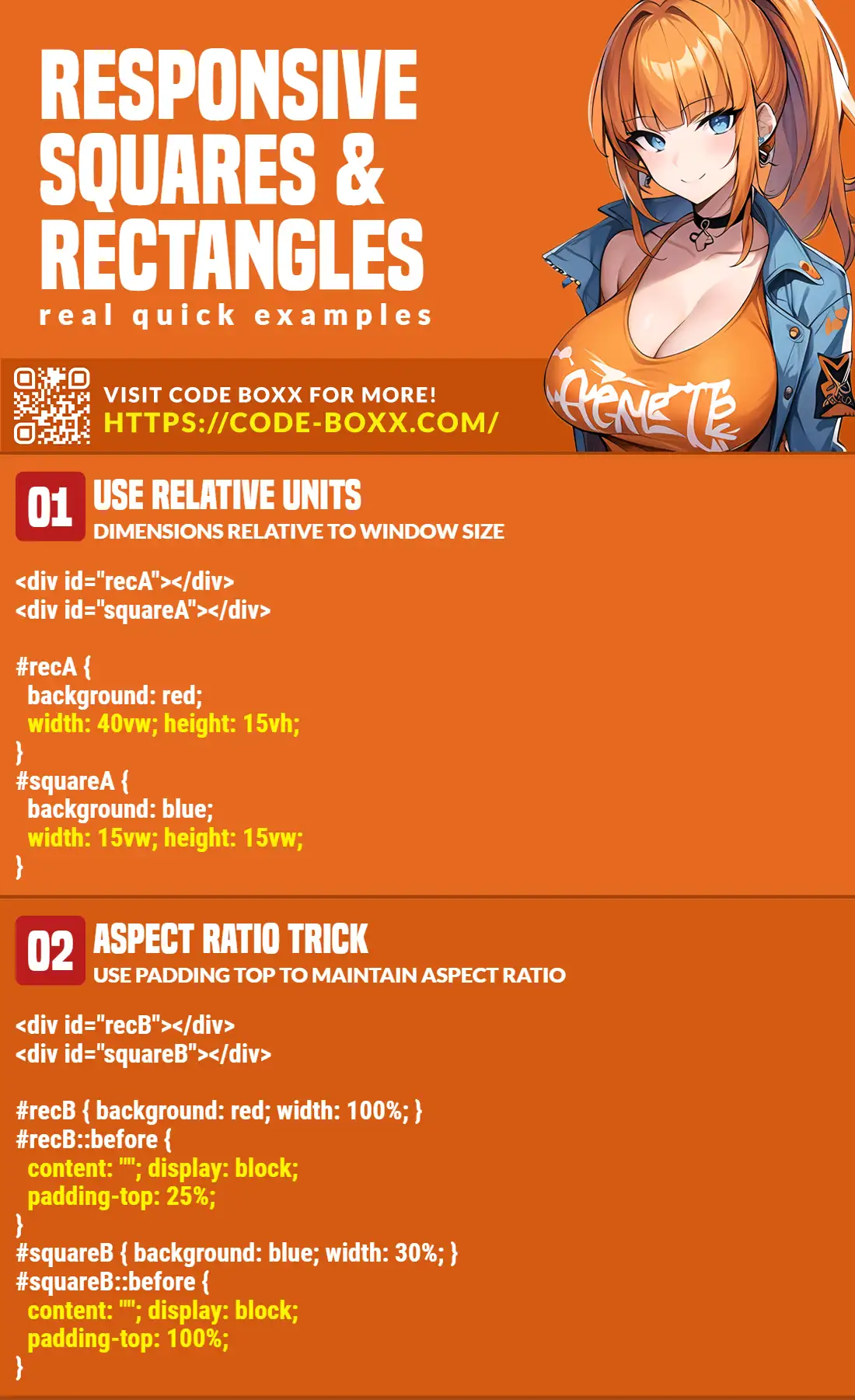
- An easy way to create a responsive rectangle in CSS is to define the width and height using relative units – Viewport width
vw, viewport heightvh, and percentage%.<div style="width:50vw; height:20vh"></div><div style="width:50%; height:25%"></div>
- For squares, just make sure that the width and height are equal
<div style="width:25vw; height:25vw"></div><div style="width:50%; height:50%"></div>
That covers the basics, but let us walk through a few more examples – Read on!
ⓘ I have included a zip file with all the source code at the start of this tutorial, so you don’t have to copy-paste everything… Or if you just want to dive straight in.
TLDR – QUICK SLIDES
[web_stories_embed url=”https://code-boxx.com/web-stories/responsive-css-squares-rectangles/” title=”Responsive CSS Squares & Rectangles” poster=”https://code-boxx.com/wp-content/uploads/2022/03/STORY-HTML-20230505.webp” width=”360″ height=”600″ align=”center”]
Fullscreen Mode – Click Here
TABLE OF CONTENTS
DOWNLOAD & NOTES

Firstly, here is the download link to the example code as promised.
QUICK NOTES
If you spot a bug, feel free to comment below. I try to answer short questions too, but it is one person versus the entire world… If you need answers urgently, please check out my list of websites to get help with programming.
EXAMPLE CODE DOWNLOAD
Click here to download the source code, I have released it under the MIT license, so feel free to build on top of it or use it in your own project.
RESPONSIVE SQUARES & RECTANGLES

All right, let us now go through the examples of responsive squares & rectangles.
1) SQUARES & RECTANGLES USING RELATIVE UNITS
HTML & CSS
<style>
#recA {
  background: #cefff9;
  width: 40vw;
  height: 15vh;
}
#squareA {
  background: #ffe3ce;
  width: 15vw;
  height: 15vw;
}
</style>

<div id="recA"></div>
<div id="squareA"></div>
THE RESULT
Go ahead, resize the window to see the shapes resize themselves.
THE EXPLANATION
Just what kind of sorcery is this!?
vwis relative to the viewport width, andvhis relative to the viewport height.- When we define
width: 40vwandheight: 15vh, the container has a size of 40% viewport width, 15% viewport height; It does not matter how the user resizes the screen, it will always maintain this ratio. - To create squares, we just have to make sure that the width and height are the same.
2) ASPECT RATIO TRICK
HTML & CSS
<style>
#recB {
  background: #eed3ff;
  width: 100%;
}
 #recB::before {
  content: "";
  display: block;
  padding-top: 25%;
}
#squareB {
  background: #d3ffee;
  width: 30%;
}
#squareB::before {
  content: "";
  display: block;
  padding-top: 100%;
}
</style>

<div id="recB"></div>
<div id="squareB"></div>
THE RESULT
HOW IT WORKS
This is an old-school CSS trick, good to keep in mind when supporting ancient browsers.
- First, set the width of the rectangle (or square) by giving it a percentage width –
#ID { width: X%; }. - The magic happens in the before pseudo-class –
#ID::before { content: ""; display: block; padding-top: X% } - How it works, is that the percentage
padding-topis calculated relative to the width of the container – We use it to control the aspect ratio.- In the above example, we have
padding-top: 25%on the rectangle. This means it has a height that is 25% of the width, an aspect ratio of 4:1. - For squares, we give the container
padding-top: 100%. Meaning, the height is equal to the width – Effectively a square, that is.
- In the above example, we have
3) ADDING & CENTERING TEXT
HTML & CSS
<style>
#recTxt, #squareTxt {
  display: flex;
  align-items: center;
  justify-content: center;
}
#recTxt {
  background: #eed3ff;
  width: 40vw;
  height: 20vh;
}
#squareTxt {
  background: #d3ffee;
  width: 15vw;
  height: 15vw;
}
</style>

<div id="recTxt">Rectangle</div>
<div id="squareTxt">Square</div>
THE RESULT
THE EXPLANATION
Once upon a time, centering a block of text involves all kinds of CSS tricks and hacks. Today, it’s as simple as using a flexible container.
- Set the container to
display: flex. - Use
align-items: centerto vertically center, andjustify-content: centerto horizontally center. Done.
4) OVERFLOW TEXT
HTML & CSS
<style>
#squareC {
  background: #fff0b7;
  width: 15vw;
  height: 15vw;
  font-size: 18px;
  overflow: auto;
}
</style>

<div id="squareC">
  <p>Lorem ipsum dolor sit amet, consectetur adipiscing elit.</p>
  <p>Integer mollis sapien sit amet odio luctus, vel mattis tortor fringilla.</p>
  <p>Praesent semper vehicula ante, quis blandit mi tristique eu. Sed vitae vehicula purus.</p>
</div>
THE RESULT
Lorem ipsum dolor sit amet, consectetur adipiscing elit.
Integer mollis sapien sit amet odio luctus, vel mattis tortor fringilla.
THE EXPLANATION
Finally, this is a small example to highlight a potential problem – If there is too much content inside a responsive container, it will “spill out” on the smaller dimensions. To prevent that, we can add overflow:auto to the box. It will result in an ugly scrollbar, but at least it’s not as ugly as spilling contents.
EXTRA BITS & LINKS

That’s all for this guide, and here is a small section on some extras and links that may be useful to you.
LINKS & REFERENCES
- How to Create a Responsive Square with CSS – Atomic Object
- How to style a div to be a responsive square? – Stack Overflow
INFOGRAPHIC CHEAT SHEET
THE END

Thank you for reading, and we have come to the end of this guide. I hope that it has helped you with your project, and if you want to share anything with this guide, please feel free to comment below. Good luck and happy coding!