Welcome to a tutorial on how to lock the screen orientation. So you have a website or web application that you wish to lock the orientation. The strange part is that native Android/iOS apps are able to do it, and the bad news is that there is not a “smart way” to do it with web pages. Well, here is a compilation of how to lock the screen orientation that I have found all over the Internet:
- Use the Javascript
screen.orientation.lock()API function. - Use CSS
transform: rotate(90 deg)on the orientation that you don’t want. - Show a “please rotate screen” message on the orientation that you don’t want.
Just how does each one of these work? Let’s walk through some examples, read on to find out!
ⓘ I have included a zip file with all the example code at the start of this tutorial, so you don’t have to copy-paste everything… Or if you just want to dive straight in.
TABLE OF CONTENTS
 Tutorial Video
DOWNLOAD & NOTES

Firstly, here is the download link to the example code as promised.
QUICK NOTES
If you spot a bug, feel free to comment below. I try to answer short questions too, but it is one person versus the entire world… If you need answers urgently, please check out my list of websites to get help with programming.
EXAMPLE CODE DOWNLOAD
Click here to download the example source code, I have released it under the MIT license, so feel free to build on top of it or use it in your own project.
ORIENTATION LOCK

All right, let us now get into the various ways to lock the orientation in Javascript and CSS.
METHOD 1) ORIENTATION LOCK API
For you guys who are looking for the “smart” way of locking the screen orientation, you are in luck but not really. There is a Javascript screen orientation API, but this API is only a working draft as at the time of writing. Meaning, it may not work on every browser.
Take extra note, the screen orientation lock API also comes with a caveat – It must be engaged in full-screen mode before the orientation can be locked.
1A) THE HTML
<h1>LOCK PORTRAIT</h1>
<input type="button" value="Portrait" onclick="lock('portrait')">
<input type="button" value="Portrait Primary" onclick="lock('portrait-primary')">
<input type="button" value="Portrait Secondary" onclick="lock('portrait-secondary')">

<h1>LOCK LANDSCAPE</h1>
<input type="button" value="Landscape" onclick="lock('landscape')">
<input type="button" value="Landscape Primary" onclick="lock('landscape-primary')">
<input type="button" value="Landscape Secondary" onclick="lock('landscape-secondary')">

<h1>UNLOCK</h1>
<input type="button" value="Unlock" onclick="unlock()">
Take a deep breath, this is just a bunch of buttons to test the various orientation lock.
1B) THE JAVASCRIPT
// (A) LOCK SCREEN ORIENTATION
function lock (orientation) {
  // (A1) GO INTO FULL SCREEN FIRST
  let de = document.documentElement;
  if (de.requestFullscreen) { de.requestFullscreen(); }
  else if (de.mozRequestFullScreen) { de.mozRequestFullScreen(); }
  else if (de.webkitRequestFullscreen) { de.webkitRequestFullscreen(); }
  else if (de.msRequestFullscreen) { de.msRequestFullscreen(); }

  // (A2) THEN LOCK ORIENTATION
  screen.orientation.lock(orientation);
}

// (B) UNLOCK SCREEN ORIENTATION
function unlock () {
  // (B1) UNLOCK FIRST
  screen.orientation.unlock();

  // (B2) THEN EXIT FULL SCREEN
  if (document.exitFullscreen) { document.exitFullscreen(); }
  else if (document.webkitExitFullscreen) { document.webkitExitFullscreen(); }
  else if (document.mozCancelFullScreen) { document.mozCancelFullScreen(); }
  else if (document.msExitFullscreen) { document.msExitFullscreen(); }
}
When it comes to locking the screen orientation using Javascript, there are only two functions that you need to know:
screen.orientation.lock(ORIENTATION)screen.orientation.unlock()
Should be pretty self-explanatory, but it irritatingly requires the web page to be in full-screen mode. Still, it may be useful for locking full-screen videos and images.
METHOD 2) THE “CSS ROTATION” TRICK
This method seems to be one of the most common solutions on the Internet. It is basically a clever little CSS trick that rotates the body 90 degrees in the orientation that you don’t want. For example, if we want to display the page in landscape, we will use CSS to rotate the screen 90 degrees when the user is in the portrait orientation.
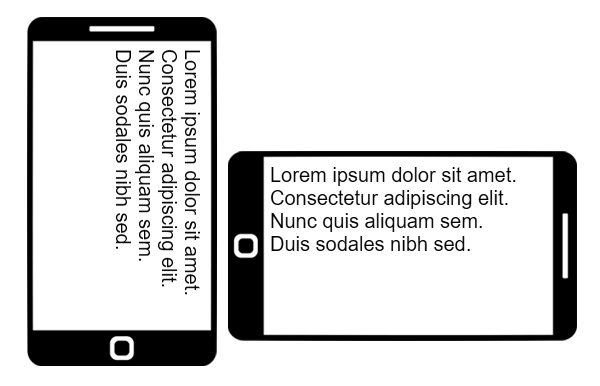
2A) THE HTML
Lorem ipsum dolor sit amet, consectetur adipiscing elit. <br>
Nunc quis aliquam sem. <br>
Duis sodales nibh sed justo posuere consequat. <br>
Ut at posuere nibh, a placerat mauris. Proin ut lobortis risus.
Just a random bunch of dummy text for testing.
2B) THE CSS
@media only screen and (orientation:portrait) {
  body {
    height: 100vw;
    transform: rotate(90deg);
  }
}
Yep, this will force the users to rotate the device to the landscape orientation or visit your website with an uncomfortable 90 degrees neck breaker… Well, this is not the most elegant way to solve the problem, but it works.
METHOD 3) ROTATE SCREEN MESSAGE
Following up with the above method, this is another way that I do not know whether to call elegant or not. It basically has 2 HTML containers – One with a “please rotate device” message and one for the main contents. So simply, show the contents on the correct orientation, and show the “rotate device” message on the wrong one.
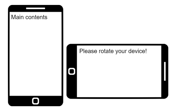
3A) THE HTML
<!-- (A) THIS WILL SHOW ON THE WRONG ORIENTATION -->
<div id="turn">
  Please rotate your device!
</div>

<!-- (B) CONTENTS AS USUAL -->
<div id="container">
  Main contents here.
</div>
3B) THE CSS
/* (A) WRONG ORIENTATION - SHOW MESSAGE HIDE CONTENT */
@media only screen and (orientation:landscape) {
  #turn { display:block; }
  #container { display:none; }
}

/* (B) CORRECT ORIENTATION - SHOW CONTENT HIDE MESSAGE */
@media only screen and (orientation:portrait) {
  #turn { display:none; }
  #container { display:block; }
}
EXTRA) FOR CORDOVA/PHONEGAP WEB APPS
<preference name="orientation" value="landscape"> If you are developing a web app using Cordova, you can laugh all the way. Because it is as easy as adding a line in the config.xml file.
EXTRA BITS & LINKS

Finally, here is a summary of the methods, and some links that may be useful to you.
THE SUMMARY
| Function | Description | Reference |
screen.orientation.lock() |
Locks the screen in the given orientation. | Click Here |
screen.orientation.unlock() |
Unlocks the orientation. | Click Here |
NODE.requestFullscreen() |
Requests for full-screen mode. | Click Here |
document.exitFullscreen() |
Exits full-screen mode. | Click Here |
| Orientation | Direction |
portrait |
 or or
Note – Tested this on Android Chrome, only locked upright. |
portrait-primary |
|
portrait-secondary |
Note – Tested this on Android Chrome, only locked upright again. |
landscape |
 or or |
landscape-primary |
|
landscape-secondary |
|
| Property / Feature | Description | Reference |
transform: rotate(DEG) |
Rotate the element. | Click Here |
orientation: portrait | landscape |
Target the screen orientation. | Click Here |
TUTORIAL VIDEO
THE CHEAT SHEET
THE END

Thank you for reading, and we have come to the end of this short tutorial. I hope it has helped you with your project. Orientation locking is still kind of rough when it comes to websites, so if you have better solutions to share, please feel free to comment below. Good luck and happy coding!
Hi, thank you for your solution. I am using method 2 in my project. It works great but I am facing a problem in Chrome when using this method.
The scrolling behaviour of all scrollable elements in my web are reversed. That means after the orientation locked by method 2, when the users drag and drop the scrollable element vertically, the element scrolls horizontaully. On the contrary, when the users drag and drop the scrollable element horizontaully, the element gots nothing changed.
Obviously, the x and y touch positions are based on the browser orientaion. And that’s opposite from the rotated HTML body.
May I ask that if you have any solution to fix this issue? I will be grateful to have your help.
CSS only rotates the element cosmetically, the page itself is still “upright”. I don’t have an “easy fix”, but you can try to flip the XY in touch/scroll events… Which is probably not a good idea. Changing the design and working without scrollbars may be the easier way out.
Thank you for your quick reply. Actually I am trying to flip the XY position in touch events.