Welcome to a tutorial on how to create a simple list grid view. Once upon a time in the Dark Ages of the Internet, we have to use all sorts of CSS hacks and fight digital dragons to transform a list into a grid. But fear not, it is pretty easy with modern HTML CSS – Read on for an example!
TABLE OF CONTENTS
 Download & Demo
 List Grid View
 Extras
 The End
DOWNLOAD & DEMO
Here is the download link to the example code, so you don’t have to copy-paste everything.
EXAMPLE CODE DOWNLOAD
Click here to download | Example on CodePen
The example code is released under the MIT license, so feel free to build on top of it or use it in your own project.
SORRY FOR THE ADS...
But someone has to pay the bills, and sponsors are paying for it. I insist on not turning Code Boxx into a "paid scripts" business, and I don't "block people with Adblock". Every little bit of support helps.
Buy Me A Coffee Code Boxx eBooks
LIST/GRID VIEW DEMO
HTML CSS LIST GRID VIEW
All right, let us now get into more details on how the list/grid view works in this section.
TUTORIAL VIDEO
PART 1) THE HTML
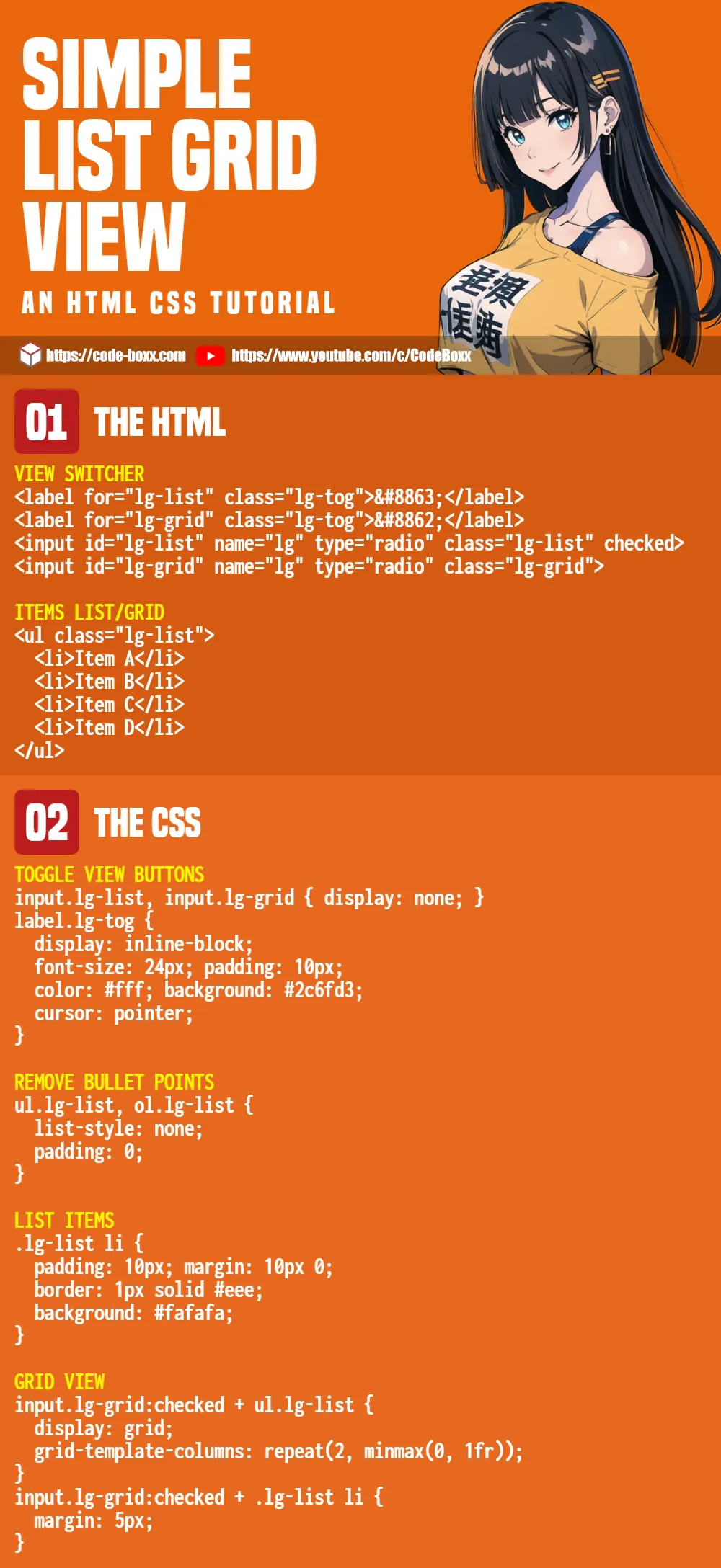
<!-- (A) VIEW SWITCHER -->
<label for="lg-list" class="lg-tog">⊟</label>
<label for="lg-grid" class="lg-tog">⊞</label>
<input id="lg-list" name="lg-tog" type="radio" class="lg-list" checked>
<input id="lg-grid" name="lg-tog" type="radio" class="lg-grid">
<!-- (B) ITEMS LIST/GRID -->
<ul class="lg-list">
<li>Item A</li>
<li>Item B</li>
<li>Item C</li>
<li>Item D</li>
</ul>- The “switch list grid” buttons. Take note of how it works – It’s a pair of labels and radio buttons.
- For the items, we will just use a regular list.
PART 2) THE CSS
/* (A) TOGGLE VIEW BUTTONS */
input.lg-list, input.lg-grid { display: none; }
label.lg-tog {
  display: inline-block;
  font-size: 24px; padding: 10px;
  color: #fff; background: #2c6fd3;
  cursor: pointer;
}

/* (B) DEFAULT - LIST VIEW */
/* (B1) REMOVE BULLET POINTS */
ul.lg-list, ol.lg-list {
  list-style: none;
  padding: 0;
}

/* (B2) LIST ITEMS */
.lg-list li {
  padding: 10px; margin: 10px 0;
  border: 1px solid #eee;
  background: #fafafa;
}

/* (C) GRID VIEW */
input.lg-grid:checked + ul.lg-list {
  display: grid;
  grid-template-columns: repeat(2, minmax(0, 1fr));
}
input.lg-grid:checked + .lg-list li {
  margin: 5px;
}- First, we deal with the list/grid toggle buttons.
- Hide the radio buttons. They will still work when we click on the label.
- Add some cosmetics on the label to make them look like buttons.
- The default – List view.
- Hide the default bullet points and indentation.
- Add some cosmetics for the list items.
- Finally, some HTML-CSS magic.
- When the grid radio button is checked, we convert the list into a grid view – 2 items per row.
EXTRAS
That’s all for this guide, and here is a small section on some extras and links that may be useful to you.
MULTIPLE LIST/GRID VIEWS
- Duplicate the entire widget.
- Just change the
idof the radio buttons. E.Gid="lg-listA"andid="lg-gridA". - Then, change the
forattribute of labels accordingly. E.G.for="lg-listA"andfor="lg-gridA".
LINKS & REFERENCES
- CSS Grid – MDN
INFOGRAPHIC CHEAT SHEET
THE END
Thank you for reading, and we have come to the end of this tutorial. I hope it has helped you to create a better project, and if you want to share anything with this guide, please feel free to comment below. Good luck and happy coding!
thank you for this article, really helped me