Welcome to a tutorial on how to keep the aspect ratio of an image in HTML and CSS. So you have placed an image on your webpage and decided to resize it a little… But the image went out of out-of-proportions and it now looks funky. Just how do we keep the aspect ratio? Let us walk through some examples in this guide – Read on!
TABLE OF CONTENTS
 Download & Notes
 Keep Aspect Ratio
 Extras
 The End
DOWNLOAD & NOTES
Here is the download link to the example code, so you don’t have to copy-paste everything.
EXAMPLE CODE DOWNLOAD
Click here to download. I have released it under the MIT license, so feel free to build on top of it or use it in your own project.
SORRY FOR THE ADS...
But someone has to pay the bills, and sponsors are paying for it. I insist on not turning Code Boxx into a "paid scripts" business, and I don't "block people with Adblock". Every little bit of support helps.
Buy Me A Coffee Code Boxx eBooks
KEEP IMAGE ASPECT RATIO
All right, let us now get into the various ways to maintain the aspect ratio of an image in HTML and CSS.
TUTORIAL VIDEO
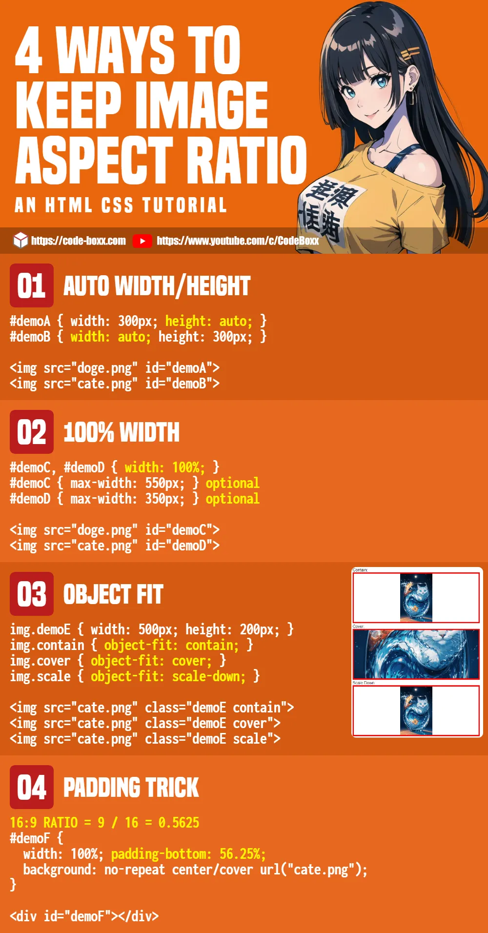
METHOD 1) AUTOMATIC WIDTH/HEIGHT
<style>
#demoA { width: 300px; height: auto; }
#demoB { width: auto; height: 300px; }
</style>

<img src="doge.png" id="demoA">
<img src="cate.png" id="demoB">
This is the easiest way to maintain the aspect ratio, and it should be self-explanatory:
- Manually define the width, then set the height to auto.
- Vice versa, define the height and set the width to auto.
METHOD 2) 100% WIDTH
<style>
#demoC, #demoD { width: 100%; }
/* optional */
#demoC { max-width: 550px; }
#demoD { max-width: 350px; }
</style>

<img src="doge.png" id="demoC">
<img src="cate.png" id="demoD">
How does one create a responsive image that scales itself to fit, while maintaining aspect ratio?
- Just set 100% width on the image.
- Optional – Limit the max width, so that it does not stretch too much.
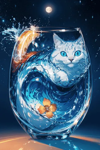
METHOD 3) OBJECT-FIT
<style>
 /* (A) FIXED IMAGE DIMENSIONS */
img.demoE {
  width: 500px;
  height: 200px;
}

/* (B) RESIZE BEHAVIOR */
img.contain { object-fit: contain; }
img.cover { object-fit: cover; }
img.scale { object-fit: scale-down; }
img.fill { object-fit: fill; }
</style>

<div>Contain:</div>
<img src="cate.png" class="demoE contain">

<div>Cover:</div>
<img src="cate.png" class="demoE cover">

<div>Scale Down:</div>
<img src="cate.png" class="demoE scale">

<div>Fill:</div>
<img src="cate.png" class="demoE fill">
What if we want an image to be contained within fixed dimensions, but scaled proportionally to the aspect ratio? Introducing object-fit.
none– The default if not defined, the image will not be resized.contain– The image will be resized to fit into the box while maintaining the aspect ratio.coverThe image will be resized to cover the entire box while maintaining the aspect ratio.scale-down– The image will be resized usingnoneorcontain, whichever gives a smaller image.fill– You will probably not want to use this one, it stretches the image to fit the box, disregarding the aspect ratio.
METHOD 4) PADDING TRICK
<style>
#demoF {
  width: 100%;
  padding-bottom: 56.25%; /* 16:9 ratio = 9 / 16 = 0.5625 */
  background: no-repeat center/cover url("cate.png");
}
</style>

<div>This will maintain 16:9 ratio:</div>
<div id="demoF"></div>Just what kind of sorcery is this? This final method is an old trick that uses padding to maintain the aspect ratio.
- First, create a
<div>container withwidth: 100%. As above, this will scale to fit. - The
padding-bottomis calculated relative to the width of the box, so:padding-bottom: 100%will create a square.padding-bottom: 50%will have a height that is half of the current width.padding-bottom: 25%will have a height that is a quarter of the current width.- To maintain a ratio of 16:9, we set
16 / 9 = 56.25%.
- Lastly, set the image as the background, centered in the container.
EXTRAS
That’s all for this tutorial, and here is a small section on some extras and links that may be useful to you.
INFOGRAPHIC CHEATSHEET
LINKS & REFERENCES
- CSS Object Fit – MDN
- Aspect Ratio Boxes – CSS Tricks
- Rounded Images In HTML CSS – Code Boxx
- Clip & Crop Images In HTML CSS – Code Boxx
- Auto-Resize Images In HTML CSS – Code Boxx
THE END
Thank you for reading, and we have come to the end of this guide. I hope that it has helped you with your project, and if you want to share anything with this guide, please feel free to comment below. Good luck and happy coding!