Welcome to a quick on how to create rounded images in HTML and CSS. So you have a website and want to display images in a circular format? Thankfully, it is easy to do so with modern CSS.
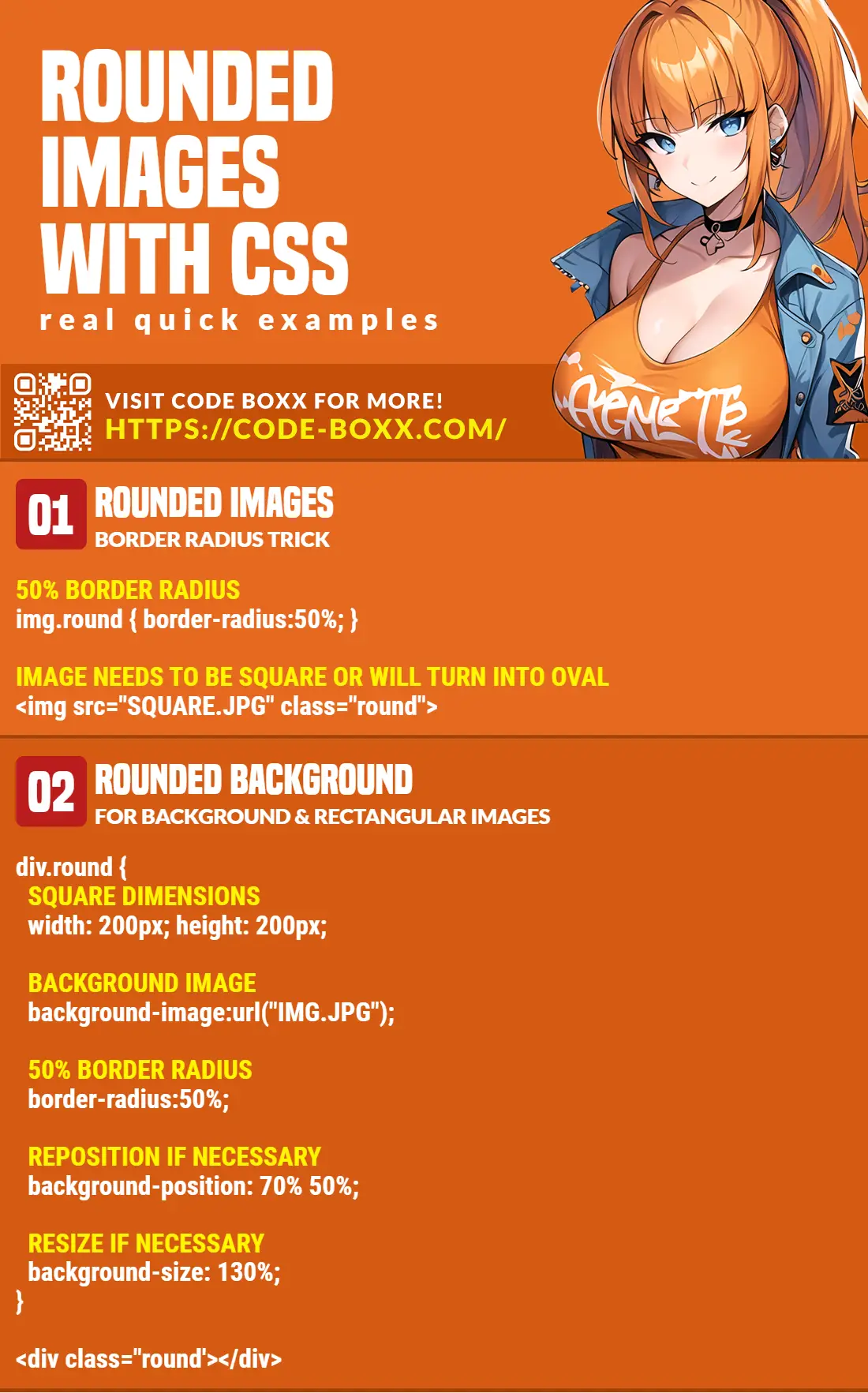
There are 2 quick ways to create rounded images in CSS.
- For square images, simply add a 50% border radius.
<img src="SQUARE.JPG" style="border-radius: 50%">
- For images that are rectangular, set it as the background image of a square
<div>then add the 50% border radius.<div id="demo"></div>#demo { width: 200px; height: 200px; }#demo { background: url("BG.JPG"); border-radius: 50%; }
That about covers the essentials, but let us walk through some examples in this guide. Read on!
ⓘ I have included a zip file with all the example source code at the start of this tutorial, so you don’t have to copy-paste everything… Or if you just want to dive straight in.
TABLE OF CONTENTS
 Tutorial Video
DOWNLOAD & NOTES

Firstly, here is the download link to the example code as promised.
QUICK NOTES
If you spot a bug, feel free to comment below. I try to answer short questions too, but it is one person versus the entire world… If you need answers urgently, please check out my list of websites to get help with programming.
EXAMPLE CODE DOWNLOAD
Click here to download the source code, I have released it under the MIT license, so feel free to build on top of it or use it in your own project.
CSS ROUNDED IMAGES

All right, let us now get into the examples of creating rounded images in HTML and CSS.
EXAMPLE 1) BASIC ROUNDED IMAGE
1A) THE HTML & CSS
<style>
.roundimg {
  border-radius: 50%;
}
</style>

<img src="wamen-square.webp">
<img src="wamen-square.webp" class="roundimg">
Yep, it’s that simple. As some of you guys already know, we normally use border-radius to create rounded corners… So when we do a border-radius: 50%, it literally turns the container (or image) into a circle.
1B) MUST BE A SQUARE IMAGE!

Take extra note though – The 50% border radius trick will only work on square images. If we apply it to a rectangular image, it turns into an oval instead.
EXAMPLE 2) ROUNDED BACKGROUND IMAGE
2A) BASIC ROUNDED BACKGROUND IMAGE
<style>
.roundedA {
  width: 200px;
  height: 200px;
  border-radius: 50%;
  background-image: url("zman.webp");
}
</style>

<img src="zman.webp">
<div class="rounded"></div>
To deal with rectangle and background images, we use the same strategy as above – But we apply it to a <div> instead.
width: 200px; height: 200px; border-radius: 50%;will turn the<div>into a circular container.- The image is then “added” using
background-image: url("zman.webp").
2B) POSITIONING THE BACKGROUND IMAGE
<style>
.roundedB {
  width: 200px;
  height: 200px;
  border-radius: 50%;
  background-image: url("zman.webp");
  background-position: 130% 50%;
  background-size: 130%;
}
</style>

<div class="roundedB"></div>
As you may have also noticed – CSS will, by default, place the top left side of the image as the background. It will be “cut off” in an awkward manner if the image is off-centered. To fix that, we can manually reposition it using background-position, and also, resize it using background-size.
2C) MULTIPLE BACKGROUND IMAGES
<style>
.roundedC {
  width: 200px;
  height: 200px;
  border-radius: 50%;
}
</style>

<div class="roundedC"
     style="background-image: url('wamen.webp');
            background-position: -10% 50%;
            background-size: cover"></div>
<div class="roundedC"
     style="background-image: url('zman.webp');
            background-position: 1300% 50%;
            background-size: 130%;"></div>
Finally, what happens if we have to deal with multiple round images? As a small extra, I will recommend putting all the “basics” in a .rounded CSS class and manually specify the background-image in the inline style. Yep… This is kind of painful, but it’s better than manually editing every image.
EXTRA BITS & LINKS

That’s all for this guide, and here is a small section on some extras and links that may be useful to you.
LINKS & REFERENCES
- Background Image – MDN
- Border Radius – MDN
- Background Position – MDN
- Background Size – MDN
TUTORIAL VIDEO
INFOGRAPHIC CHEAT SHEET
THE END

Thank you for reading, and we have come to the end of this guide. I hope that it has helped you with your project, and if you want to share anything with this guide, please feel free to comment below. Good luck and happy coding!