Welcome to a quick tutorial on how to keep HTML elements on the same line. So you are trying to create a “row of horizontal content”? Maybe a row of buttons, slides, pictures, or various different items.
One of the easiest ways to keep elements on the same line is to create a flexible container. For example:
.flex { display : flex }<div class="flex"> <p>1</p> <span>2</span> <img src="3.jpg"> </div>
But there are more ways to line things up. Let us walk through some examples – Read on to find out!
ⓘ I have included a zip file with all the example source code at the start of this tutorial, so you don’t have to copy-paste everything… Or if you just want to dive straight in.
TABLE OF CONTENTS
DOWNLOAD & NOTES

Firstly, here is the download link to the example code as promised.
QUICK NOTES
If you spot a bug, feel free to comment below. I try to answer short questions too, but it is one person versus the entire world… If you need answers urgently, please check out my list of websites to get help with programming.
EXAMPLE CODE DOWNLOAD
Click here to download the source code, I have released it under the MIT license, so feel free to build on top of it or use it in your own project.
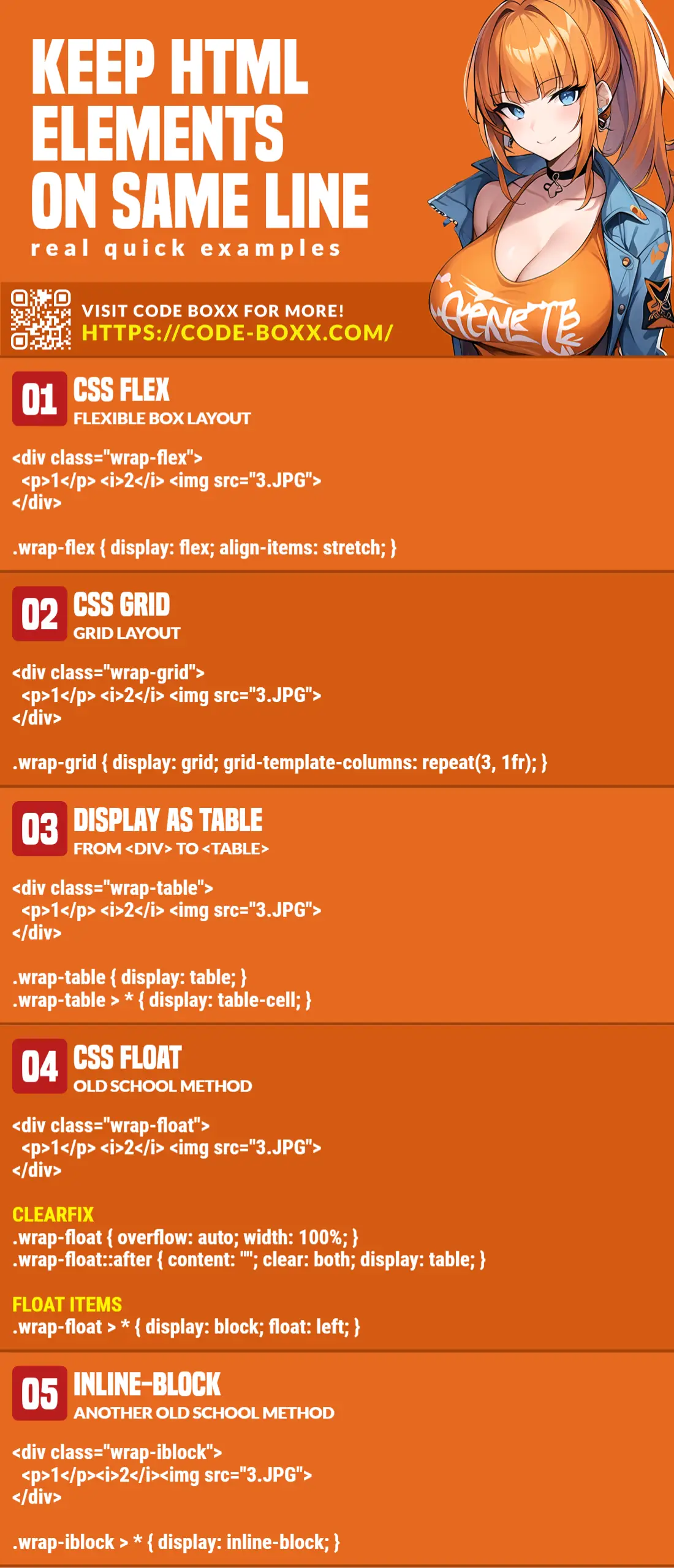
ELEMENTS ON THE SAME LINE

All right, let us now get into the ways and examples of how to line the elements up in a line.
METHOD 1) FLEXIBLE BOX
<style>
/* (A) FLEX CONTAINER */
.wrap-flex {
  display: flex;
  align-items: stretch; /* baseline | center | stretch */
}

/* (B) NOT REALLY IMPORTANT - COSMETICS */
.wrap-flex > * {
  width: 33.3%;
  padding: 10px; margin: 0;
  border: 1px solid red;
}
</style>

<!-- (C) THE HTML -->
<div class="wrap-flex">
  <p>Another craft hires a related tutor.</p>
  <span>An ice shares a deposit.</span>
  <img src="owl.png">
</div>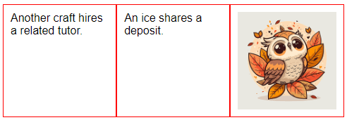
As in the above introduction, the CSS flexible box display: flex is one of the fastest and easiest ways to lay items out in a horizontal row. We can control it in many ways too:
- Add
flex-wrap : wrapto allow the items to break into new rows. - Set
align-items: baseline | center | stretchto vertically align the items to your liking. - To horizontally align the items, add
justify-content: center.
Yes, there’s still a lot more to the flexible box. So I will just leave a link in the extras section below if you want to learn more.
METHOD 2) CSS GRID
<style>
/* (A) GRID LAYOUT - 3 EQUAL COLUMNS */
.wrap-grid {
  display: grid;
  grid-template-columns: repeat(3, 1fr); /* equal items */
}

/* (B) NOT REALLY IMPORTANT - COSMETICS */
.wrap-grid > * {
  height: 100%;
  padding: 10px; margin: 0;
  border: 1px solid green;
}
.wrap-grid img { width: 100%; }
</style>

<!-- (C) THE HTML -->
<div class="wrap-grid">
  <p>Another craft hires a related tutor.</p>
  <span>An ice shares a deposit.</span>
  <img src="owl.png">
</div>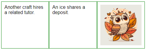
The grid layout is another convenience of modern CSS.
- Just set the
<div>container todisplay: grid. - Define the columns with
grid-template-columnsand that’s it. - In this example,
repeat(3, 1fr)will set 3 equal columns. But you can define specific dimensions for each column. E.G.100px, 200px, 150px.
METHOD 3) DISPLAY AS A TABLE
<style>
/* (A) LAYOUT CONTAINER AS A TABLE */
.wrap-table { display: table; }

/* (B) "CONVERT" ITEMS TO TABLE CELLS */
.wrap-table > * {
  display: table-cell;
  vertical-align: middle;
}

/* (C) NOT REALLY IMPORTANT - COSMETICS */
.wrap-table > * {
  width: 33.3%;
  padding: 10px; margin: 0;
  border: 1px solid blue;
}
.wrap-table img { width: 100%; }
</style>

<!-- (D) THE HTML -->
<div class="wrap-table">
  <p>Another craft hires a related tutor.</p>
  <span>An ice shares a deposit.</span>
  <img src="owl.png">
</div>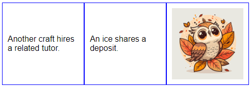
This is a rather funky method, but it works.
- Set the
<div>wrapper to display as a table –display: table - Then, set all the items inside
.wrap-table > *to show as table cells –display: table-cell.
METHOD 4) FLOAT
<style>
/* (A) CLEARFIX CONTAINER */
.wrap-float {
  overflow: auto;
  width: 100%;
}
.wrap-float::after {
  content: "";
  clear: both;
  display: table;
}

/* (B) FLOAT ITEMS */
.wrap-float > * {
  display: block;
  float: left;
}

/* (C) NOT REALLY IMPORTANT - COSMETICS */
.wrap-float > * {
  width: 33.3%;
  padding: 10px; margin: 0;
  border: 1px solid cyan;
}
</style>

<!-- (D) THE HTML -->
<div class="wrap-float">
  <p>Another craft hires a related tutor.</p>
  <span>An ice shares a deposit.</span>
  <img src="owl.png">
</div>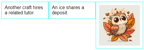
Next, we have an old-school method. The basic idea is actually pretty simple, but it is plagued with some underlying CSS issues.
- (B) The main mechanism here is to set all the items
.wrap-float > *tofloat: left. That’s all, but when all the items are floating, the container itself will “collapse”. This will cause the layout below to be destroyed. - (A) To fix this problem, we have to use an old CSS trick called a “clear fix” to help the container “retain its shape”.
There are no easy ways to vertically align floating items, unlike flex and grid… You will need to use some sort of “CSS hack”, and we will not open that can of worms.
METHOD 5) INLINE-BLOCK
<style>
/* (A) ALL ITEMS TO INLINE-BLOCK */
.wrap-iblock > * { display: inline-block; }
/* (B) NOT REALLY IMPORTANT - COSMETICS */
.wrap-iblock > * {
  width: 33.3%;
  padding: 10px; margin: 0;
  border: 1px solid magenta;
}
</style>

<!-- (C) THE HTML -->
<div class="wrap-iblock">
  <p>Another craft hires a related tutor.</p><!--
  --><span>An ice shares a deposit.</span><!--
  --><img src="owl.png">
</div>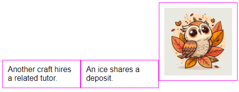
Finally, we have yet another traditional method.
- Just set all the items to
display: inline-block. But there is a “bug” withinline-block, the white space and line break in-between the items will show up. - This is why we add that dummy comment
<!-- -->between each item to prevent unnecessary spacing.
Once again, there are no easy ways to do vertical alignment of the items using inline-block.
EXTRA BITS & LINKS

That’s all for this tutorial, and here is a small section on some extras and links that may be useful to you.
WHICH IS THE BEST METHOD?
Personally, I will stick with the modern CSS flex or grid. At the time of writing, they are already well supported globally – Even on older devices… But if you have to support the ancient Internet Exploders, fallback to inline-block or float.
LINKS & REFERENCES
- A Complete Guide to Flexbox – CSS Tricks
- A Complete Guide to Grid – CSS Tricks
- Float – MDN
- Inline Block – Learn Layout
INFOGRAPHIC CHEAT SHEET
THE END

Thank you for reading, and we have come to the end of this guide. I hope that it has helped you with your project, and if you want to share anything with this guide, please feel free to comment below. Good luck and happy coding!
download link is broken to the zip fle, loving this site for some very easy and fun tutorials, thank you
Thanks for reporting – Tutorial updated.