Welcome to a tutorial on how to disable pinch zoom with the HTML viewport meta tag. Having some trouble with your website design on mobile devices? Is it zooming in too much, or zooming out too far? Well, here’s a quick fix.
<meta name="viewport" content="width=device-width, initial-scale=1.0, maximum-scale=1.0, user-scalable=no"> to the <head> section.But just what is this viewport meta thing, and what does it do? Let us explore more of that in this guide, read on to find out!
ⓘ I have included a zip file with all the example source code at the start of this tutorial, so you don’t have to copy-paste everything… Or if you just want to dive straight in.
TLDR – QUICK SLIDES
[web_stories_embed url=”https://code-boxx.com/web-stories/how-to-disable-pinch-zoom-in-html/” title=”Disable Pinch Zoom In HTML” poster=”https://code-boxx.com/wp-content/uploads/2022/03/STORY-HTML-20230505.webp” width=”360″ height=”600″ align=”center”]
Fullscreen Mode – Click Here
TABLE OF CONTENTS
DOWNLOAD & NOTES

Firstly, here is the download link to the example code as promised.
QUICK NOTES
If you spot a bug, feel free to comment below. I try to answer short questions too, but it is one person versus the entire world… If you need answers urgently, please check out my list of websites to get help with programming.
EXAMPLE CODE DOWNLOAD
Click here to download the source code, I have released it under the MIT license, so feel free to build on top of it or use it in your own project.
SCALING & VIEWPORT

So what’s up with the mobile browsers? Why did they intentionally break websites by allowing zoom? This section will explain the mystery and walk through some examples.
WHAT IS A VIEWPORT?
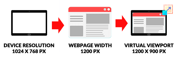
Sadly, a number of websites are still not made for small-screen mobile devices. In order to make these non-mobile-friendly websites look as good as possible, the only way is to scale them to fit onto the small screen. The mechanism behind this “scale-to-fit” is called a viewport, which is a virtual screen size that the web browser creates to fit websites in. For example:
- The device itself only has a resolution of 1024 X 768 pixels, but the website is 1200 pixels in width.
- In order to fit the website onto the small screen, the browser will create a viewport that is 1200 X 900 pixels in resolution.
- The browser may also scale the text and contents to maintain good legibility.
1) VIEWPORT BASICS
<!DOCTYPE html>
<html>
  <head>
    <title>Viewport Meta Basics</title>
    <meta name="viewport" content="width=device-width, initial-scale=1.0">
  </head>
  <body>
    <p>This viewport has the same number of pixels as the device, and it is initially scaled at 1:1.</p>
  </body>
</html>
Now that you know what the viewport is, let us start from the basics of the viewport meta tag.
widthis obviously used to set the width of the viewport. In this example, it is set to the native width of the devicedevice-width.- There is also the corresponding
heightanddevice-height, but browsers will automatically maintain the aspect ratio even if we omit it. - As some of you sharp code ninjas may have guessed,
initial-scaleis used to control the level of scaling when the page is first loaded. A largerinitial-scalewill mean “more zoomed in”. For example,initial-scale=2.0will mean 2X zoomed-in.
Lastly, please take note that screen resolution for today’s mobile devices is quite crazy, a small 6″ screen can be full HD or 2K. So even at initial-scale=1.0, the browser is already doing some automatic scaling to maintain the legibility of the website. I.E. It does not equate to exact pixels, but “what the browser deems to be the best fit”.
2) DISABLE ZOOM WITH META VIEWPORT
<!DOCTYPYE html>
<html>
  <head>
    <title>No Zoom Demo</title>
    <meta name="viewport" content="width=device-width, initial-scale=1.0, maximum-scale=1.0, user-scalable=no">
  </head>
  <body>
    <p>THOU SHALT NOT ZOOM!</p>
  </body>
</html>
The problem with the above example is that the user can pretty much pinch-zoom in and out to however much the device allows. To limit the zoom:
maximum-scalewill control how much the users can zoom in.minimum-scalewill control how much the users can zoom out.- Setting
width=device-widthandmaximum-scale=1.0pretty much already fixed it to “no-zoom”; Theminimum-scalewill be thedevice-widthby default… You add anotherminimum-scale=1.0if you like. user-scalable=nowill further enforce that the users cannot pinch zoom.
3) ALLOW ZOOM IN, NOT OUT.
<!DOCTYPE html>
<html>
  <head>
    <title>Zoom Limitation Demo</title>
    <meta name="viewport" content="width=device-width, initial-scale=1.0, maximum-scale=1.5">
  </head>
  <body>
    <div style="background: #ffe5e0; width: 100px; height: 100px;">
      Zoom is allowed up to 1.5X.
    </div>
  </body>
</html>
Congratulations, code ninja. You now know how to stop people from zooming, but there are also some considerations that you have to make. Not all people have perfect eyesight, and not everyone has big enough screens to display fonts in a legible manner. Sometimes, it is still better to allow a little wiggle room for zooming in.
EXTRA BITS & LINKS

That’s all for this project, and here is a small section on some extras and links that may be useful to you.
SUMMARY
- Use
<meta name="viewport" content="width=device-width, initial-scale=1.0">to set an initial scale of 1:1, allow users to zoom in-and-out. - Use
<meta name="viewport" content="width=device-width, initial-scale=1.0, maximum-scale=1.0, user-scalable=no">to disable pinch zoom. - Finally,
<meta name="viewport" content="width=device-width, initial-scale=1.0, maximum-scale=1.5">allows some space for zooming in.
LINKS & REFERENCES
- Viewport Meta Tag – MDN
- Responsive Design Building Blocks – MDN
INFOGRAPHIC CHEATSHEET
THE END

Thank you for reading, and we have come to the end of this guide. I hope that it has helped you with your project, and if you want to share anything with this guide, please feel free to comment below. Good luck and happy coding!
you do know this doesn’t work anymore right?
Didn’t know. I only tested and verified the viewport meta tag to be working on Android 8 + Mobile Chrome 88.0.4324.181 + Mobile Firefox 85.1.3 + Mi Browser + Brave Browser. Mobile Opera is the only NOPE. This has been stuck as a working draft for donkey years, so don’t expect 100% support – https://www.w3.org/TR/css-device-adapt/#viewport-meta
P.S. The meta viewport tag originated from Apple, it will be blasphemy if it doesn’t work on mobile Safari.
This has to be one of the more annoying things that websites do. If I am zooming it is because I’m trying to see something better. Disabling this useful feature can make a site become a site to avoid on mobile devices. My two cents.
Exactly why there is an example on allowing zoom in, not out. That still kind of misses the point though – The importance here is actually good responsive design, so users don’t even have to zoom.