Welcome to a tutorial on how to create simple arrows and animate them using pure CSS only. Want to add an arrow icon to a block of text? Create an “arrow button”? Or add an arrow to a menu item?
The easiest way to attach an arrow is to use HTML symbols and CSS content.
.arrow::before { content: "\2192" }<div class="arrow">Right Arrow</div><p>Right Arrow <i class="arrow"></i></p>
That covers the quick basics, but read on if you need more examples!
ⓘ I have included a zip file with all the source code at the start of this tutorial, so you don’t have to copy-paste everything… Or if you just want to dive straight in.
TLDR – QUICK SLIDES
[web_stories_embed url=”https://code-boxx.com/web-stories/css-arrow/” title=”Simple CSS-Only Arrow” poster=”https://code-boxx.com/wp-content/uploads/2022/03/STORY-HTML-20230505.webp” width=”360″ height=”600″ align=”center”]
Fullscreen Mode – Click Here
TABLE OF CONTENTS
DOWNLOAD & NOTES

Firstly, here is the download link to the example code as promised.
QUICK NOTES
If you spot a bug, feel free to comment below. I try to answer short questions too, but it is one person versus the entire world… If you need answers urgently, please check out my list of websites to get help with programming.
EXAMPLE CODE DOWNLOAD
Click here to download all the example source code, I have released it under the MIT license, so feel free to build on top of it or use it in your own project.
CSS ARROWS
All right, let us now get into the examples of creating arrows with pure CSS only.
1) BASIC ARROWS
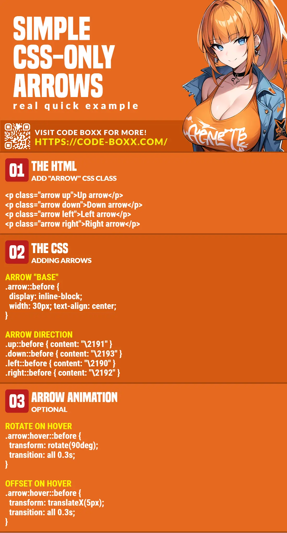
1A) THE HTML
<p class="arrow up">Up arrow</p>
<p class="arrow down">Down arrow</p>
<p class="arrow left">Left arrow</p>
<p class="arrow right">Right arrow</p>
1B) THE CSS
/* (A) ARROW "BASE" */
.arrow::before {
  display: inline-block;
  width: 30px;
  text-align: center;
  font-size: 16px;
}

/* (B) ARROW DIRECTION */
.up::before { content: "\2191" }
.down::before { content: "\2193" }
.left::before { content: "\2190" }
.right::before { content: "\2192" }
1C) THE RESULT
Up arrow
Down arrow
Left arrow
Right arrow
- The
::beforepseudo-class is probably confusing for beginners. Fear not, it is very simply<p>[::BEFORE IS HERE] CONTENT [::AFTER IS HERE]</p>. \2191is the hex code for the “up arrow” HTML symbol. Check out this link for more arrow symbols..up::before { content: "\2191" }– For allclass="up"elements, attach an HTML up arrow symbol before the actual content.
Finally, here are a few beginner questions that I can foresee people asking.
- To create an arrow button, just use the HTML code directly. No CSS is required.
<button>↑</button> - Arrow only without text –
<i class="arrow up"></i> - Bigger arrows – Just change the
font-sizeaccordingly. The arrow is literally text,colorandfont-weightwill work too. - Place the arrow on the right side.
- Use
::afterinstead of::before - Or
<p>Arrow <i class="arrow up"></i></p>
- Use
2) ARROW ANIMATION (ON HOVER)
2A) THE HTML
<p class="arrow right rotate">Hover to rotate</p>
<p class="arrow right offset">Hover to offset</p>
2B) THE CSS
/* (A) ROTATE ON HOVER */
.arrow.rotate:hover::before {
  color: red;
  transform: rotate(90deg);
  transition: all 0.3s;
}

/* (B) OFFSET ON HOVER */
.arrow.offset:hover::before {
  color: red;
  transform: translateX(5px);
  transition: all 0.3s;
}
2C) THE RESULT
Hover to rotate
Hover to offset
Some of you smart code ninjas may be thinking – “Hey, we can just do a <p>ARROW SYMBOL CODE</p>. Why all the dumb CSS sh1t?”. Well, here’s the answer, to do CSS animation.
3) ARROW ANIMATION (AUTOMATIC)
3A) THE HTML
<p class="arrow right offsetr">Animated Arrow</p>
3B) THE CSS
@keyframes offsetr {
  from { transform: translateX(-5px); }
  to { transform: translateX(5px); }
}

.offsetr::before {
  animation-name: offsetr;
  animation-duration: 0.5s;
  animation-iteration-count: infinite;
  animation-direction: alternate;
}
3C) THE RESULT
Animated Arrow
Need the arrow to be “permanently animated”?
- Define your own set of
@keyframesfirst, this is how you want to animate the arrow. In this simple example, we will just move the arrow left and right. - Attach the keyframes to the arrow –
animation-name: offsetr. - Lastly, make the animation run infinitely –
animation-iteration-count: infinite.
EXTRA BITS & LINKS

That’s all for the tutorial, and here is a small section on some extras and links that may be useful to you.
COMPATIBILITY CHECKS
- CSS Animation – CanIUse
- CSS Keyframes – CanIUse
- CSS 2D Transform – CanIUse
CSS animation is nothing new now, it is generally well-supported in all modern browsers.
LINKS & REFERENCES
- Using CSS animations – MDN
- Before Pseudo-class – MDN
- HTML Arrow Symbols – Toptal
INFOGRAPHIC CHEAT SHEET
THE END

Thank you for reading, and we have come to the end. I hope that it has helped you to better understand, and if you want to share anything with this guide, please feel free to comment below. Good luck and happy coding!