So, you are trying to create a blinking text and/or background in your project? First, stop using <blink> that everyone else is recommending – The HTML blink tag is deprecated at the time of writing.
A simple modern way to create a blink effect in HTML CSS is to create an animation that toggles the visibility.
@keyframes invisible { 100% { visibility:none; } }.blink { animation: invisible 1s steps(2, start) infinite; }<div class="blink">This will blink.</div>
Yep, that’s all. Read on if you need an actual example!
TABLE OF CONTENTS
 Download & Notes
 HTML CSS Blink
 Extras
 The End
DOWNLOAD & NOTES
Here is the download link to the example code, so you don’t have to copy-paste everything.
EXAMPLE CODE DOWNLOAD
Click here to download | Example on CodePen
The example code is released under the MIT license, so feel free to build on top of it or use it in your own project.
SORRY FOR THE ADS...
But someone has to pay the bills, and sponsors are paying for it. I insist on not turning Code Boxx into a "paid scripts" business, and I don't "block people with Adblock". Every little bit of support helps.
Buy Me A Coffee Code Boxx eBooks
BLINKING EFFECT IN HTML CSS
All right, let us now get into some examples of creating blinking animations in HTML and CSS.
TUTORIAL VIDEO
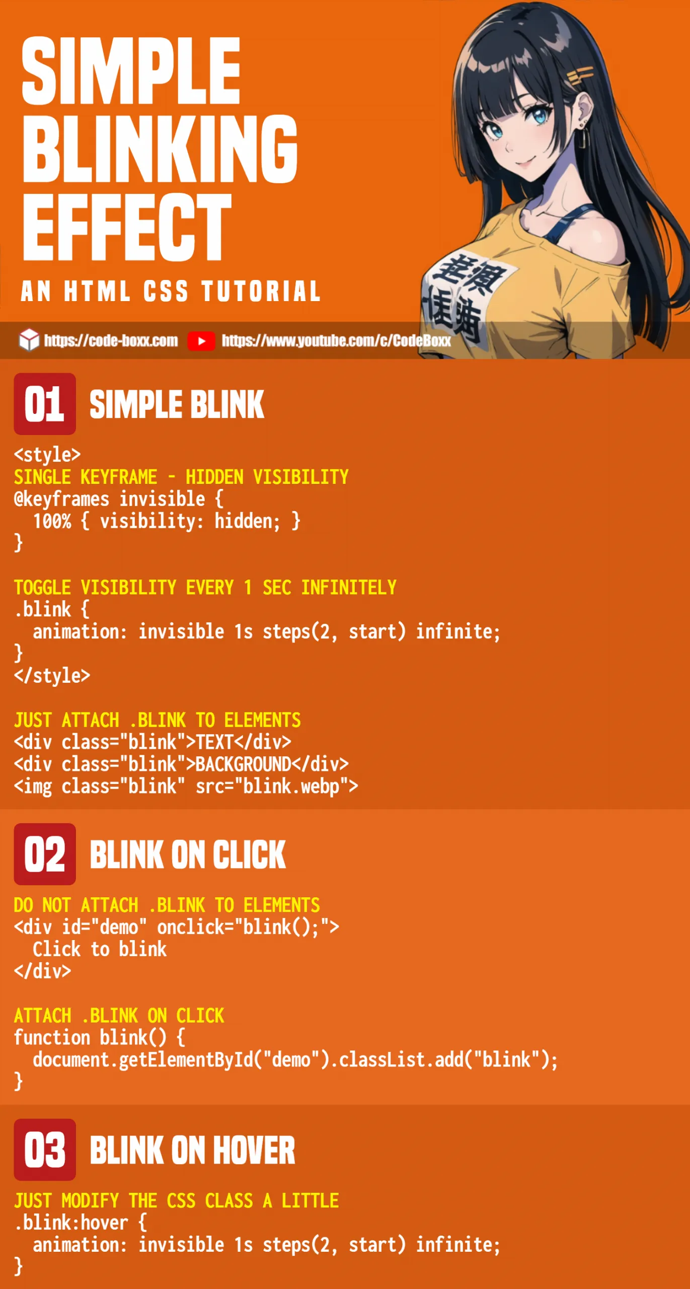
BLINK BY TOGGLING THE VISIBILITY
<style>
/* (A) BLINK ANIMATION */
@keyframes invisible {
  100% { visibility: hidden; }
}
.blink { animation: invisible 1s steps(2, start) infinite; }
</style>

<!-- (B) ATTACH TO ELEMENTS -->
<div id="demoA" class="blink">TEXT</div>
<div id="demoB" class="blink">BACKGROUND</div>
<img class="blink" src="blink.webp">
- First, we define a set of
@keyframescalledinvisible… It pretty much just togglesvisibility: hidden. - Then, attach the
invisiblekeyframes to.blinkCSS class. - The CSS class should be self-explanatory even if you have not touched on CSS animation – Toggle
visibility: hiddenevery 1 second infinitely. - Lastly, just add
class="blink"on any element that you want to blink.
BLINK ON CLICK
<style>
/* (A) BLINK ANIMATION */
@keyframes invisible {
  100% { visibility: hidden; }
}
.blink { animation: invisible 1s steps(2, start); }
</style>

<script>
// (B) JS TO ATTACH BLINK CSS CLASS
function blink () {
  var target = document.getElementById("demoD");
  target.onanimationend = () => target.classList.remove("blink");
  target.classList.add("blink");
}
</script>

<!-- (C) CLICK TO BLINK -->
<div id="demoD" onclick="blink()">
  Click to blink.
</div>If you want to “blink on click”, the mechanics are pretty much the same with minor changes:
- We have removed
infinite, so it will only blink once. - If you want to blink
Ntimes, changeinfinitetoN. For example,invisible 1s steps(2, start) 3will blink thrice. - Lastly, attach
.blinkto the element only on click.
EXTRAS
That’s all for the scripts, and here are a few small extras that you may find useful.
BLINK ON MOUSE HOVER
#demoD:hover { animation: invisible 1s steps(2, start) infinite; }A quick one for the beginners.
LINKS & REFERENCES
- CSS Keyframes – MDN
- CSS Animations – MDN
INFOGRAPHIC CHEAT SHEET
THE END
Thank you for reading, and we have come to the end of this short tutorial. I hope that it has given you a few ideas on how to create a blinking effect in CSS, and if you have anything to add to this guide, please feel free to comment below. Good luck and happy coding!