Welcome to a quick tutorial on how to create blurred text in HTML CSS. So you want to add some effects and blur a block of text?
The easiest way to create a block of blurred text is to use the CSS blur filter – <p style="filter: blur(5px);">BLUR</p>
Yes, the dark days of the Internet are over, and there are more ways to “create blur”. Read on for more examples!
TABLE OF CONTENTS
 Download & Notes
 CSS Text Blur
 Extras
 The End
DOWNLOAD & NOTES
Here is the download link to the example code, so you don’t have to copy-paste everything.
EXAMPLE CODE DOWNLOAD
Click here to download. I have released it under the MIT license, so feel free to build on top of it or use it in your own project.
SORRY FOR THE ADS...
But someone has to pay the bills, and sponsors are paying for it. I insist on not turning Code Boxx into a "paid scripts" business, and I don't "block people with Adblock". Every little bit of support helps.
Buy Me A Coffee Code Boxx eBooks
HTML CSS TEXT BLUR
With that, let us now get into the various ways and examples to create blurred text in HTML CSS.
TUTORIAL VIDEO
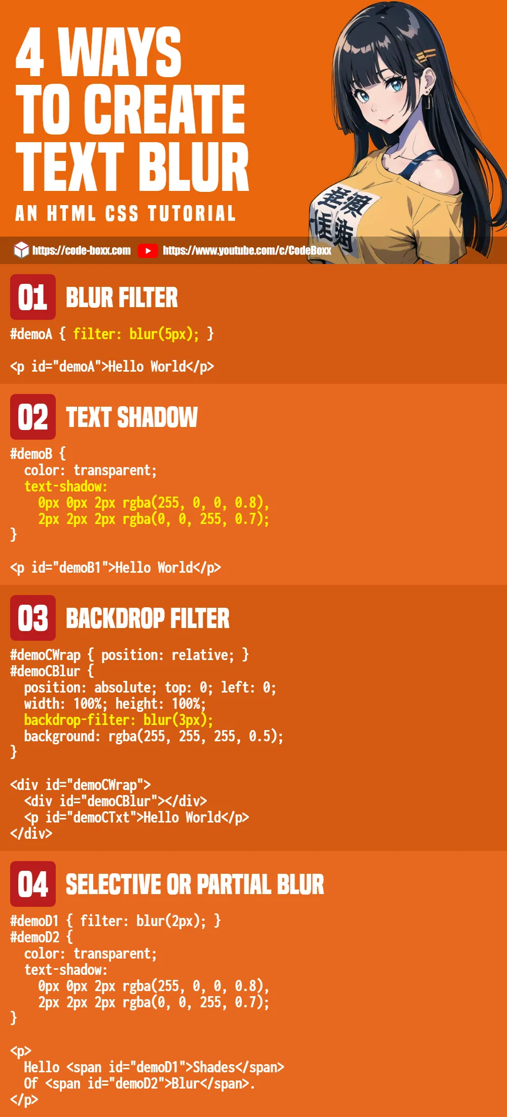
1) BLUR FILTER
<style>
#demoA1 { filter: blur(1px); }
#demoA2 { filter: blur(2px); }
#demoA3 { filter: blur(3px); }
</style>

<p id="demoA1">Hello World</p>
<p id="demoA2">Hello World</p>
<p id="demoA3">Hello World</p>
Don’t think this needs an explanation. As in the introduction, filter: blur() is the easiest way to create a block of blurred text.
2) TEXT SHADOW
<style>
#demoB1 {
  text-shadow: 1px 1px 5px black;
}
#demoB2 {
  color: transparent;
  text-shadow:
    0px 0px 2px rgba(255, 0, 0, 0.8),
    2px 2px 2px rgba(0, 0, 255, 0.7);
}
</style>

<p id="demoB1">Hello World</p>
<p id="demoB2">Hello World</p>This is an alternative to filter: blur, we use text-shadow to create the blur effect.
text-shadowtakes in 4 parameters –x-offset y-offset radius color- The idea is to set a “good enough” spread radius and color, so the text will appear blurred.
- We can also set the original text to transparent, and stack multiple text shadows to create interesting blur effects.
3) BACKDROP FILTER
<style>
#demoCWrap { position: relative; }
#demoCBlur {
  position: absolute; top: 0; left: 0;
  width: 100%; height: 100%;
  backdrop-filter: blur(3px);
  background: rgba(255, 255, 255, 0.5); /* optional */
}
</style>

<div id="demoCWrap">
  <div id="demoCBlur"></div>
  <p id="demoCTxt">Hello World</p>
</div>
Hello World
This is a roundabout way to blur an entire container.
- Take note of the HTML layout – We place
<div id="demoCBlur">and<p id="demoCTxt">into<div id="demoCWrap">. - We set
<div id="demoCBlur">as a “blurred background” withbackdrop-filter: blur(). - Then, position
<div id="demoCBlur">over<p id="demoCTxt">.
Some people may think “this is stupid”, but no. We can quickly cover an entire section or HTML form using this method.
4) SELECTIVE OR PARTIAL BLUR
<style>
#demoD1 { filter: blur(2px); }
#demoD2 {
  color: transparent;
  text-shadow:
    0px 0px 2px rgba(255, 0, 0, 0.8),
    2px 2px 2px rgba(0, 0, 255, 0.7);
}
</style>

<p>
  Hello
  <span id="demoD1">Shades</span>
  Of
  <span id="demoD2">Blur</span>.
</p>Sadly, there are no smart ways to “directly specify which words to blur” in CSS. But we can break a paragraph into multiple words in HTML and specify which ones to blur.
EXTRAS
That’s all for this tutorial, and here is a small section on some extras and links that may be useful to you.
INFOGRAPHIC CHEATSHEET
COMPATIBILITY CHECK
- CSS Filter Effects – CanIUse
- CSS Text Shadow – CanIUse
CSS filter effects should work on all modern browsers. But take note – These are rendered by CSS on the fly… Low-end devices are going to take a performance hit, don’t go crazy with “too much blur”.
LINKS & REFERENCES
- Blur – MDN
- Text Shadow – MDN
- Filter Functions – MDN
- Blurred Images – Code Boxx
THE END
Thank you for reading, and we have come to the end of this guide. I hope that it has helped you with your project, and if you want to share anything with this guide, please feel free to comment below. Good luck and happy coding!