Welcome to a quick tutorial on how to create blurred images in HTML CSS. So you want to blur an image directly in CSS, without manual editing using another app?
The easiest way to create a blurred image in HTML CSS is to apply the blur filter – <img src="IMAGE.jpg" style="filter: blur(5px);">
Yes, that’s all. But let’s walk through more examples in this guide – Read on!
TABLE OF CONTENTS
 Download & Notes
 CSS Image Blur
 Extras
 The End
DOWNLOAD & NOTES
Here is the download link to the example code, so you don’t have to copy-paste everything.
EXAMPLE CODE DOWNLOAD
Just click on “download zip” or do a git clone. I have released it under the MIT license, so feel free to build on top of it or use it in your own project.
SORRY FOR THE ADS...
But someone has to pay the bills, and sponsors are paying for it. I insist on not turning Code Boxx into a "paid scripts" business, and I don't "block people with Adblock". Every little bit of support helps.
Buy Me A Coffee Code Boxx eBooks
CSS IMAGE BLUR
All right, let us now start with blurring images using CSS filters – Yes, that is pure CSS only.
TUTORIAL VIDEO
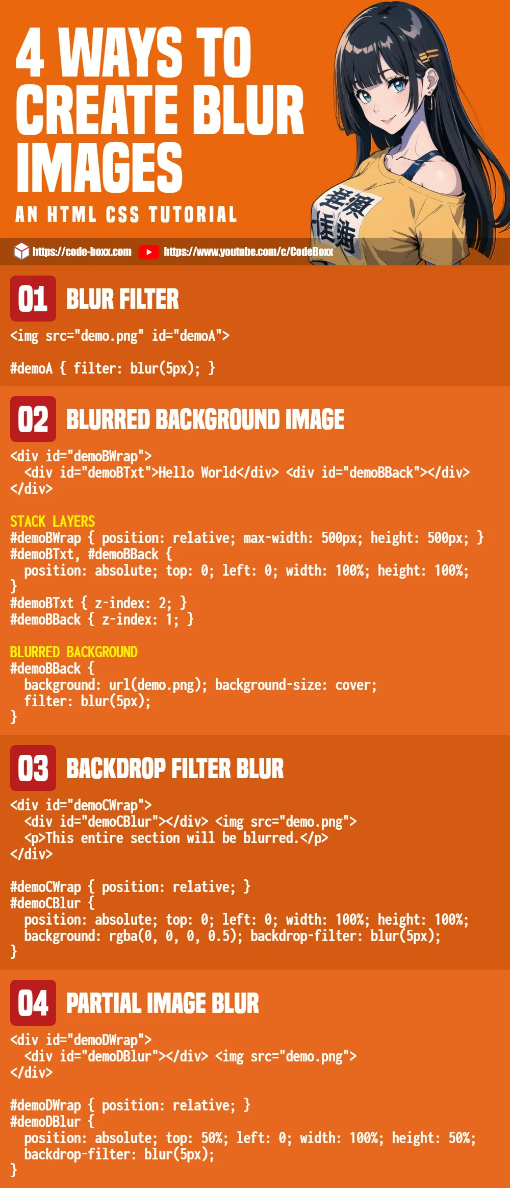
1) BLUR FILTER
<style>
#demoA { filter: blur(5px); }
</style>

<img src="demo.png" id="demoA">
As in the introduction, applying filter: blur() is the easiest way to create a blurred image. Sorry to disappoint the guys who are looking for complicated stuff. 😆
2) BACKGROUND IMAGE BLUR
<style>
/* (A) STACK LAYERS */
#demoBWrap {
  position: relative;
  max-width: 500px; height: 500px; /* optional */
}
#demoBTxt, #demoBBack {
  position: absolute; top: 0; left: 0;
  width: 100%; height: 100%;
}
#demoBTxt { z-index: 2; }
#demoBBack { z-index: 1; }

/* (B) BLURRED BACKGROUND */
#demoBBack {
  background: url(demo.png);
  background-size: cover;
  filter: blur(5px);
}
</style>

<div id="demoBWrap">
  <div id="demoBTxt">Hello World</div>
  <div id="demoBBack"></div>
</div>If you want to want to apply blur to background images, there is no such thing as background-image-blur at the time of writing… Thus this workaround method:
- For the HTML –
<div id="demoBTxt">Foreground content.<div id="demoBBack">Blurred background image.
- (A) Use
position: absoluteandz-indexto stackdemoBTxton top ofdemoBBack. - (B) Set the background image on
demoBBack, and usefilter: blur()to create a blurred background.
3) BACKDROP FILTER IMAGE BLUR
<style>
#demoCWrap { position: relative; }
#demoCBlur {
  position: absolute; top: 0; left: 0;
  width: 100%; height: 100%;
  background: rgba(0, 0, 0, 0.5); /* optional */
  backdrop-filter: blur(5px);
}
</style>

<div id="demoCWrap">
  <div id="demoCBlur"></div>
  <img src="demo.png">
  <p>This entire section will be blurred.</p>
</div>
This entire section will be blurred.
This is the same old layering trick, but slightly different – We place a blur layer over the image and content, instead of directly applying blur on the image.
- For the HTML:
<div id="demoCBlur">is simply a “blurred layer”.- The
<img>and<p>are the contents.
- Simply set
backdrop-filter: blur()ondemoCBlur, and layer it over all the contents.
4) PARTIAL IMAGE BLUR
<style>
#demoDWrap { position: relative; }
#demoDBlur {
  backdrop-filter: blur(5px);
  position: absolute;
  top: 50%; left: 0;
  width: 100%; height: 50%;
}
</style>

<div id="demoDWrap">
  <div id="demoDBlur"></div>
  <img src="demo.png">
</div>
- This is the same HTML as the previous example – We place a blur layer over the image.
- Same old trick – Layer
demoDBlurover the image. But this time, we resize and positiondemoDBlurover where the blur effect is required.
EXTRAS
That’s all for this tutorial, and here is a small section on some extras and links that may be useful to you.
INFOGRAPHIC CHEATSHEET
COMPATIBILITY CHECKS
- CSS Filter Effects – CanIUse
- Backdrop Filter – CanIUse
Most modern browsers support CSS filters and blur effects. But take note, the blur effect is rendered by the browser on the fly. Lower-end devices will take a performance hit, don’t go crazy with “blur everything”.
LINKS & REFERENCES
- Blur – MDN
- Filter Functions – MDN
- Simple Blurred Text – Code Boxx
THE END
Thank you for reading, and we have come to the end of this guide. I hope that it has helped you with your project, and if you want to share anything with this guide, please feel free to comment below. Good luck and happy coding!