Welcome to a tutorial on how to create a simple typewriter effect with HTML and CSS only. Yes, you read that right. It is possible to create a typewriter effect using only CSS, not a single line of Javascript – Read on for the example!
TABLE OF CONTENTS
 Download & Demo
 HTML CSS Typewriter
 Extras
 The End
DOWNLOAD & DEMO
Here is the download link to the example code, so you don’t have to copy-paste everything.
EXAMPLE CODE DOWNLOAD
Click here to download | Example on CodePen
The example code is released under the MIT license, so feel free to build on top of it or use it in your own project.
SORRY FOR THE ADS...
But someone has to pay the bills, and sponsors are paying for it. I insist on not turning Code Boxx into a "paid scripts" business, and I don't "block people with Adblock". Every little bit of support helps.
Buy Me A Coffee Code Boxx eBooks
HTML CSS TYPEWRITER DEMO
HTML CSS TYPEWRITER EFFECT
All right, let us now get into the details of how the HTML CSS typewriter effect works.
TUTORIAL VIDEO
PART 1) THE HTML
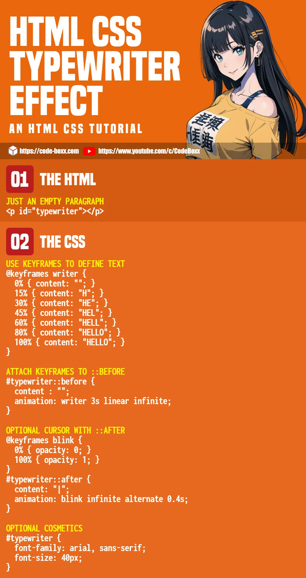
<p id="typewriter"></p>Yep… This is just a good old empty <p>.
PART 2) CSS TYPEWRITER ANIMATION
/* (A) USE KEYFRAMES TO DEFINE TEXT */
@keyframes writer {
  0% { content: ""; }
  15% { content: "H"; }
  30% { content: "HE"; }
  45% { content: "HEL"; }
  60% { content: "HELL"; }
  80% { content: "HELLO"; }
  100% { content: "HELLO"; }
}

/* (B) ATTACH KEYFRAMES TO ::BEFORE */
#typewriter::before {
  /* (B1) REQUIRED - EMPTY CONTENT */
  content : "";

  /* (B2) KEYFRAMES | TIME | TIMING FUNCTION | LOOP */
  animation: writer 3s linear infinite;
}- First, create a set of
@keyframesthat will “type” out the text you want. - Attach the
@keyframesto the::beforepseudo-class. CSS animation will do the rest of the magic.
PART 3) COSMETICS
/* (C) OPTIONAL CURSOR WITH ::AFTER */
@keyframes blink {
  0% { opacity: 0; }
  100% { opacity: 1; }
}
#typewriter::after {
  content: "|";
  animation: blink infinite alternate 0.4s;
}

/* (X) COSMETICS - DOES NOT MATTER */
#typewriter {
  color: #0dff0d;
  font-family: 'Courier New', Courier, monospace;
  font-size: 40px;
}
body { background: #000; }
Here are 2 small extras we can add to the typewriter effect.
- (C) Using CSS animation in a different manner, we can create and attach a “blinking cursor” to
::after. Remove this entire section if you don’t need the cursor. - (D) The
contentis literally text. We can still apply all the “usual” font weight, font family, text color, and text size.
EXTRAS
That’s all for the tutorial, and here is a small section on some extras and links that may be useful to you.
CSS TYPEWRITER IS NOT SO CLEVER
- As you can see, it is a real pain to change the text – The entire
@keyframeshas to be updated, and you have to guesstimate the timing. - Long story short, it is much easier with Javascript.
- But there’s no need to panic – I have made a Javascript typewriter as well, you can use it like a plugin. Links below.
COMPATIBILITY CHECKS
- CSS Keyframes – CanIUse
- CSS Animation – CanIUse
This example will work on all modern and not-so-modern browsers.
LINKS & REFERENCES
- Javascript Typewriter Effect – Code Boxx
INFOGRAPHIC CHEAT SHEET
THE END
Thank you for reading, and we have come to the end. I hope that it has helped you to better understand, and if you want to share anything with this guide, please feel free to comment below. Good luck and happy coding!