Welcome to a tutorial on how to create equal height columns in HTML CSS. So you need to line up columns equally in your project? Here are 5 different ways to do it – Read on!
TABLE OF CONTENTS
 Download & Notes
 Equal Height Columns
 Extras
 The End
DOWNLOAD & NOTES
Here is the download link to the example code, so you don’t have to copy-paste everything.
EXAMPLE CODE DOWNLOAD
Click here to download | Example on CodePen
The example code is released under the MIT license, so feel free to build on top of it or use it in your own project.
SORRY FOR THE ADS...
But someone has to pay the bills, and sponsors are paying for it. I insist on not turning Code Boxx into a "paid scripts" business, and I don't "block people with Adblock". Every little bit of support helps.
Buy Me A Coffee Code Boxx eBooks
RESPONSIVE EQUAL HEIGHT COLUMNS
All right, let us now get into the various ways and examples to create equal height columns in HTML CSS.
TUTORIAL VIDEO
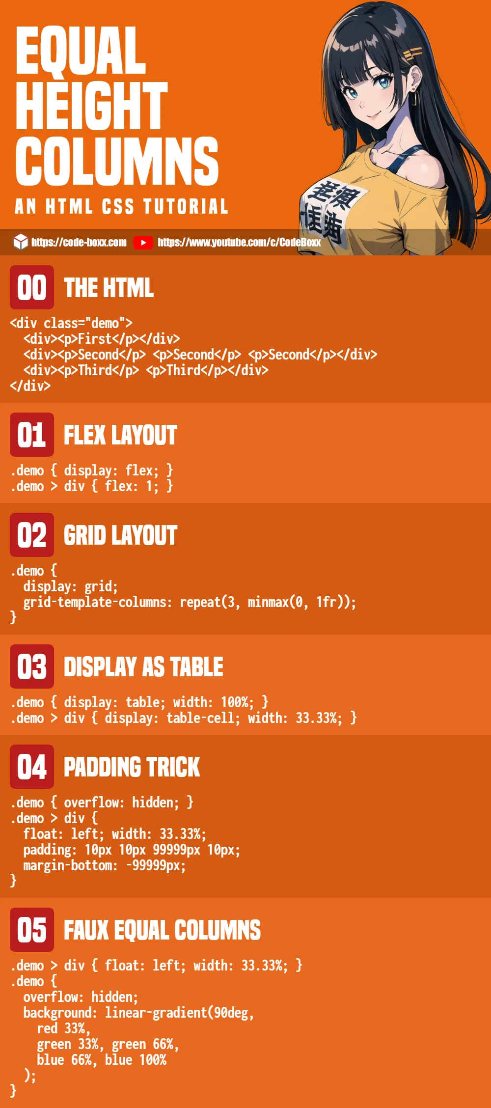
METHOD 1) FLEXIBLE LAYOUT
<style>
/* (A) ON BIG SCREENS */
.demoA { display: flex; }
.demoA > div { flex: 1; } /* equal column width */

/* (B) ON SMALL SCREEN - COLLAPSE INTO ROWS */
@media (max-width: 768px) {
  .demoA { display: block; }
}
</style>

<div class="demoA demo">
  <div><p>First</p></div>
  <div><p>Second</p> <p>Second</p> <p>Second</p></div>
  <div><p>Third</p> <p>Third</p></div>
</div>
First
Second
Second
Second
Third
Third
This is one of the easiest ways to create equal height columns, using the modern CSS flex layout.
- A
display: flexcontainer will lay the items out in a left-to-right manner by default, with equal height. - On small screens we turn the container back to
display: block. This will collapse the items into rows.
METHOD 2) GRID LAYOUT
<style>
/* (A) ON BIG SCREENS */
.demoB {
  display: grid;
  grid-template-columns: repeat(3, minmax(0, 1fr)); /* equal column width */
}

/* (B) ON SMALL SCREEN - COLLAPSE INTO ROWS */
@media (max-width: 768px) {
  .demoB { display: block; }
}
</style>

<div class="demoB demo">
  <div><p>First</p></div>
  <div><p>Second</p> <p>Second</p> <p>Second</p></div>
  <div><p>Third</p> <p>Third</p></div>
</div>
First
Second
Second
Second
Third
Third
CSS grid layout is another modern-day convenience.
- All we need to do – Create a
display: gridcontainer and set equal columns withgrid-template-columns. - Same as flex layout, we change to
display: blockon small screens to collapse the items into rows.
METHOD 3) DISPLAY AS TABLE
<style>
/* (A) ON BIG SCREENS */
.demoC {
  display: table; width: 100%;
}
.demoC > div {
  display: table-cell; width: 33.33%; /* equal column width */
}

/* (B) ON SMALL SCREEN - COLLAPSE INTO ROWS */
@media (max-width: 768px) {
  .demoC, .demoC > div {
    display: block; width: 100%;
  }
}
</style>

<div class="demoC demo">
  <div><p>First</p></div>
  <div><p>Second</p> <p>Second</p> <p>Second</p></div>
  <div><p>Third</p> <p>Third</p></div>
</div>
First
Second
Second
Second
Third
Third
Some people don’t like this method… But if it works, it works.
- (A) On big screens, we set the container and items to act just like a
table. - (A) By default, cells in an HTML table will always match the height of the tallest one – This creates the “equal height columns”.
- (B) On small screens, we simply “revert” the container and items back to
display: block. This will collapse them into rows.
METHOD 4) PADDING TRICK
<style>
/* (A) ON BIG SCREENS */
/* (A1) EQUAL WIDTH COLUMNS */
.demoD > div {
  float: left; width: 33.33%;
}

/* (A2) EQUAL HEIGHT COLUMNS */
.demoD { overflow: hidden; } /* hide scrollbars */
.demoD > div {
  padding: 10px 10px 99999px 10px; /* a lot of bottom padding */
  margin-bottom: -99999px; /* "counter" bottom padding */
}

/* (B) ON SMALL SCREEN - COLLAPSE INTO ROWS */
@media (max-width: 768px) {
  .demoD > div {
    float: none; width: 100%;
    padding-bottom: 10px; margin-bottom: 0;
  }
}
</style>

<div class="demoD demo">
  <div><p>First</p></div>
  <div><p>Second</p> <p>Second</p> <p>Second</p></div>
  <div><p>Third</p> <p>Third</p></div>
</div>
First
Second
Second
Second
Third
Third
This is an old-school method, a “CSS hack” that we roll in the early 2000s.
- (A1) The basic idea is to set
float: lefton all the items, so they form a horizontal row. - (A2) But the items will have different height. To “trick” the browser into rendering all the items at equal height, we set an insane amount of
padding-bottom, then “counter” it back with a negativemargin-bottom. - (B) On small screens, we simply remove the
floatand trickpadding margin– This will collapse the items into rows.
METHOD 5) FAUX EQUAL COLUMNS
<style>
/* (A) ON BIG SCREENS */
/* (A1) EQUAL WIDTH COLUMNS */
.demoE > div {
  float: left; width: 33.33%;
}

/* (A2) FAUX EQUAL HEIGHT */
.demoE {
  overflow: hidden;
  background: linear-gradient(90deg,
    #ffebeb 33%,
    #e3ffdf 33%, #e3ffdf 66%,
    #cbedfb 66%, #cbedfb 100%
  );
}

/* (B) ON SMALL SCREEN - COLLAPSE INTO ROWS */
@media (max-width: 768px){
  .demoE > div { float: none; width: 100%; }
  .demoE { background: none; }
  .demo div:nth-child(1) { background: #ffebeb; }
  .demo div:nth-child(2) { background: #e3ffdf; }
  .demo div:nth-child(3) { background: #cbedfb; }
}
</style>

<div class="demoE demo">
  <div><p>First</p></div>
  <div><p>Second</p> <p>Second</p> <p>Second</p></div>
  <div><p>Third</p> <p>Third</p></div>
</div>
First
Second
Second
Second
Third
Third
Lastly, this is yet another old-school method, an alternative to the previous method.
- (A1) The basic idea is the same, we float the items to create a single row.
- (A2) But instead of “fixing” the height issue, we make it look like they have equal height… By adding a linear gradient background colors that matches the columns.
- (B) Same old technique. Remove
floaton small screens to collapse into rows, remove the funky linear gradient background colors.
EXTRAS
That’s all for this guide, and here is a small section on some extras and links that may be useful to you.
WHICH IS THE BEST METHOD?
- I will recommend using
flexorgrid. - These are well-supported in all modern browsers at the time of writing.
- Avoid the “hacks”, they are confusing and have not much merits…
LINKS & REFERENCES
- A Complete Guide to Flexbox – CSS Tricks
- A Complete Guide to Grid – CSS Tricks
- 5 Ways to Display Div Containers Side By Side – Code Boxx
INFOGRAPHIC CHEAT SHEET
THE END
Thank you for reading, and we have come to the end of this guide. I hope that it has helped you with your project, and if you want to share anything with this guide, please feel free to comment below. Good luck and happy coding!