Welcome to a quick tutorial on how to create a simple popup dialog box in HTML CSS. Yep, if you need a simple popup for your project, HTML has a native dialog box. There’s no need to load an entire “plugin” or “framework” – Read on for the example!
TABLE OF CONTENTS
DOWNLOAD & DEMO
Here is the download link to the example code, so you don’t have to copy-paste everything.
EXAMPLE CODE DOWNLOAD
Click here to download | Example on CodePen
Just click on “download zip” or do a git clone. I have released it under the MIT license, so feel free to build on top of it or use it in your own project.
SORRY FOR THE ADS...
But someone has to pay the bills, and sponsors are paying for it. I insist on not turning Code Boxx into a "paid scripts" business, and I don't "block people with Adblock". Every little bit of support helps.
Buy Me A Coffee Code Boxx eBooks
HTML POPUP DIALOG BOX DEMO
<!-- (A) LOAD CSS + JS -->
<link rel="stylesheet" type="text/css" href="popup.css">
<script defer src="popup.js"></script>

<!-- (B) POUP DEMO -->
<button onclick="pop.show('Hello!')">
  Popup Demo
</button>
For those who want to use this as a “plugin”:
- Include the CSS and Javascript in your project.
- Call
pop.show("TEXT")to open the popup.
That’s all. If you minify the CSS and Javascript, this “plugin” is not even 1KB. Take that, you bloated libraries!
HTML CSS POPUP DIALOG BOX
All right, let us move into more details on the popup itself. This section is for those who want to learn more and “deep customize” the popup.
TUTORIAL VIDEO
PART 1) BASIC HTML DIALOG BOX
<dialog id="ezpop"><form method="dialog">
  <div id="eztxt">Hello!</div>
  <button id="ezclose">X</button>
</form></dialog>

<button onclick="document.getElementById('ezpop').showModal()">
  Show
</button>
That’s right, HTML has a native <dialog> element that not many people seem to use. The mechanics are pretty self-explanatory too.
<div id="eztxt">Place your message in this wrapper.<button id="ezclose">Close button.<form method="dialog">This is necessary to register<button id="ezclose">as a “close button”.
PART 2) THE JAVASCRIPT
2A) INIT
var pop = {
  // (A) CREATE POPUP DIALOG BOX
  dialog : null, // dialog box wrapper
  txt : null, // dialog box text area
  init : () => {
    pop.dialog = document.createElement("dialog");
    pop.dialog.id = "ezpop";
    pop.dialog.innerHTML = `<form method="dialog">
      <div id="eztxt"></div>
      <button id="ezclose">X</button>
    </form>`;
    pop.txt = pop.dialog.querySelector("#eztxt");
    document.body.appendChild(pop.dialog);
  },
  // ...
};
window.addEventListener("load", pop.init);
Now that we have walked through the basic <dialog>, let us package it into a “reusable plugin”.
pop.init()is called on page load.- All it does is create the above HTML dialog box.
2B) OPEN POPUP
// (B) SHOW DIALOG BOX
show : txt => {
  pop.txt.innerHTML = txt;
  pop.dialog.showModal();
}- As in the above demo, we call
pop.show()to open the dialog box. - Self-explanatory. We place the text inside
<div id="eztxt">and open the dialog box as a modal.
P.S. Use pop.dialog.show() will also open the dialog box, but without a backdrop (full-screen blackout).
P.P.S. Use pop.dialog.close() to close the dialog box programmatically.
PART 3) THE CSS
/* (A) POPUP WRAPPER */
#ezpop {
  display: block;
  min-width: 400px; padding: 20px;
  border: 0; border-radius: 10px;
  background: #fff;
  opacity: 0;
  transition: opacity 0.5s;
}
#ezpop[open] { opacity: 1; }

/* (B) CLOSE BUTTON */
#ezclose {
  position: absolute; top: 0; right: 0;
  margin: 5px; padding: 0;
  font-size: 30px; font-weight: 700;
  color: #cd2f2f; background: none; border: none;
  cursor: pointer;
}
#ezclose:focus { outline: none; }

/* (C) BACKGROUND COLOR */
#ezpop::backdrop {
  background-color: rgba(0, 0, 0, 0.5);
}
A bunch of optional cosmetics to “customize” the dialog box.
- The default style is pretty much “white box with a border”. Customize the dimensions, colors, and even open/close animations here.
- Place the close button at the top-right corner.
- Set the background color of the “fullscreen blackout”.
EXTRAS
That’s all for the tutorial, and here is a small section on some extras and links that may be useful to you.
GET VALUE ON CLOSING POPUP
<dialog id="ezpop"><form method="dialog">
  <div id="eztxt">Hello!</div>
  <button value="1">Yes</button>
  <button value="0">No</button>
</form></dialog>

<script>
var ezp = document.getElementById("ezpop");
ezp.addEventListener("close", e => {
  alert(ezp.returnValue);
});
ezp.showModal();
</script>
One last interesting about HTML dialog boxes:
- We can insert multiple “close buttons”
<button value="XYZ">into the dialog box. - On close, we can get the selected value –
DIALOG.returnValue
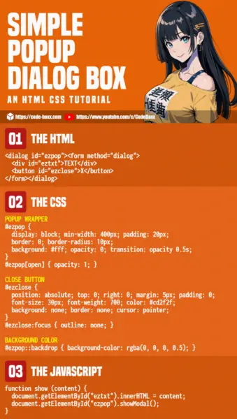
INFOGRAPHIC CHEATSHEET

COMPATIBILITY CHECKS
- Arrow Functions – CanIUse
- Viewport Units (vw vh) – CanIUse
- CSS Flex – CanIUse
- Dialog Element – CanIUse
All the required features are already well-supported on all modern browsers. You will not have compatibility issues unless the user is using an ancient browser.
LINKS & REFERENCES
- HTML Dialog – MDN
THE END
Thank you for reading, and we have come to the end of this guide. I hope that it has helped you with your project, and if you want to share anything with this guide, please feel free to comment below. Good luck and happy coding!

love this – very thorough