Welcome to a short tutorial on how to fade an image background using CSS and Javascript. So you are working on a project with a nice background image that needs some fade effect? Bad news, it is not so straightforward.
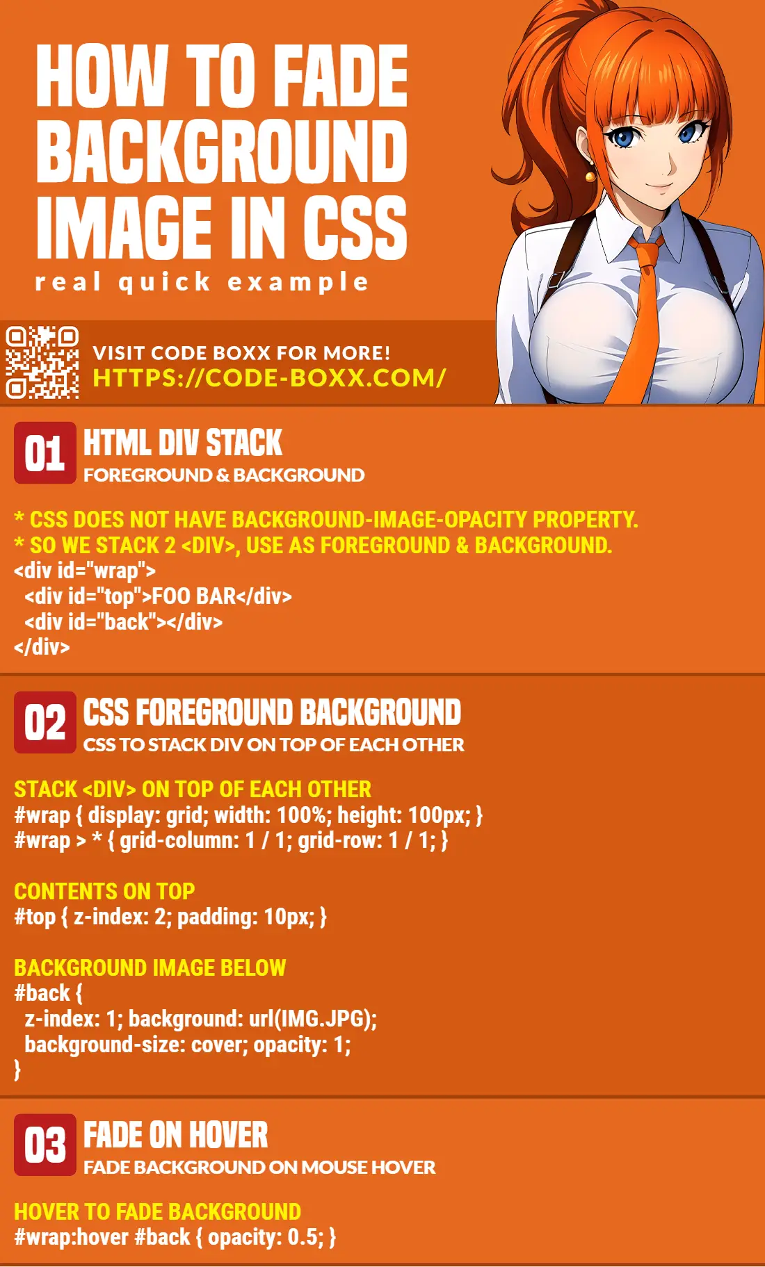
There is no background-image-opacity property in CSS. To fade a background image, the general steps are to:
- Stack 2 layers of
<div>together to create the foreground and background.<div id="front"></div><div id="back"></div>
- Position and set the dimensions of the
<div>containers.#front, #back { position: absolute; width: 100vw; }#back { min-height: 100vh; z-index: 1; }#front { z-index: 2; }
- Lastly, set the background image and opacity.
#back { background-image: url("IMG.JPG"); opacity: 0.5; }
That covers the basics, but let us walk through a few more examples in this guide – Read on!
TLDR – QUICK SLIDES
[web_stories_embed url=”https://code-boxx.com/web-stories/fade-background-image-html-css/” title=”Fade Background Image In HTML CSS” poster=”https://code-boxx.com/wp-content/uploads/2022/03/STORY-HTML-20230505.webp” width=”360″ height=”600″ align=”center”]
Fullscreen Mode – Click Here
TABLE OF CONTENTS
FADE BACKGROUND IMAGE

All right, let us now get into the examples of how to fade the background image with CSS and (a little bit of) Javascript.
EXAMPLE 1) FADE BACKGROUND IMAGE ON MOUSE HOVER
1A) THE HTML
<div id="demoA">
  <div id="demoATop">FOO BAR</div>
  <div id="demoABack"></div>
</div>
As mentioned in the introduction, there is no background-image-opacity property in CSS. So we have to work around this problem by using multiple <div> containers:
- Captain Obvious to the rescue –
<div id="demoA">is a container that will keep our “fade background image” mechanism together. <div id="demoATop">will hold the contents.<div id="demoABack">is used to hold the background image.
The whole idea is the stack <div id="demoATop"> on top of <div id="demoABack">. Then, we will use opacity on #demoABack to do the fade effect.
1B) THE CSS
/* (A) STACK DIV ON TOP OF EACH OTHER */
/* CREDITS: https://stackoverflow.com/questions/1909648/stacking-divs-on-top-of-each-other */
#demoA {
  display: grid;
  width: 100%;
  height: 100px;
}
#demoA > * {
  grid-column: 1 / 1;
  grid-row: 1 / 1;
}

/* (B) CONTENTS ON TOP */
#demoATop {
  z-index: 2;
  padding: 10px;
}

/* (C) BACKGROUND BELOW */
#demoABack {
  z-index: 1;
  background-image: url(demo.webp);
  background-repeat: no-repeat;
  background-position: center;
  background-size: cover;
  transition: opacity 0.5s;
}

/* (D) FADE ON MOUSE HOVER */
#demoA:hover #demoABack {
  opacity: 0.3;
}
Yikes, this one may probably seem like a lot to the beginners, but let us walk through this:
- First, remember that we need to “stack” the
<div>on top of each other?#demoA { display: grid } #demoA > * { grid-column: 1 / 1; grid-row: 1 / 1; }pretty much does the trick.#demoATop { z-index: 2 }will place the contents on top.#demoABack { z-index: 1 }will place the background image below.
- Next, we set a whole series of
background-imagestuff on#demoABack. Feel free to tweak these to your own liking. - Finally, the fade itself:
#demoA:hover #demoABack { opacity: 0.3 }fades the background on mouse hover.#demoABack { transition: opacity 0.5s }to add the sleek fade animation automatically.
That’s all!
1C) THE DEMO
EXAMPLE 2) FADE BACKGROUND IMAGE ON PAGE LOAD
2A) THE HTML
<div id="demoB">
  <div id="demoBTop">FOO BAR</div>
  <div id="demoBBack"></div>
</div>
Yep, it’s the same “layer stacking method” again.
2B) THE CSS
/* (A) "BORDERLESS" PAGE */
html, body {
  padding: 0;
  margin: 0;
}

/* (B) STACK DIV ON TOP OF EACH OTHER */
/* CREDITS: https://stackoverflow.com/questions/1909648/stacking-divs-on-top-of-each-other */
#demoB {
  display: grid;
  /* FULL PAGE COVER */
  width: 100vw;
  min-height: 100vh;
}
#demoB > * {
  grid-column: 1 / 1;
  grid-row: 1 / 1;
}

/* (C) CONTENTS ON TOP */
#demoBTop {
  z-index: 2;
  padding: 10px;
}

/* (D) BACKGROUND BELOW */
#demoBBack {
  z-index: 1;
  background-image: url(demo.webp);
  background-repeat: no-repeat;
  background-position: center;
  background-size: cover;
  opacity: 0.1;
  transition: opacity 3s;
}
Nope, no sweat. The basic mechanics are the same as above, but only with a few minor changes:
#demoB { width: 100vw; min-height: 100vh; }sets the container to cover the entire screen.#demoBBack { opacity: 0.1; }we now start with a faded background image instead.#demoBBack { transition: opacity 3s; }a slower fade animation… Adjust this to your own liking.
2C) THE JAVASCRIPT
<script>
window.addEventListener("load", () => {
  document.getElementById("demoBBack").style.opacity = 1;
});
</script>
Sorry to the guys who are looking for complicated code. The Javascript should be self-explanatory – We wait for the window to be fully loaded, then set the background image to fully opaque (opacity = 1).
DOWNLOAD & NOTES

Here is the download link to the example code, so you don’t have to copy-paste everything.
SORRY FOR THE ADS...
But someone has to pay the bills, and sponsors are paying for it. I insist on not turning Code Boxx into a "paid scripts" business, and I don't "block people with Adblock". Every little bit of support helps.
Buy Me A Coffee Code Boxx eBooks
EXAMPLE CODE DOWNLOAD
Click here for the source code on GitHub gist, just click on “download zip” or do a git clone. I have released it under the MIT license, so feel free to build on top of it or use it in your own project.
EXTRA BITS & LINKS

That’s all for this tutorial, and here is a small section on some extras and links that may be useful to you.
LINKS & REFERENCES
- Opacity – MDN
- Transition – MDN
- Fade In & Out – Code Boxx
- Examples on CodePen
COMPATIBILITY CHECKS
- CSS Transitions – CanIUse
- Opacity – CanIUse
These examples will work across all browsers. Less the “ancient ones”.
INFOGRAPHIC CHEAT SHEET
THE END

Thank you for reading, and we have come to the end of this guide. I hope that it has helped you with your project, and if you want to share anything with this guide, please feel free to comment below. Good luck and happy coding!