Welcome to a tutorial on how to detect mobile devices with Javascript. So you have some features on your website that you want to offer to mobile users only? Or maybe you want to hide some “desktop only” features from mobile users?
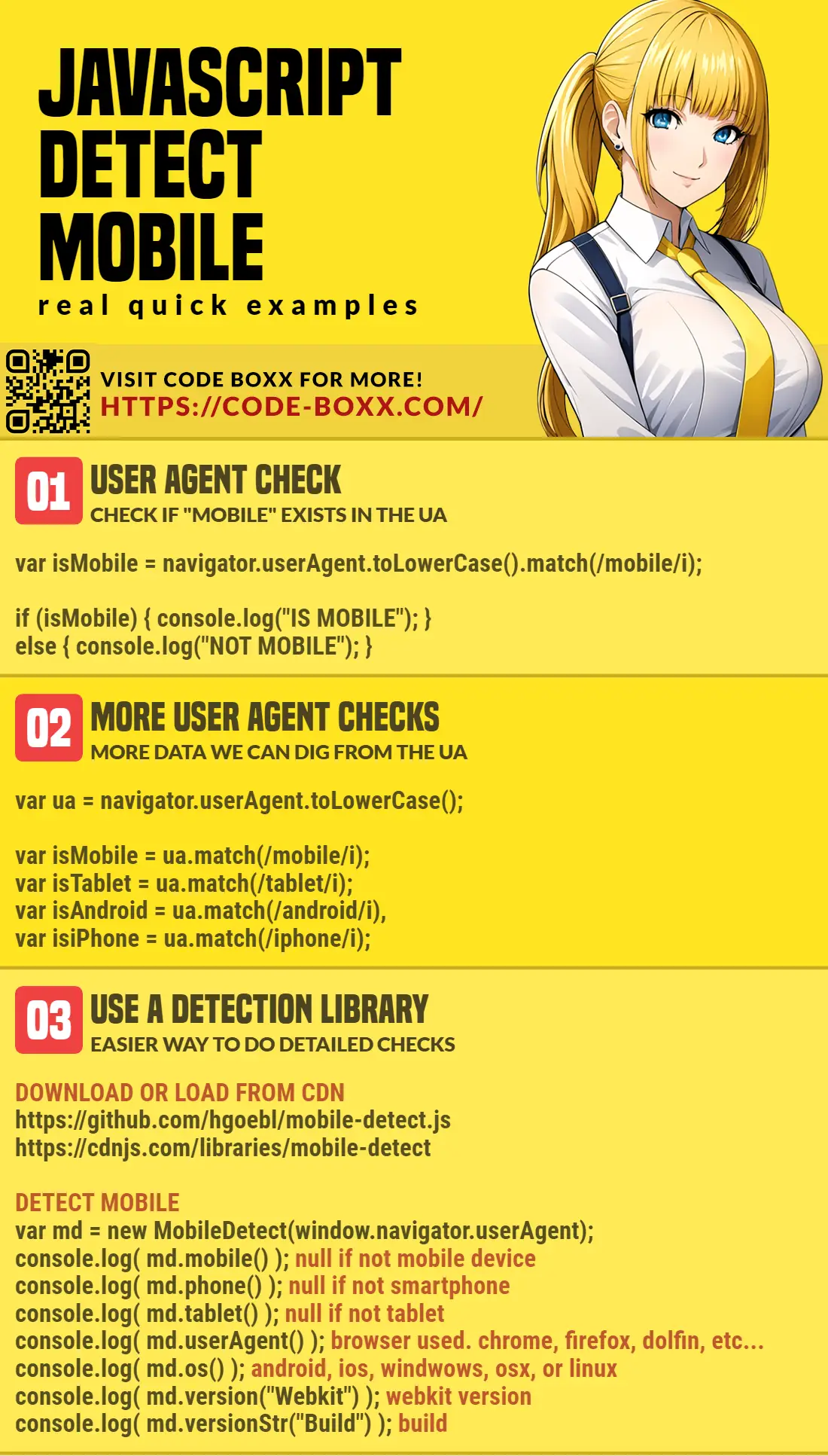
if (navigator.userAgent.toLowerCase().match(/mobile/i)) { IS MOBILE DEVICE }That covers the basics, but let us walk through a few more examples in this guide – Read on!
TLDR – QUICK SLIDES
[web_stories_embed url=”https://code-boxx.com/web-stories/detect-mobile-devices-javascript/” title=”How To Detect Mobile Devices In Javascript” poster=”https://code-boxx.com/wp-content/uploads/2021/11/STORY-JS-20230518.webp” width=”360″ height=”600″ align=”center”]
Fullscreen Mode – Click Here
TABLE OF CONTENTS
JAVASCRIPT MOBILE DETECTION

All right, let us now get into the examples of mobile detection in Javascript.
1) SIMPLE DETECTION WITH USER AGENT
window.addEventListener("load", () => {
  // (A) CHECK FOR MOBILE
  var isMobile = navigator.userAgent.toLowerCase().match(/mobile/i);

  // (B) DO SOMETHING...
  if (isMobile) { console.log("Is mobile device"); }
  else { console.log("Not mobile device"); }
});
As in the introduction above, the easiest way to detect mobile devices is to look for the word “mobile” in the user agent. For you guys who do not know what the user-agent is, it is simply a small piece of header data that the browser sends to the server – It contains various information on the browser name, operating systems, versions, and platform.
2) BETTER USER AGENT DETECTION
window.addEventListener("load", () => {
  // (A) BREAK USER AGENT DOWN
  var isMobile = navigator.userAgent.toLowerCase().match(/mobile/i),
      isTablet = navigator.userAgent.toLowerCase().match(/tablet/i),
      isAndroid = navigator.userAgent.toLowerCase().match(/android/i),
      isiPhone = navigator.userAgent.toLowerCase().match(/iphone/i),
      isiPad = navigator.userAgent.toLowerCase().match(/ipad/i);

  // (B) DETECTED DEVICE TYPE
  console.log("Mobile", isMobile);
  console.log("Tablet", isTablet);
  console.log("Android", isAndroid);
  console.log("iPhone", isiPhone);
  console.log("iPad", isiPad);
});
Yes, we can do more “detailed checks” on the user-agent – It is even possible to determine if the user is Android/iOS/Windows/Mac.
3) USING A DETECTION LIBRARY
<!-- (A) LOAD THE LIBRARY -->
<!-- https://github.com/hgoebl/mobile-detect.js -->
<!-- https://hgoebl.github.io/mobile-detect.js/doc/MobileDetect.html -->
<script src="https://cdnjs.cloudflare.com/ajax/libs/mobile-detect/1.4.5/mobile-detect.min.js"></script>

<!-- (B) DEVICE DETECTION -->
<script>
window.addEventListener("load", () => {
  var md = new MobileDetect(window.navigator.userAgent);
  console.log( md.mobile() ); // null if not mobile device
  console.log( md.phone() ); // null if not smartphone
  console.log( md.tablet() ); // null if not tablet
  console.log( md.userAgent() ); // browser used. chrome, firefox, dolfin, etc...
  console.log( md.os() ); // android, ios, windwows, osx, or linux
  console.log( md.version("Webkit") ); // webkit version
  console.log( md.versionStr("Build") ); // build
});
</script>
Finally, if you really need to go down into the “micro-management level” of mobile detection – I will recommend you use a library instead. There are quite a few that you can use, but here is one of the more popular options, Mobile Detect Library – Documentation.
DOWNLOAD & NOTES

Here is the download link to the example code, so you don’t have to copy-paste everything.
SORRY FOR THE ADS...
But someone has to pay the bills, and sponsors are paying for it. I insist on not turning Code Boxx into a "paid scripts" business, and I don't "block people with Adblock". Every little bit of support helps.
Buy Me A Coffee Code Boxx eBooks
EXAMPLE CODE DOWNLOAD
Click here for the source code on GitHub gist, just click on “download zip” or do a git clone. I have released it under the MIT license, so feel free to build on top of it or use it in your own project.
EXTRA BITS & LINKS

That’s all for this project, and here is a small section on some extras and links that may be useful to you.
LIMITATIONS & ALTERNATIVE
Please take note that the user agent is not 100% accurate, users can easily change or hide the user agent using browser extensions. The better way is to do proper responsive design and use feature detection. For example, if your app requires GPS, check if the Geolocation API is supported in the user’s browser. A feature detection library I recommend is Modernizr.
LINKS & REFERENCES
- HTTP User-Agent on MDN
- If you are interested, you can also see your own user-agent at whatismybrowser.com.
- Here are more examples of how mobile user agents look like:
INFOGRAPHIC CHEAT SHEET
THE END

Thank you for reading, and we have come to the end of this short guide. I hope that it has helped you with your project, and if you want to share anything with this guide, please feel free to comment below. Good luck and happy coding!
another good way to check for the device type is using window.matchMedia like this:
// All touch devices (landscape, portrait)
var isTouchDevice = window.matchMedia(“(pointer:coarse)”).matches
// Mobile devices (landscape, portrait)
var isMobileDevice = window.matchMedia(“(pointer:coarse) and (max-width: 575.98px)”).matches
// Tablet (landscape+portrait)
var isTabletLP = window.matchMedia(“(pointer:coarse) and (min-width: 576px)”).matches
// Tablet (landscape)
var isTabletLandscape = window.matchMedia(“(pointer:coarse) and (min-width: 576px) and (orientation: landscape)”).matches
// Tablet (portrait)
var isTabletPortrait = window.matchMedia(“(pointer:coarse) and (min-width: 576px) and (orientation: portrait)”).matches
Sorry, but this is far from a “good way”… It simply assumes all touchscreens with certain resolutions are tablets or mobiles. Which is obviously not the case.