Welcome to a tutorial on how to create a responsive logo in HTML CSS. So you have just gotten an awesome logo and are eager to put it up on your website… Only to notice that it is way too big on a small mobile screen. Just how do we “fix” this issue then?
<img src="LOGO.PNG" style="width:100%; height:auto; max-width:300px;">It’s that simple, but read on for more detailed examples and ideas!
TABLE OF CONTENTS
 Download & Notes
 Responsive Logo
 Extras
 The End
DOWNLOAD & NOTES
Here is the download link to the example code, so you don’t have to copy-paste everything.
EXAMPLE CODE DOWNLOAD
The example code is released under the MIT license, so feel free to build on top of it or use it in your own project.
SORRY FOR THE ADS...
But someone has to pay the bills, and sponsors are paying for it. I insist on not turning Code Boxx into a "paid scripts" business, and I don't "block people with Adblock". Every little bit of support helps.
Buy Me A Coffee Code Boxx eBooks
RESPONSIVE LOGO
All right, let us now go into some ways and ideas on how to create a responsive logo in this section.
TUTORIAL VIDEO
METHOD 1) AUTO-SCALING LOGO
<style>
/* (A) RESPONSIVE LOGO */
img.logo {
  width: 100%; height: auto;
  max-width: 400px; /* optional */
}
</style>

<!-- (B) PAGE LOGO -->
<img src="potato.png" class="logo">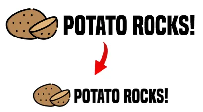
As in the introduction above, this is probably the easiest way to create a responsive logo (and any responsive image).
width: 100%; height: auto;will automatically scale the logo while maintaining the aspect ratio.max-width: 400pxis used to limit how wide the logo can stretch up to.
METHOD 2) SPLIT LOGO
<style>
/* (A) ONLY APPLY ON SMALL SCREENS */
@media only screen and (max-width: 640px) {
  /* (A1) CENTER LOGO */
  #page-header { text-align: center; }

  /* (A2) BREAK LOGO & TEXT INTO 2 ROWS */
  img.logoA, img.logoB {
    display: block;
    margin: 0 auto;
  }
  img.logoB { max-width: 200px; } /* optional */
}
</style>

<!-- (B) PAGE LOGO -->
<header id="page-header">
  <!-- (B1) LOGO -->
  <img src="potato-a.png" class="logoA">

  <!-- (B2) TEXT -->
  <img src="potato-b.png" class="logoB">
</header>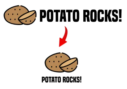
This is a slightly more “advanced” method:
- The graphic logo and the text are split into two different images.
- On big screens, the logo will display “as usual”.
- But on the smaller screens, we use
@mediato split the graphic and text into 2 different rows and center them on the screen.
METHOD 3) SPLIT LOGO (ALTERNATIVE)
<style>
/* (A) ONLY APPLY ON SMALL SCREENS */
@media only screen and (max-width: 640px) {
  /* (A1) CENTER LOGO */
  #page-header { text-align: center; }

  /* (A2) SHOW LOGO ONLY */
  img.logoA {
    display: block;
    margin: 0 auto;
  }
  img.logoB { display: none; }
}
</style>

<!-- (B) PAGE LOGO -->
<header id="page-header">
  <!-- (B1) LOGO -->
  <img src="potato-a.png" class="logoA">

  <!-- (B2) TEXT -->
  <img src="potato-b.png" class="logoB">
</header>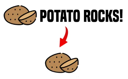
This is an alternative version of the above “split logo”. Pretty much the same graphic and text strategy, except that we hide the text on small screens to make things look more streamlined.
EXTRAS
That’s all for this guide, and here is a small section on some extras and links that may be useful to you.
HOW TO SPLIT THE LOGO?
There are many free graphic applications you can download and install for free:
- Paint.net (Windows)
- GIMP (Windows/Mac/Linux)
- Photoshop Express – Android, IOS, Windows
If you don’t want to install anything, there are plenty of free online image editors as well.
INFOGRAPHIC CHEATSHEET
LINKS & REFERENCES
THE END
Thank you for reading, and we have come to the end of this guide. I hope that it has helped you with your project, and if you want to share anything with this guide, please feel free to comment below. Good luck and happy coding!
good job, thank you !