Welcome to a tutorial on how to create responsive circles in HTML CSS. Once upon a time in the Stone Age of the Internet, we had to use circle images and there were no alternatives. But it is a breeze to create circles with modern CSS – Read on for the examples!
TABLE OF CONTENTS
 Download & Notes
 HTML CSS Circles
 Extras
 The End
DOWNLOAD & NOTES
Here is the download link to the example code, so you don’t have to copy-paste everything.
EXAMPLE CODE DOWNLOAD
Click here to download. The example code is released under the MIT license, so feel free to build on top of it or use it in your own project.
SORRY FOR THE ADS...
But someone has to pay the bills, and sponsors are paying for it. I insist on not turning Code Boxx into a "paid scripts" business, and I don't "block people with Adblock". Every little bit of support helps.
Buy Me A Coffee Code Boxx eBooks
RESPONSIVE HTML CSS CIRCLES
So, just how do we create a responsive circle? Add text to it? Let us walk through step-by-step.
TUTORIAL VIDEO
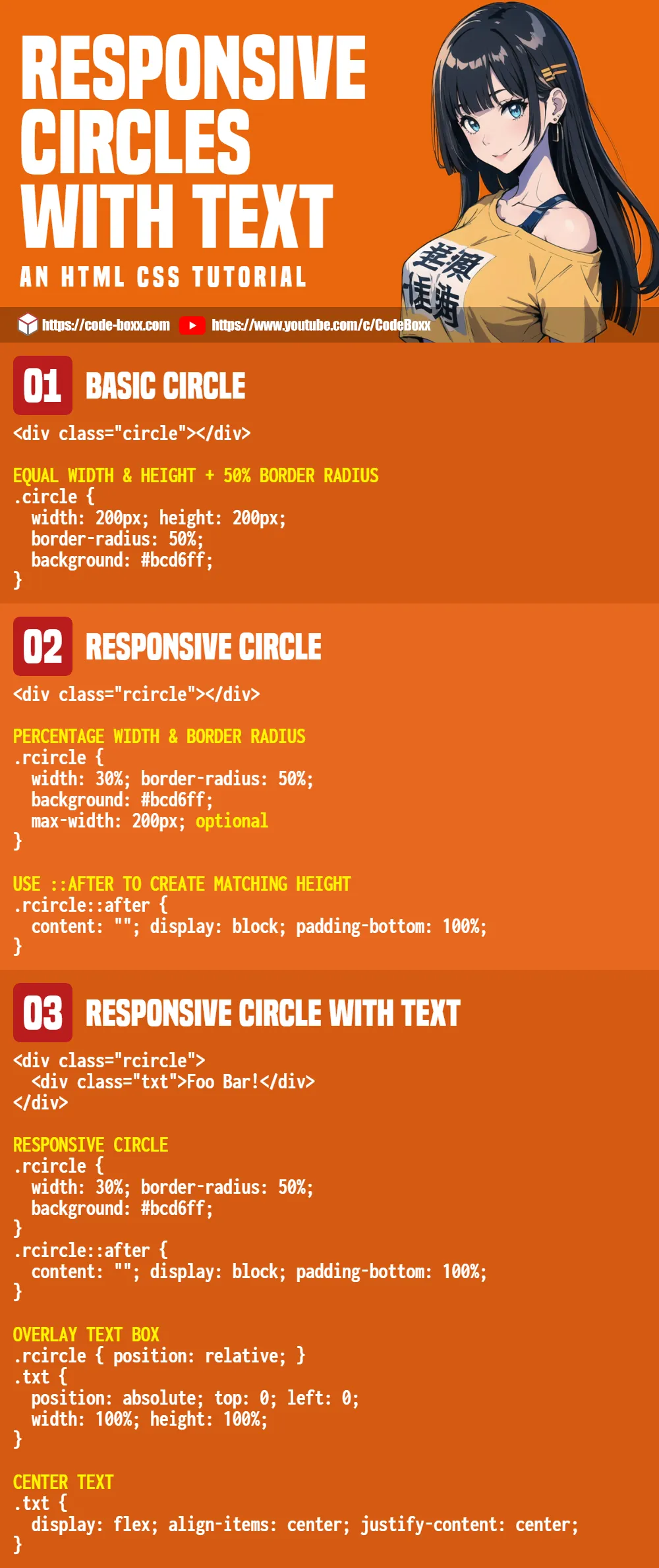
PART 1) BASIC CIRCLE
<style>
.circle {
  /* (A) SQUARE - EQUAL WIDTH & HEIGHT */
  width: 200px; height: 200px;

  /* (B) CIRCLE - 50% RADIUS */
  border-radius: 50%;

  /* (C) COSMETIC - BACKGROUND COLOR */
  background: #bcd6ff;
}
</style>

<div class="circle"></div>- Define equal
widthandheightto create a square. - Then, just add
border-radius: 50%. This effectively turns the square into a circle.
PART 2) RESPONSIVE CIRCLE
<style>
/* (A) PERCENTAGE WIDTH & BORDER RADIUS */
.rcircle {
  width: 30%; border-radius: 50%;
  background: #bcd6ff;
  max-width: 200px; /* optional */
}

/* (B) USE ::AFTER TO CREATE MATCHING HEIGHT */
/* credit - https://spin.atomicobject.com/2015/07/14/css-responsive-square/ */
.rcircle::after {
  content: "";
  display: block;
  padding-bottom: 100%;
}
</style>

<div class="rcircle"></div>- To create a responsive circle, we use the same
border-radius: 50%trick, but set a percentagewidthinstead. - Now, we need to set a matching
height.- Unfortunately, an equal percentage
heightwill not work. Example – 20% width and height. This will be 20% of the window width and 20% of the window height… Which will only work if the user is using a square window. - Thankfully, there is another simple trick. Just set
padding-bottom: 100%to the::afterpseudo-class.
- Unfortunately, an equal percentage
P.S. You can use max-width (or max-height) to limit how much the circle can “grow”.
PART 3) RESPONSIVE CIRCLE WITH TEXT
<style>
/* (A) RESPONSIVE CIRCLE */
.rcircle {
  width: 30%; border-radius: 50%;
  background: #bcd6ff;
}
.rcircle::after {
  content: "";
  display: block;
  padding-bottom: 100%;
}

/* (B) TEXT BLOCK */
.rcircle { position: relative; }
.txt {
  /* (B1) OVERLAY TEXT BOX */
  position: absolute; top: 0; left: 0;
  width: 100%; height: 100%;

  /* (B2) CENTER TEXT */
  display: flex;
  align-items: center;
  justify-content: center;
}
</style>

<div class="rcircle">
  <div class="txt">Foo Bar!</div>
</div>
- Take note, we now add
<div class="txt">TEXT</div>inside the circle. - (A) Same “responsive circle trick” as above.
- (B1) Overlay the text on top of the circle.
.rcircle { position: relative }and.txt { position: absolute }Place the text over the circle..txt { width: 100%; height: 100%; }The text layer will adopt the dimensions of the circle.
- (B2) Pretty self-explanatory. Set the text layer to flex layout, center the text horizontally and vertically.
EXTRAS
That’s all for the tutorial, and here is a small section on some extras and links that may be useful to you.
EXTRA) “3D SPHERE” WITH GRADIENT & SHADOW
<style>
.rsphere {
  /* (A) PERCENTAGE WIDTH & BORDER RADIUS */
  width: 30%; border-radius: 50%;

  /* http://www.colorzilla.com/gradient-editor/ */
  background: linear-gradient(135deg, #a7cfdf 0%,#23538a 100%);
  /* https://html-css-js.com/css/generator/box-shadow/ */
  box-shadow: inset -8px -7px 4px 0px rgba(0,0,0,0.3);
}

/* (B) MATCH HEIGHT */
.rsphere:after {
  content: "";
  display: block;
  padding-bottom: 100%;
}
</style>

<div class="rsphere"></div>
Well, this is the same responsive circle, but with a gradient background and box-shadow – This is a nice trick for you guys who want to create “fake 3D spheres”.
REFERENCES & LINKS
- CSS Border Radius on MDN
- CSS Gradient on MDN
- Gradient generator – Generate your CSS gradients here quickly.
INFOGRAPHIC CHEAT SHEET
THE END
Thank you for reading, and we have come to the end of this guide. I hope that it has helped you with your project, and if you want to share anything with this guide, please feel free to comment below. Good luck and happy coding!
Hey there..
Thanks for giving me a head start. To keep larger texts in shape i used a disabled textarea. To make the text fit to the circle i used size and padding.
EDIT: HTML TAGS STRIPPED BY SPAM FILTER, I AM GUESSING YOUR HTML LOOKS LIKE THIS
Thanks for sharing. The simpler way is to just give the text a relative unit.
But this may still run into a clipped text problem and legibility issues.
Thanks, helped a lot.