Welcome to a tutorial on how to create responsive triangles in HTML and CSS.
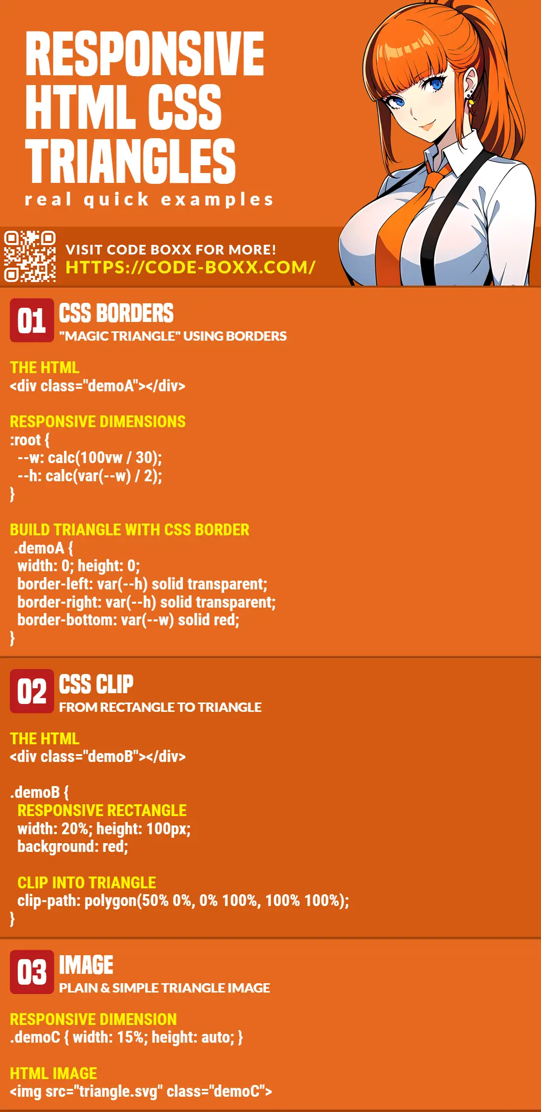
The common ways to create triangles in HTML and CSS are:
- Using CSS borders.
width: 0; height: 0;border-left: 10px solid transparent;border-right: 10px solid transparent;border-bottom: 20px solid red;
- Using CSS clip-path.
width: 100px; height: 100px;clip-path: polygon(50% 0%, 0% 100%, 100% 100%);
- Using images.
<img src="triangle.jpg">
That covers the quick basics, but how do we turn them into “responsive triangles”? Read on for more examples!
ⓘ I have included a zip file with all the example source code at the start of this tutorial, so you don’t have to copy-paste everything… Or if you just want to dive straight in.
TLDR – QUICK SLIDES
[web_stories_embed url=”https://code-boxx.com/web-stories/responsive-triangles-in-html-css/” title=”Responsive Triangles In HTML CSS” poster=”https://code-boxx.com/wp-content/uploads/2022/03/STORY-HTML-20230505.webp” width=”360″ height=”600″ align=”center”]
Fullscreen Mode – Click Here
TABLE OF CONTENTS
DOWNLOAD & NOTES

Firstly, here is the download link to the example code as promised.
QUICK NOTES
If you spot a bug, feel free to comment below. I try to answer short questions too, but it is one person versus the entire world… If you need answers urgently, please check out my list of websites to get help with programming.
EXAMPLE CODE DOWNLOAD
Click here to download the source code, I have released it under the MIT license, so feel free to build on top of it or use it in your own project.
RESPONSIVE TRIANGLES

All right, let us now walk through the various ways to create responsive triangles in HTML and CSS.
METHOD 1) TRIANGLES WITH BORDERS
1A) FIXED DIMENSION TRIANGLES
<style>
/* (A) BASE CONTAINER FOR TRIANGLES */
.demoA { width: 0; height: 0; }

/* (B) TRIANGLE DIRECTION */
/* (B0) FOR DEMO - ALL BORDERS */
.demoA.all {
  border-top: 30px solid green;
  border-bottom: 30px solid red;
  border-left: 30px solid blue;
  border-right: 30px solid yellow;
}

/* (B1) UP TRIANGLE */
.demoA.up {
  border-left: 15px solid transparent;
  border-right: 15px solid transparent;
  border-bottom: 30px solid red;
}

/* (B2) DOWN TRIANGLE */
.demoA.down {
  border-left: 15px solid transparent;
  border-right: 15px solid transparent;
  border-top: 30px solid green;
}

/* (B3) LEFT TRIANGLE */
.demoA.left {
  border-top: 15px solid transparent;
  border-bottom: 15px solid transparent;
  border-right: 30px solid yellow;
}

/* (B4) RIGHT TRIANGLE */
.demoA.right {
  border-top: 15px solid transparent;
  border-bottom: 15px solid transparent;
  border-left: 30px solid blue;
}
</style>

<div>Borders are "cut" at 45 degrees</div>
<div class="demoA all"></div>

<div>Up Triangle</div>
<div class="demoA up"></div>

<div>Down Triangle</div>
<div class="demoA down"></div>

<div>Left Triangle</div>
<div class="demoA left"></div>

<div>Right Triangle</div>
<div class="demoA right"></div>A triangle magically appears from border? How!? For those who are still lost:
- Take a close look at the “all 4 borders”, they are cut at 45 degrees.
- So very simply, a solid border at only one side will create that “magic border triangle”.
1B) RESPONSIVE BORDER TRIANGLE
<style>
/* (A) BASE CONTAINER & CALCULATIONS FOR TRIANGLES */
:root {
  --twidth: calc(100vw / 30);
  --theight: calc(var(--twidth) / 2);
}
.demoB { width: 0; height: 0; }

/* (B) TRIANGLE DIRECTION */
/* (B1) UP TRIANGLE */
.demoB.up {
  border-left: var(--theight) solid transparent;
  border-right: var(--theight) solid transparent;
  border-bottom: var(--twidth) solid red;
}

/* (B2) DOWN TRIANGLE */
.demoB.down {
  border-left: var(--theight) solid transparent;
  border-right: var(--theight) solid transparent;
  border-top: var(--twidth) solid green;
}

/* (B3) LEFT TRIANGLE */
.demoB.left {
  border-top: var(--theight) solid transparent;
  border-bottom: var(--theight) solid transparent;
  border-right: var(--twidth) solid yellow;
}

/* (B4) RIGHT TRIANGLE */
.demoB.right {
  border-top: var(--theight) solid transparent;
  border-bottom: var(--theight) solid transparent;
  border-left: var(--twidth) solid blue;
}
</style>

<div>Up Triangle</div>
<div class="demoB up"></div>

<div>Down Triangle</div>
<div class="demoB down"></div>

<div>Left Triangle</div>
<div class="demoB left"></div>

<div>Right Triangle</div>
<div class="demoB right"></div>Following up with the previous example, this one makes the triangles responsive.
- Basically, we start with defining CSS variables.
--twidth: calc(100vw / 30)Pretty self-explanatory,--twidthwill be 1/30th of the viewport width.--theight: calc(var(--twidth) / 2)Very simply, this is half of--twidth.
- Assign the CSS variables to the borders.
That’s all, the triangles are now responsive and will scale accordingly.
METHOD 2) TRIANGLES WITH CSS CLIP-PATH
<style>
.demoC {
  width: 20%;
  height: 100px;
  background: red;
  clip-path: polygon(50% 0%, 0% 100%, 100% 100%);
}
</style>

<div class="demoC"></div>
The wonders of modern CSS.
width: 20%; height: 100px; background: red;Creates a rectangle.clip-path: polygon(50% 0%, 0% 100%, 100% 100%)Clips the rectangle into a triangle.
P.S. We can use clip-path to turn the container into any shape. Use online tools such as Clippy to help you quickly form the path.
P.P.S. We can also use clip-path on <img> and background-image.
METHOD 3) TRIANGLE IMAGE
<style>
/* (A) FIXED DIMENSIONS */
.demoD {
  width: 48px;
  height: auto;
}

/* (B) RESPONSIVE DIMENSIONS */
.demoE {
  width: 15%;
  height: auto;
}
</style>

<div>Fixed Triangle</div>
<img src="ico-triangle.svg" class="demoD">

<div>Fixed Triangle</div>
<img src="ico-triangle.svg" class="demoE">
Lastly, the good old triangle image – Just add a percentage width (or any relative dimension) on it.
EXTRA BITS & LINKS

That’s all for this guide, and here is a small section on some extras and links that may be useful to you.
COMPATIBILITY CHECKS
- CSS Clip Path – CanIUse
- CSS Calc – CanIUse
These methods will work on most modern browsers.
INFOGRAPHIC CHEAT SHEET
THE END

Thank you for reading, and we have come to the end of this guide. I hope that it has helped you with your project, and if you want to share anything with this guide, please feel free to comment below. Good luck and happy coding!