Welcome to a quick tutorial on how to create a countdown timer using pure CSS only. Want to create a countdown timer without any Javascript? Yes, it is possible with modern CSS animations and keyframes – Read on for the example!
TABLE OF CONTENTS
 Download & Demo
 CSS Countdown
 Extras
 The End
DOWNLOAD & DEMO
Here is the download link to the example code, so you don’t have to copy-paste everything.
EXAMPLE CODE DOWNLOAD
Click here to download | Example on CodePen
Just click on “download zip” or do a git clone. I have released it under the MIT license, so feel free to build on top of it or use it in your own project.
SORRY FOR THE ADS...
But someone has to pay the bills, and sponsors are paying for it. I insist on not turning Code Boxx into a "paid scripts" business, and I don't "block people with Adblock". Every little bit of support helps.
Buy Me A Coffee Code Boxx eBooks
CSS COUNTDOWN DEMO
This demo is set to loop infinitely for convenience. In the example below, the animation will end at “pop”.
CSS COUNTDOWN TIMER
All right, let us now get into the details of how the HTML CSS countdown timer works.
TUTORIAL VIDEO
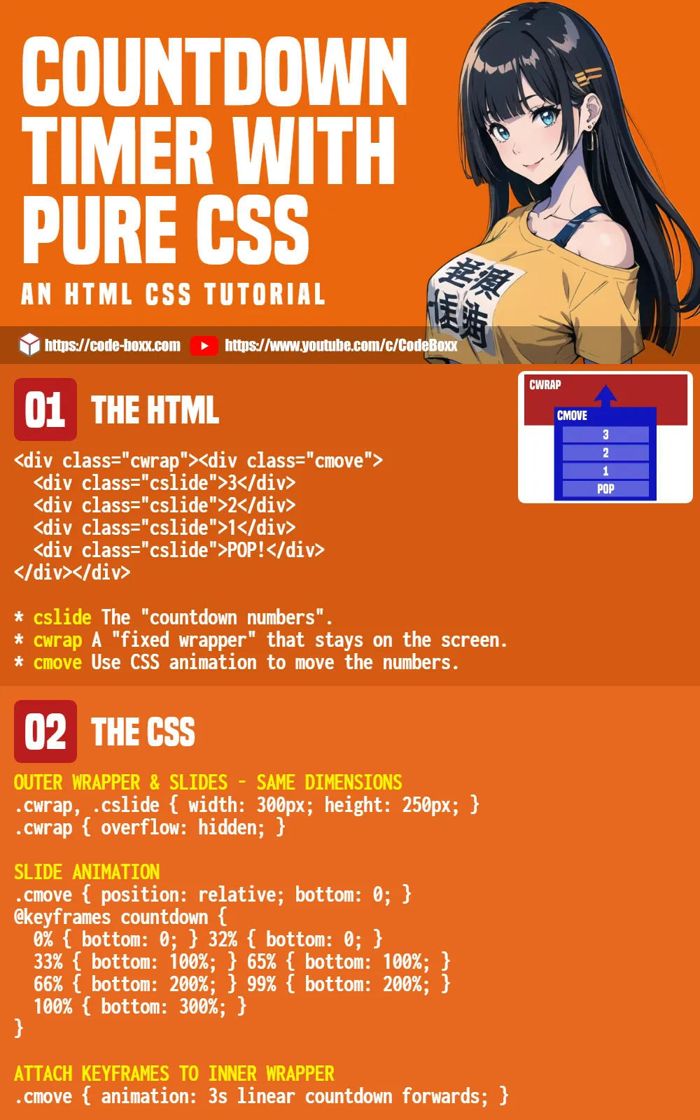
PART 1) THE HTML
<div class="cwrap"><div class="cmove">
  <div class="cslide">3</div>
  <div class="cslide">2</div>
  <div class="cslide">1</div>
  <div class="cslide">POP!</div>
</div></div>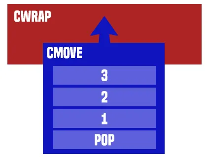
<div class="cslide">Start by creating the “countdown number slides”.- Wrap the “number slides” in two wrappers.
<div class="cwrap">The outer wrapper will be “fixed”.<div class="cmove">We will use CSS animation to shift this wrapper upward, so the numbers will appear to “countdown”.
PART 2) THE CSS
/* (A) OUTER WRAPPER & SLIDES - SAME DIMENSIONS */
.cwrap, .cslide { width: 300px; height: 250px; }
.cwrap { overflow: hidden; }

/* (B) SLIDE ANIMATION */
.cmove { position: relative; bottom: 0; }
@keyframes countdown {
  0% { bottom: 0; } 32% { bottom: 0; }
  33% { bottom: 100%; } 65% { bottom: 100%; }
  66% { bottom: 200%; } 99% { bottom: 200%; }
  100% { bottom: 300%; }
}

/* (C) ATTACH KEYFRAMES TO INNER WRAPPER */
.cmove { animation: 3s linear countdown forwards; }
This may seem rather intimidating to some beginners, but keep calm and study slowly.
- (A) First, we set the outer wrapper and all “number slides” to the same dimensions.
- (A) Hide the scrollbar on the outer wrapper, so it only displays one number at a time.
- (B) As above, the trick is to use a relative bottom position to shift the inner wrapper.
- (B) Create a set of keyframes to rotate through the numbers.
- (C) Attach the keyframes to the wrapper, and let CSS do the magic.
EXTRAS
That’s all for the tutorial, and here is a small section on some extras and links that may be useful to you.
START ON CUE
<style>
/* (C) START */
/* RENAME .CMOVE TO .GO */
.go { animation: 3s linear countdown forwards; }
</style>

<script>
window.addEventListener("load", () => {
  document.querySelector(".cmove").classList.add("go");
});
</script>
If you want the countdown to start on page load:
- Do not attach the keyframes to the inner wrapper directly, change
.cmove { animation... }to.go { animation... }. - Attach
.goto the inner wrapper on page load… The only way to do this is with Javascript.
DO SOMETHING ON THE END
<script>
document
  .querySelector(".cmove")
  .addEventListener("animationend", () => {
    // DO SOMETHING
    console.log("POP!");
  });
</script>
Once again, Javascript is required to “do something” when the countdown has reached the end.
INFOGRAPHIC CHEAT SHEET
COMPATIBILITY CHECKS
- CSS Keyframes – CanIUse
- CSS Animation – CanIUse
Works on all modern “Grade A” browsers.
LINKS & REFERENCES
- Javascript Countdown Timer – Code Boxx
THE END
Thank you for reading, and we have come to the end. I hope that it has helped you to better understand, and if you want to share anything with this guide, please feel free to comment below. Good luck and happy coding!