Welcome to a quick tutorial on how to create rainbow text in HTML and CSS. So you need a colorful splash of colors for a promotion, or a dazzling message to grab the users’ attention? Let us walk through a few examples of rainbow text – Read on!
TABLE OF CONTENTS
 Download & Notes
 Rainbow Text
 Extras
 The End
DOWNLOAD & NOTES
Here is the download link to the example code, so you don’t have to copy-paste everything.
EXAMPLE CODE DOWNLOAD
Click here to download | Example on CodePen
Just click on “download zip” or do a git clone. I have released it under the MIT license, so feel free to build on top of it or use it in your own project.
SORRY FOR THE ADS...
But someone has to pay the bills, and sponsors are paying for it. I insist on not turning Code Boxx into a "paid scripts" business, and I don't "block people with Adblock". Every little bit of support helps.
Buy Me A Coffee Code Boxx eBooks
RAINBOW TEXT
All right, let us now walk through the examples of creating rainbow text in HTML CSS.
TUTORIAL VIDEO
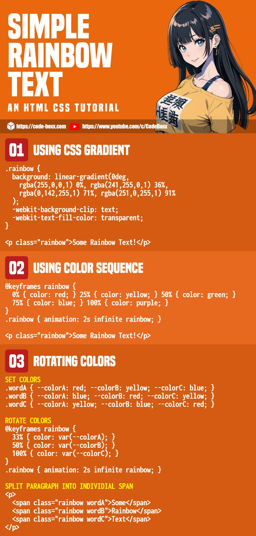
EXAMPLE 1) RAINBOW TEXT WITH GRADIENT
<style>
.rainbow {
  background: linear-gradient(0deg,
    rgba(255,0,0,1) 0%,
    rgba(241,255,0,1) 36%,
    rgba(0,142,255,1) 71%,
    rgba(251,0,255,1) 91%
  );
  -webkit-background-clip: text;
  -webkit-text-fill-color: transparent;
}
</style>

<p class="rainbow">Some Rainbow Text!</p>- It is not a secret that we can use
linear-gradientorradial-gradientto create a gradient background. - But strangely, we cannot apply gradients directly to the text color… Thus this roundabout way:
-webkit-background-clip: textUse the text as a reference to clip the gradient background.-webkit-text-fill-color: transparentSet the text as transparent, so it shows the gradient background instead.
P.S. If you want to change the colors of the gradient background, just use any “online CSS gradient generator” – Pick your colors, copy and paste your selected gradient.
EXAMPLE 2) RAINBOW TEXT COLOR SEQUENCE
<style>
/* (A) RAINBOW COLOR SEQUENCE */
@keyframes rainbow {
  0% { color: red; }
  25% { color: yellow; }
  50% { color: green; }
  75% { color: blue; }
  100% { color: purple; }
}

/* (B) ATTACH RAINBOW EFFECT */
.rainbow {
  animation: 2s infinite rainbow;
}
</style>

<p class="rainbow">Some Rainbow Text!</p>This should be pretty self-explanatory.
- First, we define a set of
keyframes, the colors to rotate through. - Attach the
keyframes, let CSS animation do the rest of the magic.
EXAMPLE 3) ROTATING RAINBOW TEXT COLORS
<style>
/* (A) SET COLORS */
.wordA {
  --colorA: red;
  --colorB: yellow;
  --colorC: blue;
}
.wordB {
  --colorA: blue;
  --colorB: red;
  --colorC: yellow;
}
.wordC {
  --colorA: yellow;
  --colorB: blue;
  --colorC: red;
}

/* (B) ROTATE COLORS */
@keyframes rainbow {
  33% { color: var(--colorA); }
  50% { color: var(--colorB); }
  100% { color: var(--colorC); }
}
.rainbow {
  animation: 2s infinite rainbow;
}
</style>

<!-- (C) SPLIT INTO INDIVIDIAL SPAN -->
<p>
  <span class="rainbow wordA">Some</span>
  <span class="rainbow wordB">Rainbow</span>
  <span class="rainbow wordC">Text</span>
</p>This looks like a handful at first, but keep calm and look carefully.
- (C) Split the words into individual
<span>, each with its ownwordABCCSS class. - (A & B) For those who are lost, it will be easier if you start with
wordAonly – It will cycle through red, yellow, and blue. - (A & B) Then for
wordBit will cycle through blue, red, and yellow. Yes, we are simply alternating the text colors on different words to produce the “rainbow effect”.
EXTRAS
That’s all for this guide, and here is a small section on some extras and links that may be useful to you.
INFOGRAPHIC CHEATSHEET
COMPATIBILITY CHECKS
- CSS Keyframes – CanIUse
- CSS Animation – CanIUse
- CSS Transitions – CanIUse
- Background Clip – CanIUse
- Text Fill Color – CanIUse
These examples should run without any issues – CSS animation is already well-supported in all modern browsers.
LINKS & REFERENCES
- Using CSS animations – MDN
- CSS Transition – MDN
- Set Interval – MDN
THE END
Thank you for reading, and we have come to the end of this guide. I hope that it has helped you with your project, and if you want to share anything with this guide, please feel free to comment below. Good luck and happy coding!