Welcome to a tutorial on creating a responsive sidebar in HTML and CSS. So you are working with a layout that has a sidebar, and wonder “how to turn it into a responsive website”? Here are a few simple examples, read on!
TABLE OF CONTENTS
 Download & Notes
 Responsive Sidebars
 Extras
 The End
DOWNLOAD & NOTES
Here is the download link to the example code, so you don’t have to copy-paste everything.
EXAMPLE CODE DOWNLOAD
Click here to download | Collapsing Sidebar on CodePen | Compact Sidebar on CodePen | Drawer Sidebar on CodePen
Just click on “download zip” or do a git clone. I have released it under the MIT license, so feel free to build on top of it or use it in your own project.
SORRY FOR THE ADS...
But someone has to pay the bills, and sponsors are paying for it. I insist on not turning Code Boxx into a "paid scripts" business, and I don't "block people with Adblock". Every little bit of support helps.
Buy Me A Coffee Code Boxx eBooks
TUTORIAL VIDEO
1) SIMPLE COLLAPSING SIDEBAR
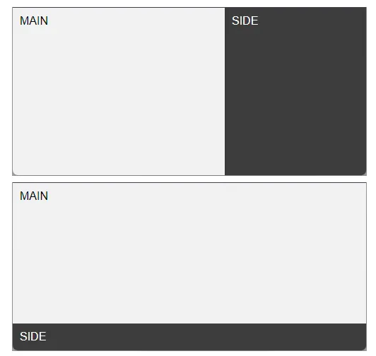
1A) THE HTML
<div id="main">MAIN</div>
<div id="side">SIDE</div>
Yep, this is as simple as it gets.
<div id="main">The main content area.<div id="side">The sidebar.
1B) THE CSS – BIG SCREEN
/* (A) BIG SCREEN - 2 COLUMNS LAYOUT */
body {
  display: flex;
  padding: 0; margin: 0;
  min-height: 100vh; /* optional */
}
#main { flex-grow: 1; }
#side { flex-shrink: 0; width: 200px; }
On big screens, we have a 2 column layout.
- Set the
<body>to flex layout. Remove the annoying default page spacing with 0 padding and margin. - Set
<div id="side">to a fixed (or percentage) width. - Then, set
flex-grow: 1on<div id="main">. This will allow it to fill up the remaining screen width automatically.
1C) THE CSS – SMALL SCREEN
/* (B) SMALL SCREEN - COLLAPSE */
@media screen AND (max-width:768px) {
  body { flex-direction: column; }
  #side { width: 100%; }
}
On a small screen, we collapse the sidebar.
- Setting
flex-direction: columnon<body>will rearrange the main content to be on top, sidebar below. - Allow the sidebar to fill with
width: 100%.
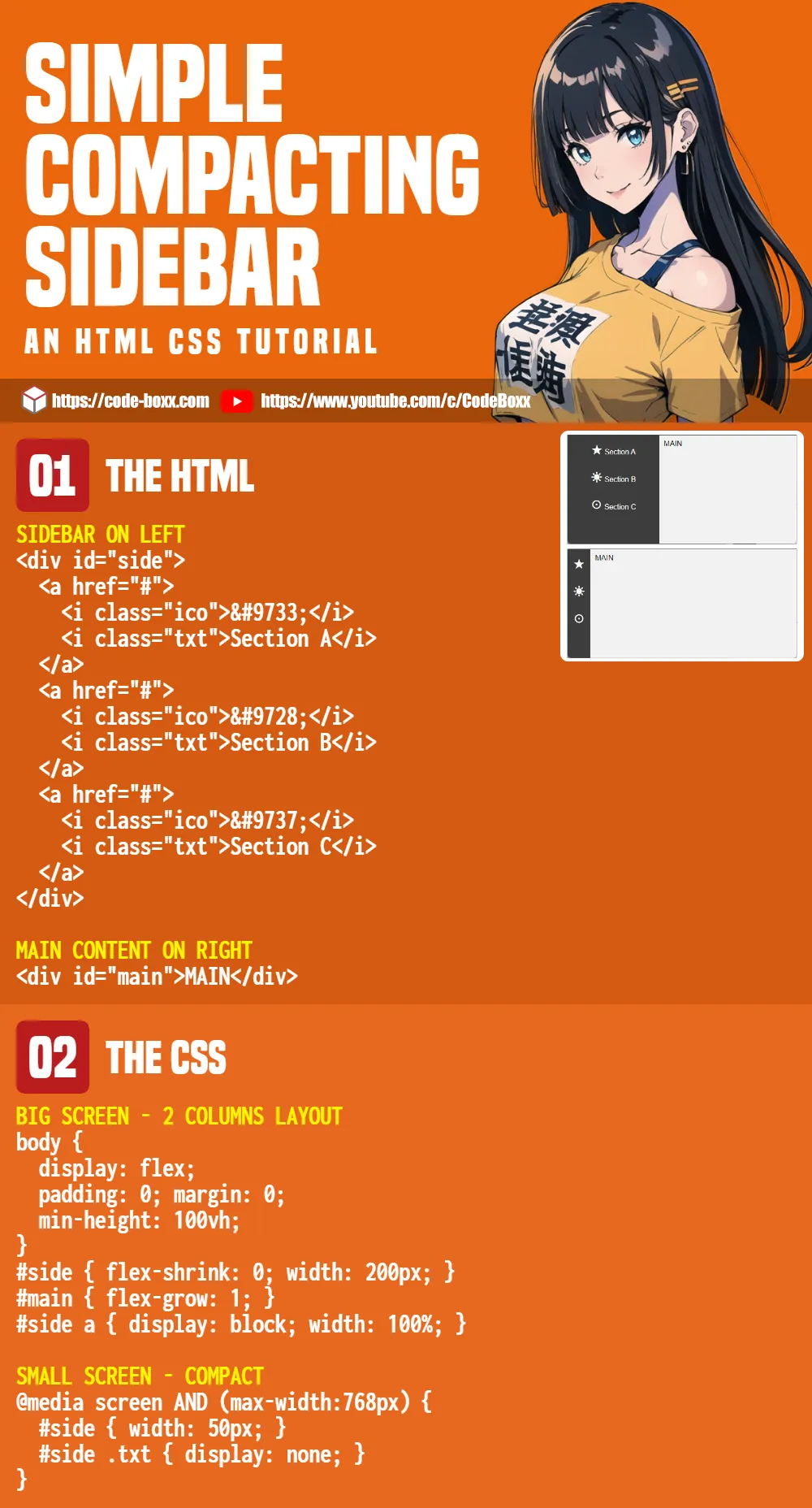
2) COMPACT SIDEBAR
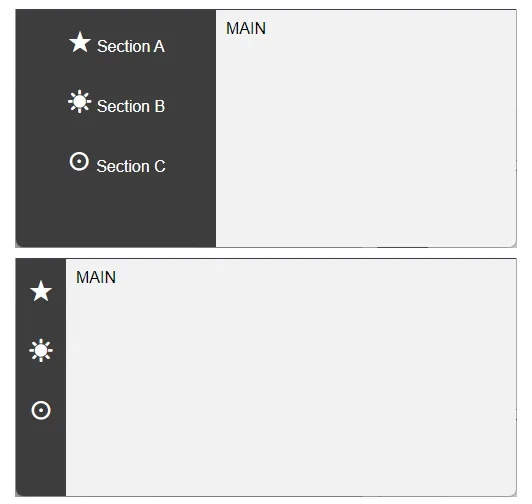
2A) THE HTML
<!-- (A) SIDEBAR -->
<div id="side">
<a href="#">
<i class="ico">★</i>
<i class="txt">Section A</i>
</a>
<a href="#">
<i class="ico">☀</i>
<i class="txt">Section B</i>
</a>
<a href="#">
<i class="ico">☉</i>
<i class="txt">Section C</i>
</a>
</div>
<!-- (B) MAIN CONTENT -->
<div id="main">MAIN</div>
This is pretty much the same as the previous example.
<div id="side">The sidebar, but take note, we have menu items this time.<i class="ico">Menu item icon. This is just an HTML symbol, feel free to use any “icon library” in your project.<i class="txt">Menu item text.
<div id="main">Main content.
2B) THE CSS – BIG SCREEN
/* (A) BIG SCREEN */
/* (A1) 2 COLUMNS LAYOUT */
body {
  display: flex;
  padding: 0; margin: 0;
  min-height: 100vh;
}
#side { flex-shrink: 0; width: 200px; }
#main { flex-grow: 1; }

/* (A2) MENU ITEMS */
#side a { display: block; width: 100%; }- (A1) Same old layout, set the body to flex layout.
- (A1) Fixed/percentage width on the sidebar, allow
flex-growon the main content. - (A2) A small bit to allow the menu items to be “one line on its own”.
2C) THE CSS – SMALL SCREEN
/* (B) SMALL SCREEN - COMPACT */
@media screen AND (max-width:768px) {
  #side { width: 50px; }
  #side .txt { display: none; }
}
On small screens:
- Simply “compact” the sidebar with a lesser width.
- Hide the menu item text, only show the icons.
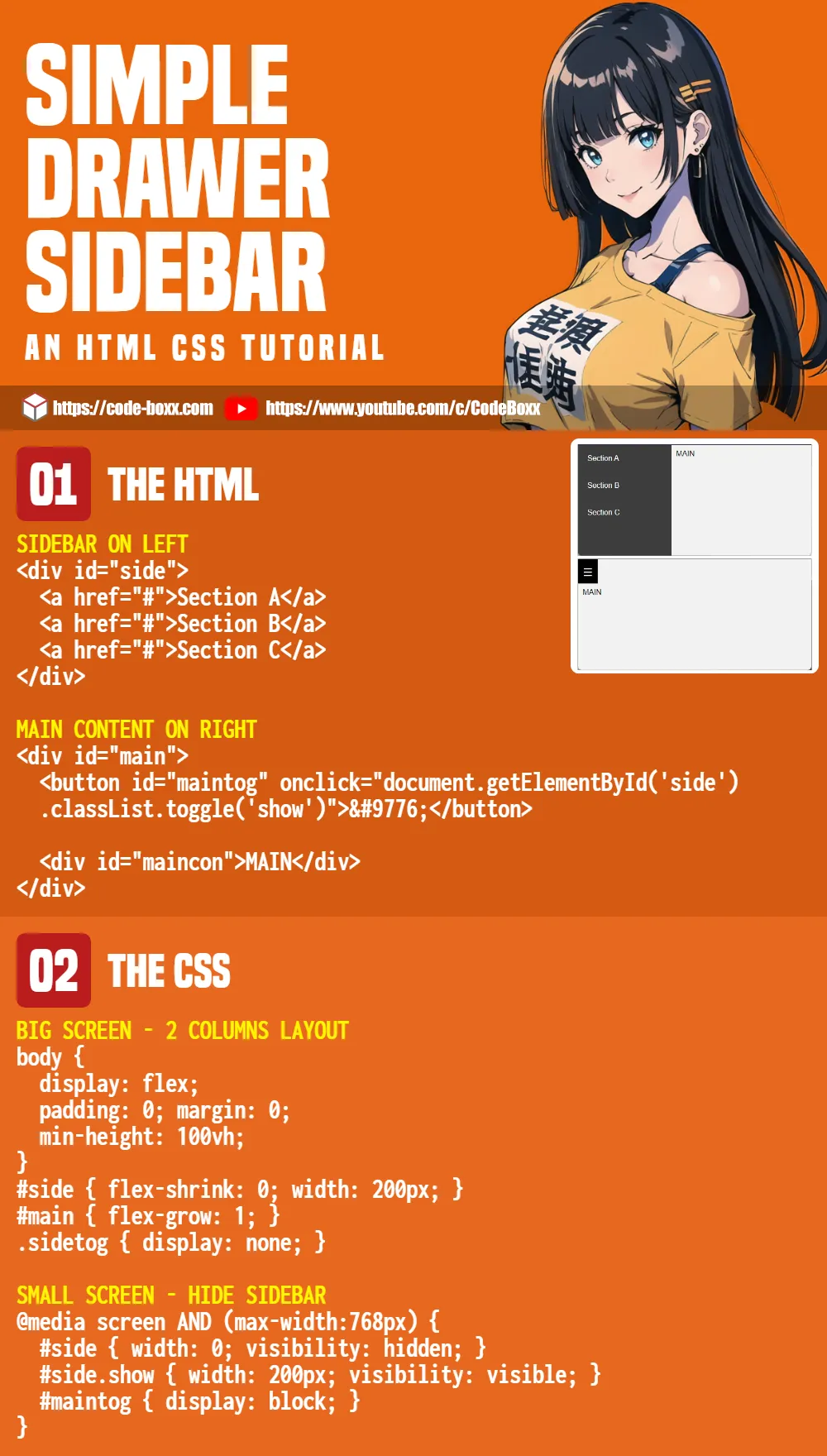
3) DRAWER SIDEBAR
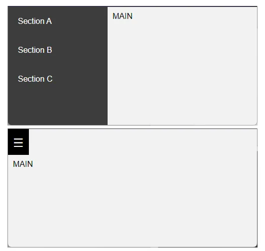
3A) THE HTML
<!-- (A) SIDEBAR -->
<div id="side">
<a href="#">Section A</a>
<a href="#">Section B</a>
<a href="#">Section C</a>
</div>
<!-- (B) MAIN CONTENT -->
<div id="main">
<!-- (B1) SIDEBAR TOGGLE -->
<button id="maintog" onclick="document.getElementById('side').classList.toggle('show')">
☰
</button>
<!-- (B2) CONTENTS -->
<div id="maincon">MAIN</div>
</div>This is the same old sidebar and main contents yet again. The only difference is an additional <button id="maintog">, to toggle the sidebar on small screens.
3B) THE CSS – BIG SCREEN
/* (A) BIG SCREEN */
/* (A1) 2 COLUMNS LAYOUT */
body {
  display: flex;
  padding: 0; margin: 0;
  min-height: 100vh;
}
#side { flex-shrink: 0; width: 200px; }
#main { flex-grow: 1; }

/* (A2) HIDE SIDEBAR TOGGLE */
.sidetog { display: none; }
I think you guys should be bored of this by now.
- Same layout. The sidebar is on the left, and the main content is on the right.
- Hide the toggle button on big screens.
3C) THE CSS – SMALL SCREEN
/* (B) SMALL SCREEN */
@media screen AND (max-width:768px) {
  /* (B1) HIDE SIDEBAR BY DEFAULT */
  #side { width: 0; visibility: hidden; }
  #side.show { width: 200px; visibility: visible; }

  /* (B2) SHOW TOGGLE BUTTON */
  #maintog { display: block; }
}
On small screens:
- Hide the sidebar by default.
- Show the sidebar only when the
showCSS class is attached. - Show the toggle button.
EXTRAS
That’s all for this guide, and here is a small section on some extras and links that may be useful to you.
INFOGRAPHIC CHEATSHEET
LINKS & REFERENCES
- Need more? Here’s a collection of “nice-looking” sidebars – Free Frontend.
- More sidebar design ideas – CodeDemy
- Hidden Sidebar Menu – Code Boxx
THE END
Thank you for reading, we have come to the end of this guide. I hope that it has helped you with your project, and if you have anything to share with this guide, please feel free to comment below. Good luck and happy coding!