Welcome to a tutorial on how to create a responsive fullscreen background image in HTML CSS. Need to add a background image that will look nice on both big and small screens?
Creating a responsive fullscreen background image is as easy as setting a background image to cover the entire window – body { width: 100vw; min-height: 100vh; background: url("IMAGE") center no-repeat; background-size: cover; }.
That covers the quick basics, but read on for the example!
TABLE OF CONTENTS
 Download & Demo
 Background Image
 Extras
 The End
DOWNLOAD & DEMO
Here is the download link to the example code, so you don’t have to copy-paste everything.
EXAMPLE CODE DOWNLOAD
Click here to download | Example on CodePen
The example code is released under the MIT license, so feel free to build on top of it or use it in your own project.
SORRY FOR THE ADS...
But someone has to pay the bills, and sponsors are paying for it. I insist on not turning Code Boxx into a "paid scripts" business, and I don't "block people with Adblock". Every little bit of support helps.
Buy Me A Coffee Code Boxx eBooks
RESPONSIVE BACKGROUND DEMO
CITY LIFE
Lorem ipsum dolor sit amet, consectetur adipiscing elit.
RESPONSIVE FULLSCREEN BACKGROUND IMAGE
All right, let us now get into the examples of how to create responsive background images.
TUTORIAL VIDEO
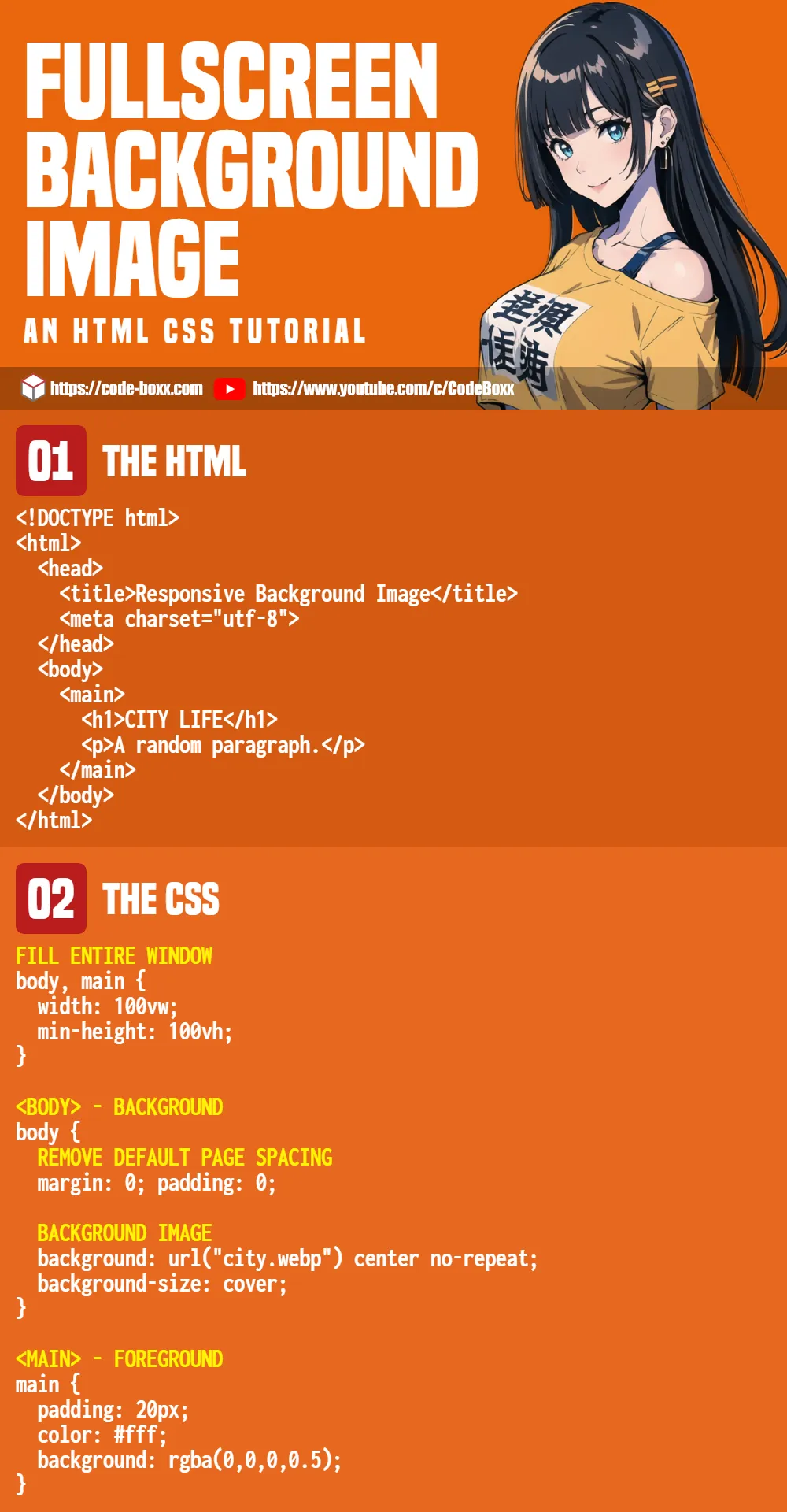
PART 1) THE HTML
<!DOCTYPE html>
<html>
  <head>
    <title>Responsive Background Image</title>
    <meta charset="utf-8">
    <link rel="stylesheet" href="background.css">
  </head>
  <body>
    <main>
      <h1>CITY LIFE</h1>
      <p>Lorem ipsum dolor sit amet, consectetur adipiscing elit.</p>
    </main>
  </body>
</html>
Yes, that’s all it takes to create a responsive full-page background image.
- We will be applying the background image onto
<body>. - Then,
<main>will serve as the “foreground content”.
PART 2) THE CSS
/* (A) FILL ENTIRE WINDOW */
body, main {
  width: 100vw;
  min-height: 100vh;
}

/* (B) <BODY> - BACKGROUND */
body {
  /* (B1) REMOVE DEFAULT PAGE SPACING */
  margin: 0; padding: 0;

  /* (B2) BACKGROUND IMAGE */
  background: url("city.webp") center no-repeat;
  background-size: cover;
}

/* (C) <MAIN> - FOREGROUND */
main {
  padding: 20px;
  color: #fff;
  background: rgba(0,0,0,0.5);
}
Just what is happening here?
- We set both
<body><main>towidth: 100vwandmin-height: 100vh. This will make the page fill up the entire window by default. - Remember that
<body>will serve as the background?- (B1) First, use
margin: 0; padding: 0;to remove the annoying default page spacing. - (B2)
background: url("city.webp") center no-repeatSet the background image, centered on the page. - (B2)
background-size: coverThe background image will cover the entire page. You can also set this tocontain, but it will not fill the entire page.
- (B1) First, use
- Finally,
<main>will serve as foreground content. All we are doing here is setting the font and color “as usual”. Give it a transparent background so that the text can show up a little better.
EXTRAS
That’s all for the tutorial, and here is a small section on some extras and links that may be useful to you.
LINKS & SUMMARY
| Property | Description | Reference |
background-image |
Set background image. | Link |
background-size |
Set the size of the background image. | Link |
background-position |
Set the position of the background image. | Link |
background-repeat |
Repeat the background image. | Link |
- Perfect Full Page Background Image – CSS Tricks
- How to Create a Responsive Full Background Image Using CSS – WebFX
INFOGRAPHIC CHEAT SHEET
THE END
Thank you for reading, and we have come to the end. I hope that it has helped you to better understand, and if you want to share anything with this guide, please feel free to comment below. Good luck and happy coding!
Excellent post, I love your website, full of programming tricks, thanks for existing!