Welcome to a tutorial on how to create rows and columns in HTML without using tables. So you need to some layout on your website, but just not by using the inflexible tables?
In HTML and CSS, there are a few common ways to create rows and columns without using the <table> tag:
- CSS flexible box
<div id="flex"> <div>CELL</div> <div>CELL</div> </div>#flex { display: flex; flex-wrap: wrap; }#flex div { width: 50%; }
- CSS grid
<div id="grid"> <div>CELL</div> <div>CELL</div> </div>#grid { display: grid; grid-template-columns: 35% 65%; }
- Floating containers
<div id="float"> <div>CELL</div> <div>CELL</div> </div>#float div { float: left; width: 50%; }
That covers the quick basics, but read on for the detailed examples!
ⓘ I have included a zip file with all the example source code at the start of this tutorial, so you don’t have to copy-paste everything… Or if you just want to dive straight in.
QUICK SLIDES
[web_stories_embed url=”https://code-boxx.com/web-stories/rows-columns-without-tables/” title=”Rows & Columns Without Tables In HTML CSS” poster=”https://code-boxx.com/wp-content/uploads/2022/03/STORY-HTML-20230505.webp” width=”360″ height=”600″ align=”center”]
TABLE OF CONTENTS
 Download & Notes Download & Notes |
 Rows & Columns Rows & Columns |
 Useful Bits & Links Useful Bits & Links |
 The End The End |
DOWNLOAD & NOTES
Firstly, here is the download link to the example code as promised.
QUICK NOTES
If you spot a bug, feel free to comment below. I try to answer short questions too, but it is one person versus the entire world… If you need answers urgently, please check out my list of websites to get help with programming.
EXAMPLE CODE DOWNLOAD
Click here to download the source code, I have released it under the MIT license, so feel free to build on top of it or use it in your own project.
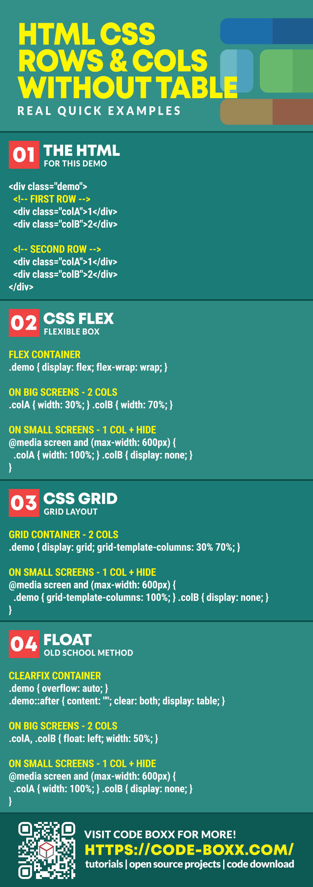
HTML ROWS & COLUMNS
All right, let us now get into the various ways to create rows and columns in HTML, without using the table tag itself.
1) CSS FLEXIBLE BOX
1A) THE HTML
<div class="demoA">
  <!-- FIRST ROW -->
  <div class="colA">First</div>
  <div class="colB">Second</div>
  <div class="colC">Third</div>

  <!-- SECOND ROW -->
  <div class="colA">First</div>
  <div class="colB">Second</div>
  <div class="colC">Third</div>
</div>
Instead of using <table>, we create a <div class="demoA"> container and sandwich the <div class="col"> columns inside.
1B) THE CSS
/* (A) FLEX CONTAINER */
.demoA {
  display: flex;
  flex-wrap: wrap;
}
.demoA * { box-sizing: border-box; }

/* (B) COLUMN DIMENSIONS */
/* (B1) ON BIG SCREENS */
.colA { width: 30%; }
.colB { width: 40%; }
.colC { width: 30%; }

/* (B2) ON SMALL SCREENS */
@media screen and (max-width: 600px) {
  .colA, .colB { width: 50%; }
  .colC { display: none; }
}

/* (C) COSMETICS */
.colA, .colB, .colC { padding: 10px; }
.colA { background: #ffe6e6; }
.colB { background: #e0e4ff; }
.colC { background: #d0fff2; }
This may look complicated at first, but keep calm and look carefully. It is actually very straightforward:
- First, we declare a flexible container.
.demoA { display: flex; }will layout all the<div class="col">in a left-to-right manner (creating the columns).flex-wrap: wrapallows the columns to wrap into a new row when the width exceeds the container.
- Self-explanatory, the dimensions.
- (B1) The width of each column.
- (B2)
@media screen and (max-width: 600px)is what we call a “CSS media query”. This is optional, but we can use this to change the width of columns on smaller screens sizes. Even hide certain columns/sections that are not as important.
- Lastly, just some cosmetics.
1C) THE RESULT
2) CSS GRID LAYOUT
2A) THE HTML
<div class="demoB">
  <!-- FIRST ROW -->
  <div class="colA">First</div>
  <div class="colB">Second</div>
  <div class="colC">Third</div>

  <!-- SECOND ROW -->
  <div class="colA">First</div>
  <div class="colB">Second</div>
  <div class="colC">Third</div>
</div>
Look no further, this is the same as the previous example.
2B) THE CSS
/* (A) GRID CONTAINER */
.demoB {
  display: grid;
  grid-template-columns: 20% 55% 25%;
}

/* (B) ON SMALL SCREENS */
@media screen and (max-width: 600px) {
  .demoB { grid-template-columns: repeat(2, minmax(0, 1fr)); }
  .colC { display: none; }
}

/* (C) COSMETICS */
.colA, .colB, .colC { padding: 10px; }
.colA { background: #ffe6e6; }
.colB { background: #e0e4ff; }
.colC { background: #d0fff2; }
The basic CSS grid layout is a lot easier than CSS flex.
- Just set the container to
display: gridand define the width of the columns withgrid-template-columns. The browser will do the rest of the magic. - The same old strategy, we use CSS media query to set a different layout, hide columns if necessary.
- Cosmetics.
2C) THE RESULT
3) FLOAT
3A) THE HTML
<div class="demoC">
  <!-- FIRST ROW -->
  <div class="colA">First</div>
  <div class="colB">Second</div>
  <div class="colC">Third</div>

  <!-- SECOND ROW -->
  <div class="colA">First</div>
  <div class="colB">Second</div>
  <div class="colC">Third</div>
</div>
Think you catch the drift by now… It’s the same.
3B) THE CSS
/* (A) CLEARFIX CONTAINER */
.demoC { overflow: auto; }
.demoC::after {
  content: "";
  clear: both;
  display: table;
}
.demoC * { box-sizing: border-box; }

/* (B) COLUMNS FLOAT + DIMENSIONS */
.colA, .colB, .colC {
  float: left;
  width: 33.33%;
}

/* (C) ON SMALL SCREENS */
@media screen and (max-width: 600px) {
  .colA, .colB { width: 50%; }
  .colC { display: none; }
}

/* (D) COSMETICS */
.colA, .colB, .colC { padding: 10px; }
.colA { background: #ffe6e6; }
.colB { background: #e0e4ff; }
.colC { background: #d0fff2; }
This final method is a traditional one… Quite a pain to deal with actually. But if you have to work with ancient browsers, this is the only way to go.
- (B) The whole idea is actually simple. Just add
float: leftorfloat: rightto the columns that you want to spread out, then give them their respectivewidth. - (C) Same old small screen strategy.
- (A) But a problem may arise when all the elements inside
.demoCis “floated”. It will “collapse” and possibly cause the layout below to wreck. This is why we apply a “clearfix” to make sure that.demoC“retains its shape”. - (D) Cosmetics.
3C) THE RESULT
USEFUL BITS & LINKS
That’s all for this tutorial, and here is a small section on some extras and links that may be useful to you.
LINKS & REFERENCES
- The Box Model – MDN
- A Complete Guide to Flexbox – CSS Tricks
- A Complete Guide to Grid – CSS Tricks
- All About Floats – CSS Tricks
INFOGRAPHIC CHEAT SHEET
THE END
Thank you for reading, and we have come to the end of this guide. I hope that it has helped you with your project, and if you want to share anything with this guide, please feel free to comment below. Good luck and happy coding!